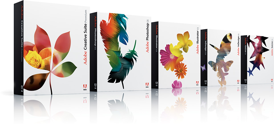
In 2003, Adobe® introduced the Creative Suite, which bundled together the core Adobe Creative Professional products and united them technologically through VersionCue, a file management application that maintains version control. The company saw the introduction of the Creative Suite as an opportunity to present a new product image to their Creative Professional audience, who had increasingly resisted both new and upgrade sales for several years. Adobe commissioned MetaDesign® San Francisco to help them “emotionally reconnect” with this culturally sophisticated audience by redesigning the Creative Suite packaging and related materials.
Strategy generates style
MetaDesign began the design process by considering the Adobe positioning statement:
“Adobe helps people and businesses communicate better—in more effective and compelling ways— by helping them integrate ideas, information, images, and insights through the Adobe platform of innovative technologies.”
From this starting point, a strategic context was established by proposing attributes that resonate with the Creative Professional audience—precision, beauty, and aspiration. These attributes were brought to life through a system of artfully presented natural forms as metaphors for the reative process.
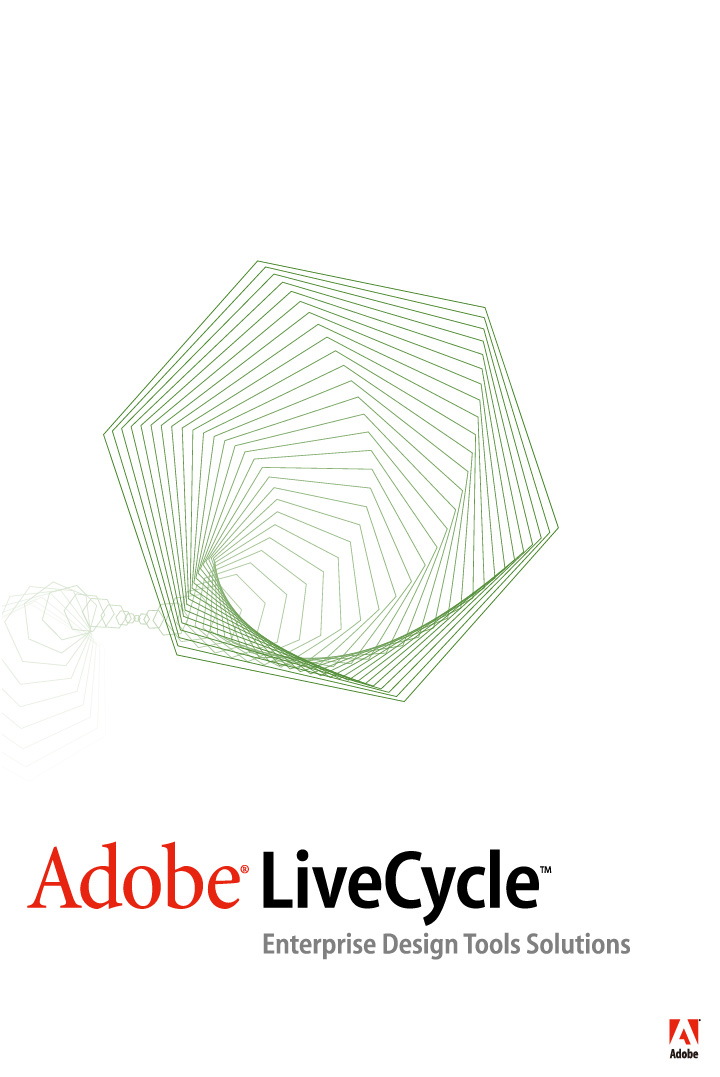
To complement the Creative Suite packaging design, a new look for Adobe’s business-to-business Enterprise line of server and IT applications was also created. The design strategy extended into an Adobe Style Framework of attributes, expressions, and key messages for their three audiences: Creative Professional, Enterprise and Consumer.
The MetaDesign team communicated the Enterprise attributes of collaboration, efficiency, and value through a design system based on the hexagon, a stable and infinitely connected form. Variations of the same hexagonal, revolving image, variously cropped and colored, represent the full range of Adobe’s Enterprise software. This visual metaphor maintains consistency among Adobe’s many robust, customizable, and connectable Enterprise applications.
Extending the brand look
Adobe has retained MetaDesign to help them reconsider and evolve the overall “look, feel and tone” of their other business segments and communications, using the Adobe Style Framework as a lens. This ongoing design consulting relationship is unifying the company’s visual presentation into a single, recognizable visual identity.
Corporate communications
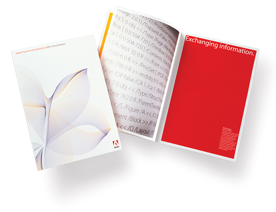
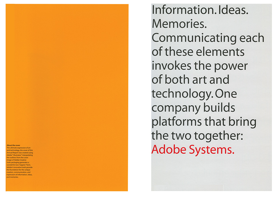
The corporate communications pieces created for Adobe—the company’s 2003 annual report and the 2004 corporate brochure—highlighted the company’s heritage and vision of bringing “the art and technology of communication” to the company’s distinct customer segments. To achieve these goals, a focus on the Adobe corporate brand promise was decided on: Enabling people to communicate more effectively through the art of communication. These corporate pieces have differentiated Adobe in the marketplace and have built awareness of Adobe products and solutions.
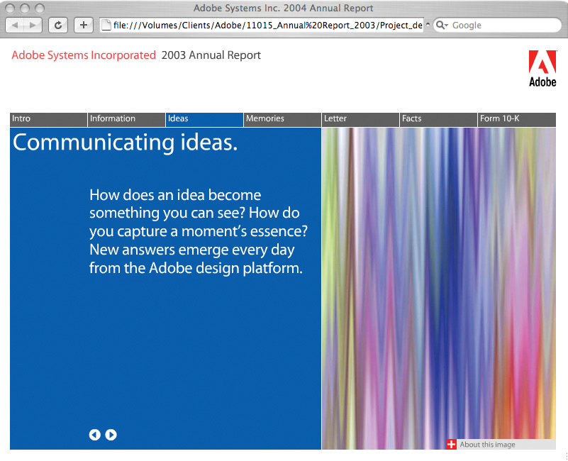
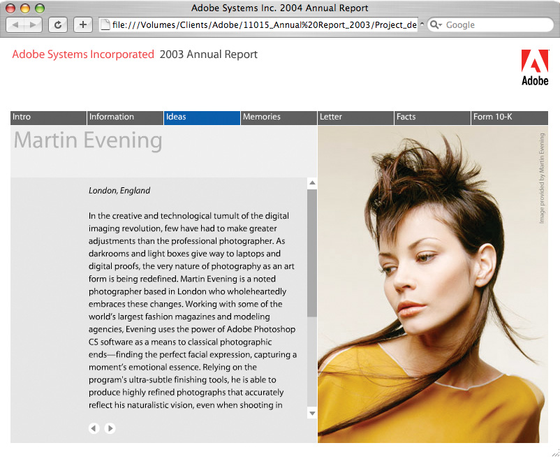
For the annual report, a brand framework called “Finding Focus” was created. This framework provided distinct themes for the three key audiences: communicating ideas (Creative Professional), exchanging information (Enterprise), and sharing memories (Consumer). Using these themes, a simple, clear typographic and photographic presentation of how Adobe serves these different audiences was established.
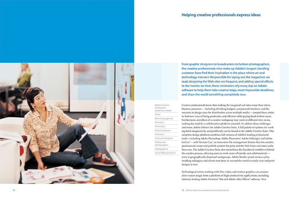
In the corporate brochure, themes from the annual report were expanded upon. Bold colors, demonstrative photography showing how the applications are used, and large typographic statements conveyed a dynamic, progressive brand position.
A redesign of the Adobe Web site home page was undertaken to reflect the new design strategy and look. Their home page had been simplified to a single column of text, with one image. It represented neither the diversity of Adobe’s product offerings nor the company’s needs to surface the frequently clicked Adobe Reader® buttons and feature news and announcements. The new home page design featured a prominent story with a large image, followed by a clear, three-column information hierarchy.
Design extension and renewal
In 2005, MetaDesign created a related look for Adobe’s digital video and audio software. This suite offers powerful solutions for efficient film, video, DVD, and Web workflows. To reflect the same Creative Professional audience attributes of precision, beauty, and aspiration, the team created a series of evocative abstract shapes rendered in 3-D for this product line.
Every 18 months, Adobe releases a new version of its creative products. After the successful launch of the first Creative Suite, in 2005 Adobe returned to MetaDesign to design a new packaging look for Creative Suite 2, working within the original design strategy.
For Creative Suite 2, the original theme of nature was extended, using X-ray photography as a metaphor for the unseen creative process. London artist Nick Veasey, working from a studio specially equipped for radiography, captured the raw X-rays, which were manipulated and colorized for use in the packaging and icon system.
The resulting images revealed the mathematical formulas that define the forms found in nature. Even though the growth pattern of a shell or the shape of a leaf is determined by a fixed formula, no two shells or leaves are alike. Similarly, different people using the same software achieve very different results.
The success of the Creative Suite packaging and the Adobe brand look demonstrated how an insightful design strategy became the starting point to restage the company brand across all communications, and provided long-term value for Adobe.
Results
Since the launch of the first Creative Suite in the fourth quarter of 2003, its sales have exceeded both company and analysts’ expectations. The success of the new brand look has contributed to a premium valuation for the company.
In 2005, the Creative Suite packaging won a Special Award of Distinction from ReBrand 100 as one of the world’s six most effective rebrands.
The 2003 annual report was named to the prestigious Black Book Annual Report 100, and was a finalist for the 2004 London International Advertising & Design Awards.