

Branding paradigm
11
Pictures from WorldBranding
South Korea’s credit card market had reached a saturation point, with working adults holding an average of five cards each. Most offerings were virtually indistinguishable, with even interest rates — once a key differentiator — showing little variation.
In response, Hyundai Card implemented a diversified merchandising strategy, tailoring its card services to suit different usage contexts and customer segments. Under the strong leadership of its top management, the company also drove an internal transformation centred on innovation, while simultaneously launching bold and dynamic brand promotions in the market.
This dual focus on internal cultural reform and external differentiation enabled Hyundai Card to significantly expand its market share.
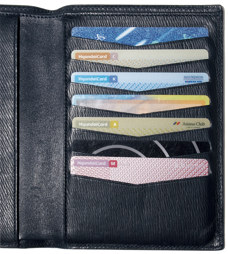
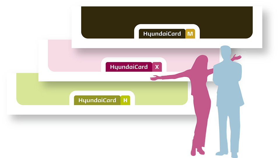
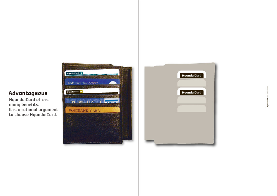
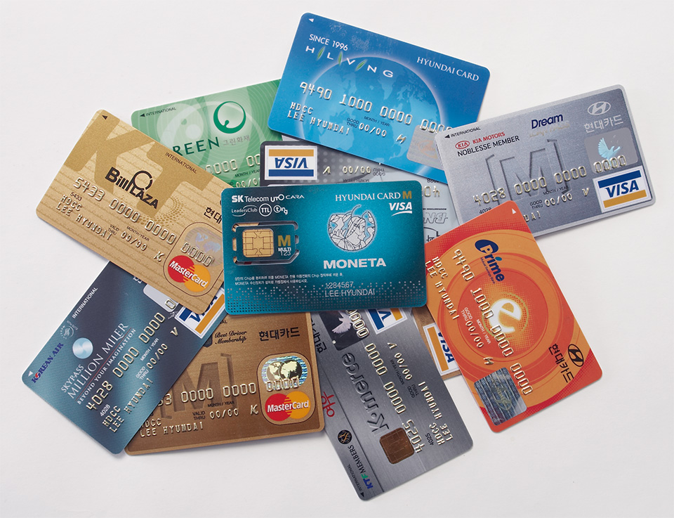
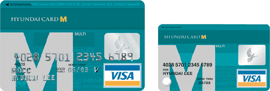
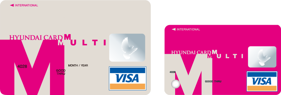
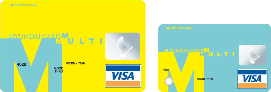
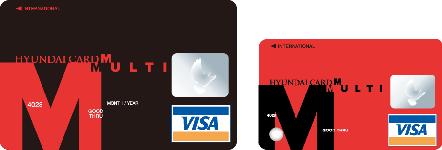
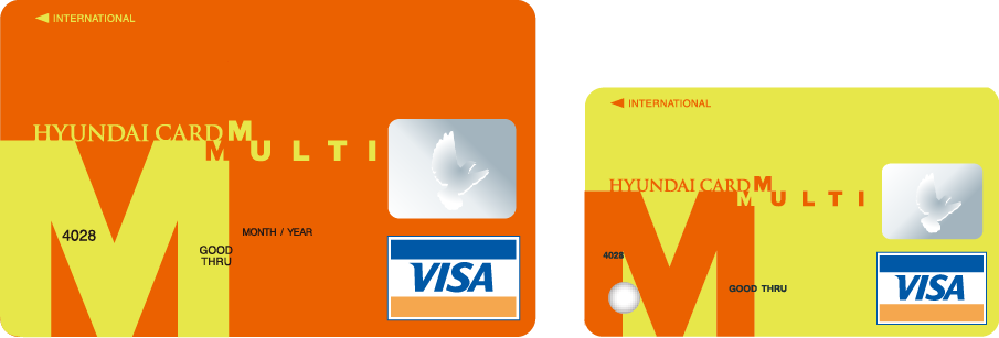
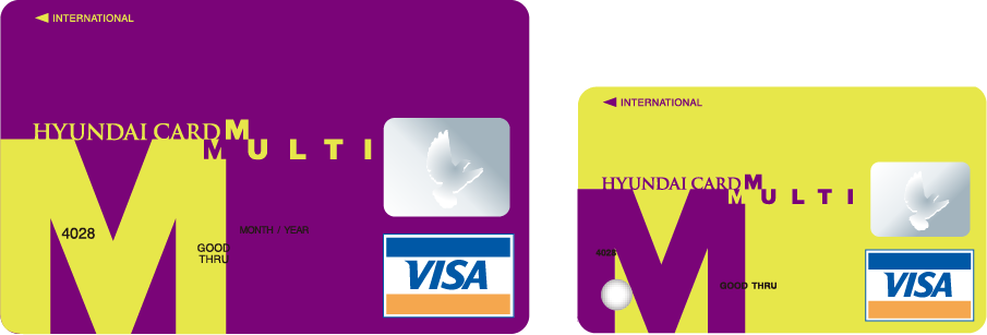
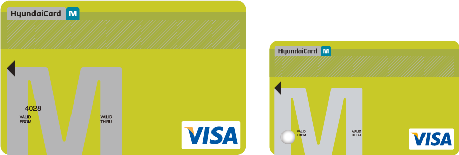
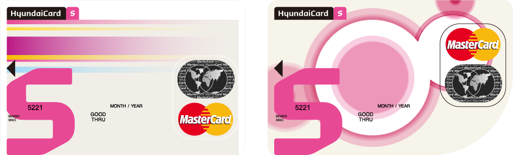
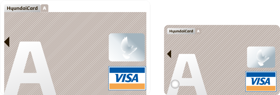
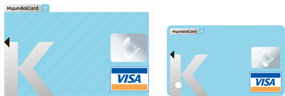
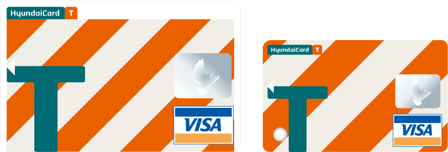
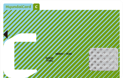
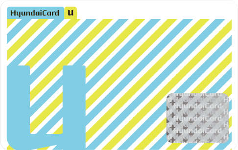
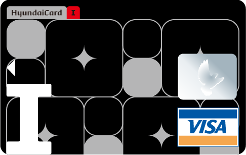
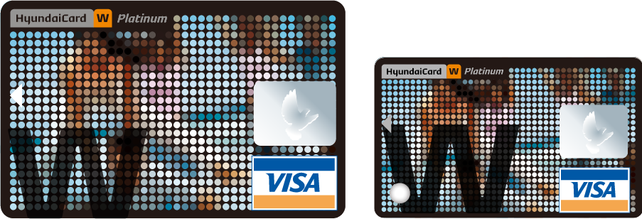
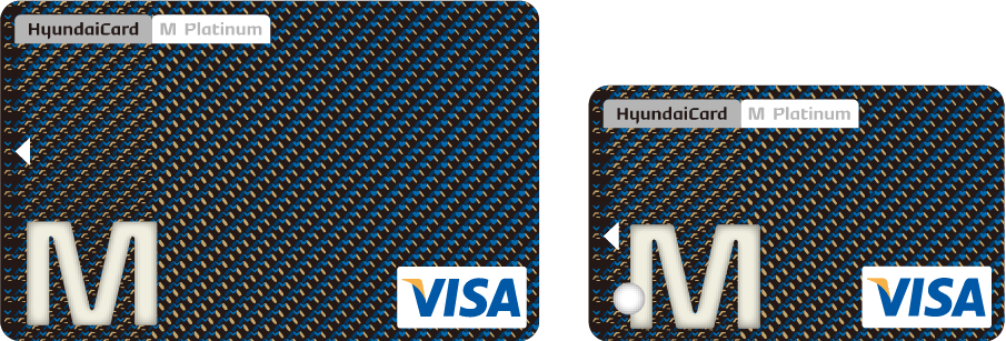
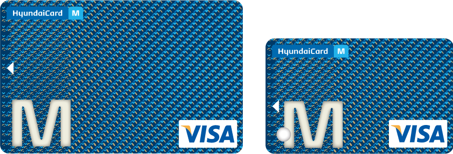
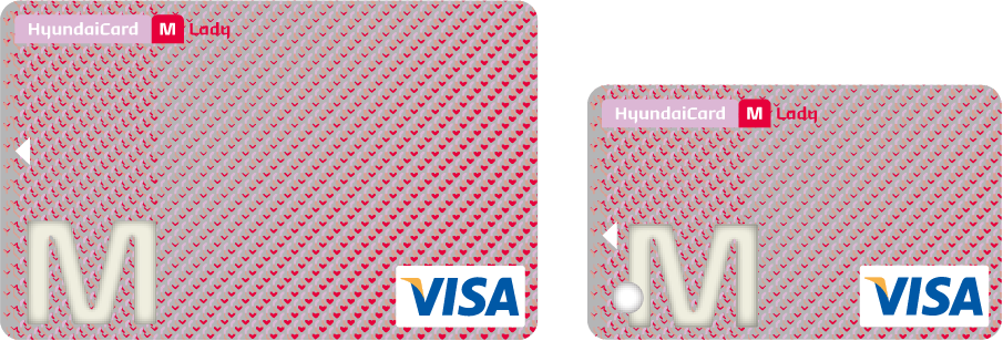
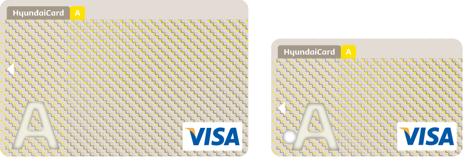
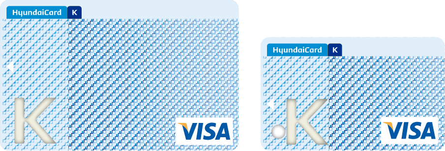
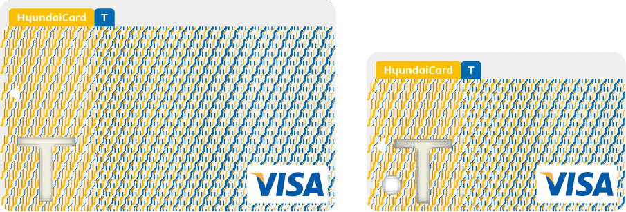
The HyundaiCard visually dominates a wallet. When a wallet is opened, the name HyundaiCard immediately catches the eye like an index tab in the cardholder. The letters ‘M’ or ‘S’ after the name indicate the type of card, so that even if the customer has several HyundaiCards, the right one for the situation can immediately be selected.
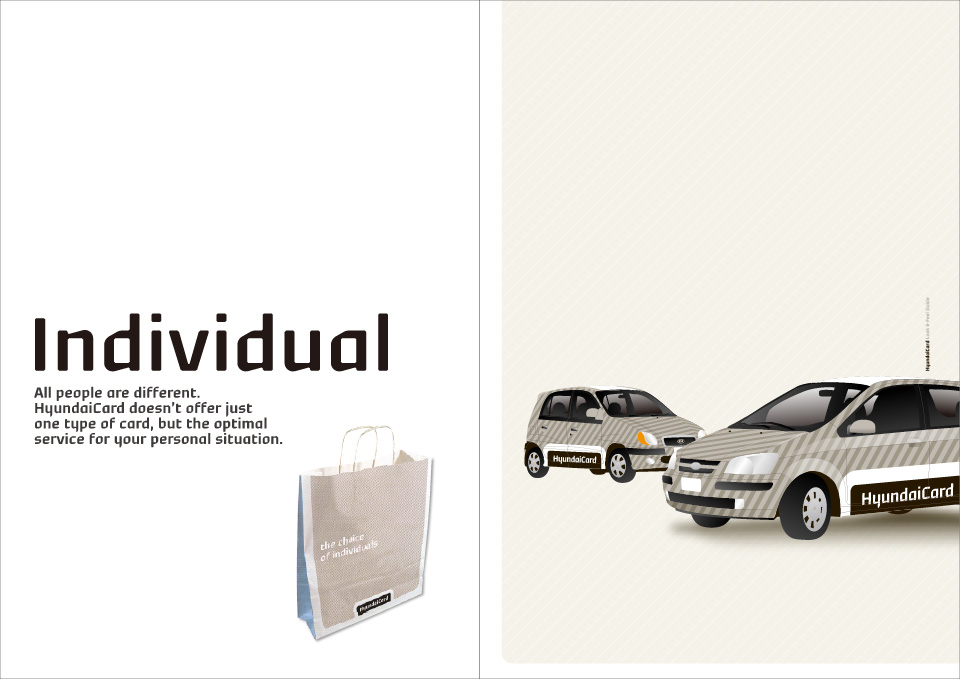
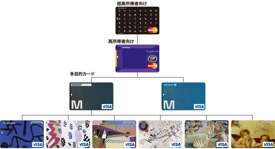
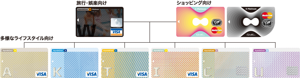
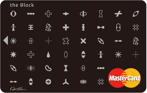
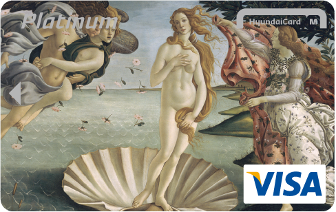
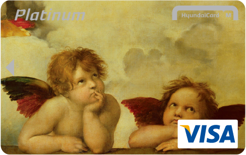
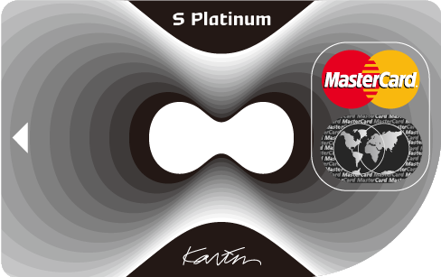
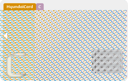
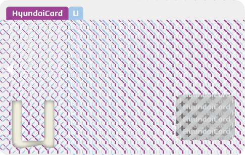
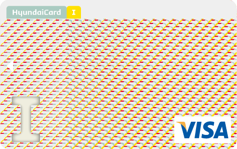
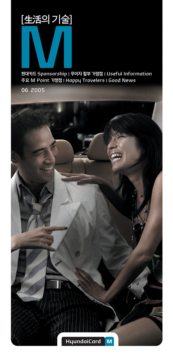
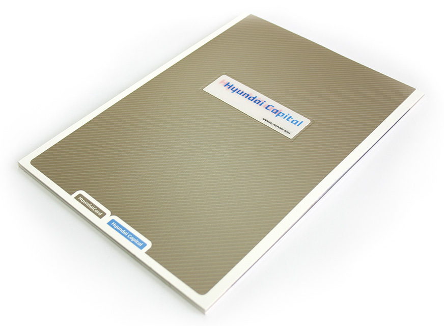
HyundaiCard, engaged in the credit card business, is one of South Korea’s conglomerates (chaebol), Hyundai Group, which includes Hyundai Motor, dealing in the automotive business, and Hyundai Capital dealing in financial products. HyundaiCard offers different benefits to match different customer lifestyles. The cards are named ‘Card M’, ‘Card S’, and so on, with the additional letter standing for a word that describes the nature of the services provided. For example, Card M is designed for car owners, and points are awarded in line with the amount spent when the holder has the car serviced, buys airline tickets, or makes purchases at member retail outlets. The points can be used when the holder uses services. Card S (shopping sponsor) offers the advantages of a 5% discount and car parking at the Hyundai Department Store, and is targeted at consumer groups who shop frequently. Card A (Asiana mileage card) offers benefits and mileage points to Asiana Airlines customers. The company made news when it released the Black Card in a limited issue of 9,999 for those in the upper-income bracket.
By providing cards and services to suit the customer’s individual character and lifestyle, together with the value that only HyundaiCard can offer, it helps the customer enjoy life by selecting a card based on their need. This represents the brand value of HyundaiCard.
As of 2006, HyundaiCard’s domestic credit card market share (based on percentage of credit cards issued) is 12%. The aim is to expand this share to 15% in order to capture the number one position in the industry. Only three years ago in 2003, HyundaiCard’s market share was a mere 2%. The company achieved rapid growth in this short period, but there was a time when it was considered part of the ‘corporate baggage’ of its parent company, the Hyundai Motor Group.
Three years ago, South Korea’s credit card industry was in a state of saturation, with 110 million cards in circulation among a working population of 22 million. This meant five cards for each working adult.
Moreover, the whole industry was uniform. The differentiating factors between credit cards such as credit limit, interest rate and point award rates were very similar for all credit card companies, and differentiation had even disappeared from the plastic card itself. The HyundaiCard of the time was no different, and all the credit cards it issued were either platinum or gold, with focus placed only on the interest rate. Quite simply, the HyundaiCard of those days had no personality.
When it came to promoting differentiation from other companies, the HyundaiCard was at a disadvantage compared to the Samsung card or the Shinhan card as it was felt to be distant from the customer. At the time in South Korea, the Samsung card and the LG card were affiliated to major manufacturers and had an air of approachability and familiarity to the customer. The Shinhan card and the KB (Kookmin Bank) card, meanwhile, as products associated with banks, had an image of reliability. In contrast, as the name Hyundai in South Korea has had strong associations with the construction and manufacturing industry for 50 years, there was a feeling that it was not suited to finance and would find it hard to compete in the credit card business.
Against this background, HyundaiCard needed to create a brand with a clearly defined personality.
Low prices and good quality alone were not enough to differentiate it from other companies and did not constitute a reason for selecting the HyundaiCard. Only when the brand image was linked with the product, would the product be chosen. In order to build a strong brand, it was an urgent task to establish a brand personality by creating a distinctive tone and manner.
HyundaiCard held on to the Hyundai name with its high degree of recognition at home and overseas and its image of reliability in connection with the South Korean conglomerate, while at the same time adopting a policy of aiming for top-class quality and emphasising design. It was decided that the power of design would be used to promote its visual recognition as the HyundaiCard and attachment to the brand. In addition to using design as a strategy, the operational aspect including finance was seen as forming part of the brand, and the corporate body itself was subjected to progressive surgery.
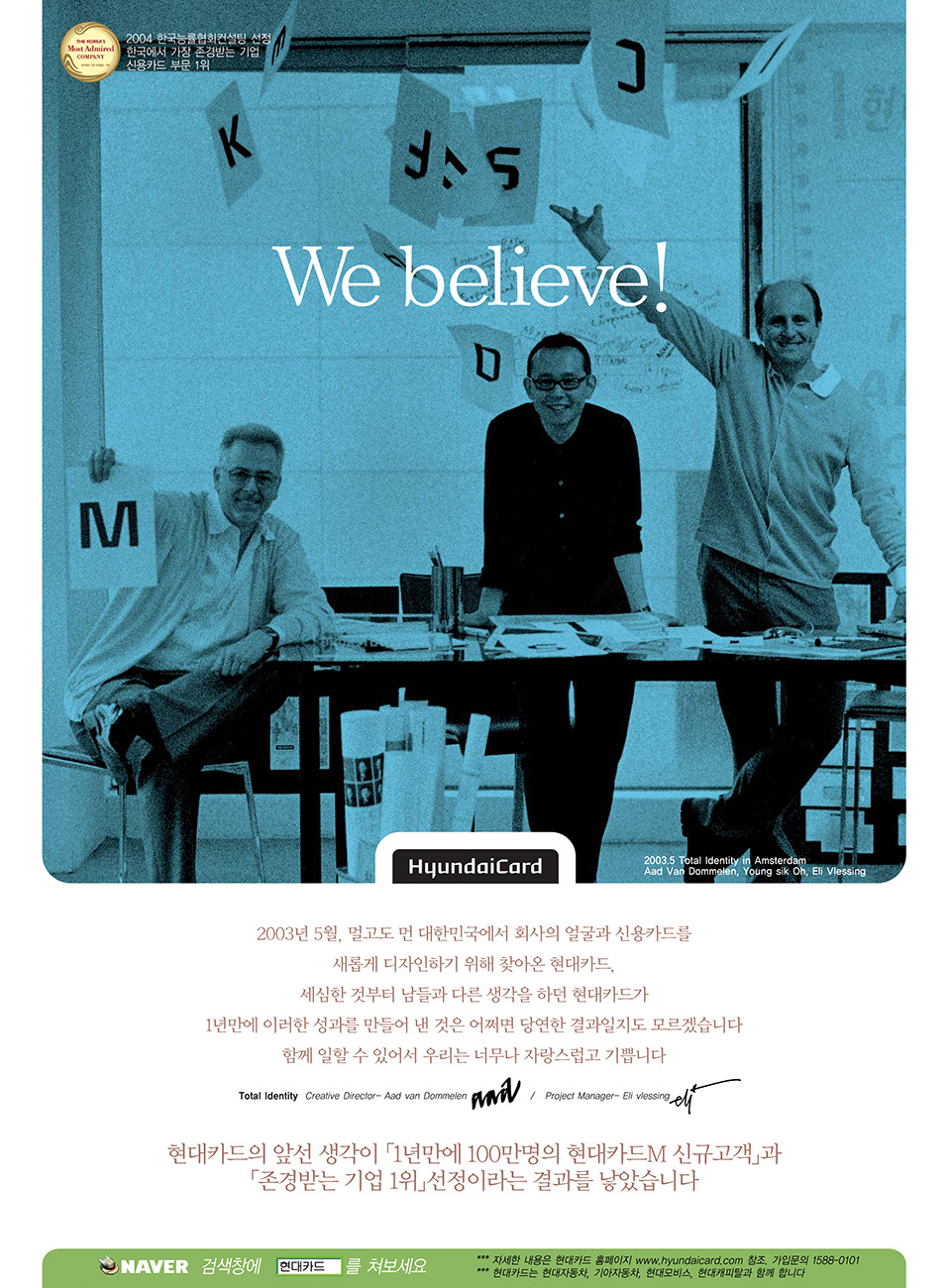
By creating a powerful brand, the aim was to win the position of number one in the industry. This branding project was carried out under the leadership of Total Identity, the headquarters of which is in the Netherlands.
First of all, HyundaiCard created a new corporate identity consisting of a new company logotype and typeface, while a tone and manner was worked out and reflected in its Finance/Brand Shops, credit cards, posters and television commercials.
In order to build a brand with a true personality, the company realised that it was necessary to undertake organisational reform, along with the renewal of design through introduction of a new CI programme. This meant that the mindset of individual employees, the way work was approached on a daily basis, the style of meetings, down to the interior décor of Finance/Brand Shops and offices, all had to be given the same personality, and all had to change.
One aspect of the HyundaiCard brand personality is innovation. In order to become innovative, the HyundaiCard CEO M. Chung apparently started the change beginning with small things. For instance, the company president spontaneously communicated to employees the idea that a friendly and informal atmosphere was appropriate, for instance by telling them that they did not need to wear a jacket to meet him, or that they could contact him by telephone or e-mail when they were pressed for time. Likewise, in a very unusual departure for a country like South Korea, which is very concerned with rank and status, it was decided that staff could sit wherever they liked in meetings instead of observing the usual seating order based on rank. Meanwhile, the head office canteen was decorated with photographs of employees, including the company president, in amusing and different guises to create a bright and enjoyable workplace environment. All of this was part of a reform designed to banish the old company atmosphere and create an innovative corporate ethos which would encourage the free expression of ideas.
Unique initiatives were also introduced in the area of recruitment. In South Korea, card company personnel are drawn largely from the financial industry, but HyundaiCard recruited actively from a range of backgrounds. It adopted a policy of recruiting 50% of its employees from other industries, instead of 100% from a financial background as before. Organisational changes have also been made, including inviting the former director of a design college to join the board and establishing a new marketing department.
In customer service at Finance/Brand Shops and on the telephone, which are the direct points of contact with the customer, in office consultations and all other work scenarios, each and every employee and member of the management at HyundaiCard, embodies the brand. This idea is expressed in the things that the CEO M. Chung has said about the brand.
“Brand is a form of self-expression. Brand value is something that can be felt physically. There is no need to put it into specific words. Our day-to-day work is what HyundaiCard is. When I meet someone, it is important to feel something from that person and how that person feels about me. When we meet or talk with people, if we do not believe what they say or do not feel anything, there is no point.”
HyundaiCard, which only a few years ago was at a disadvantage in the industry, has achieved tremendous growth. This has been brought about by undertaking reform in design, management and all other areas, and by each and every member of the management and employee teams embodying the brand, thereby succeeding in building a strong brand.
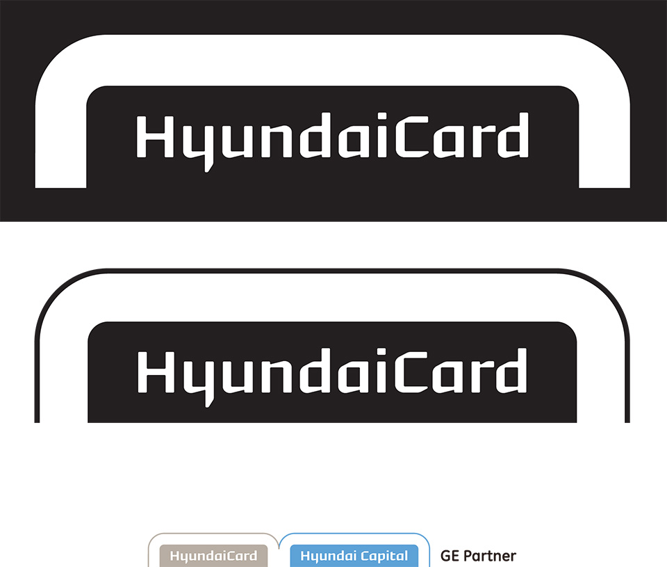
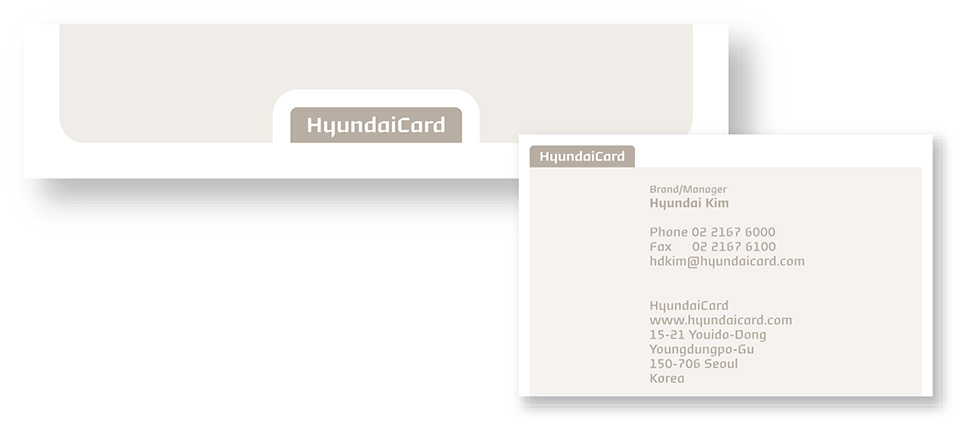
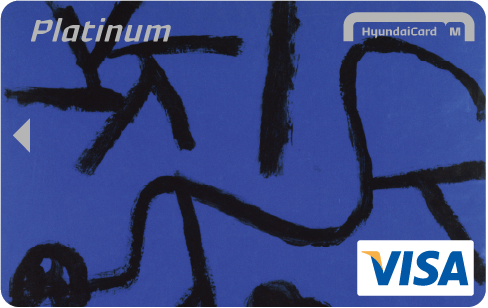
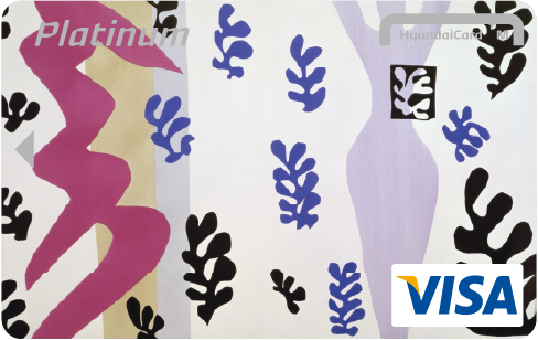
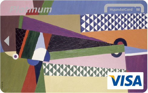
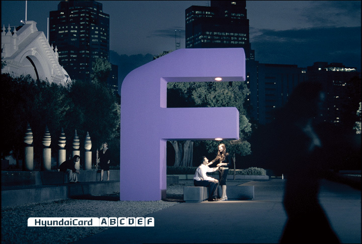
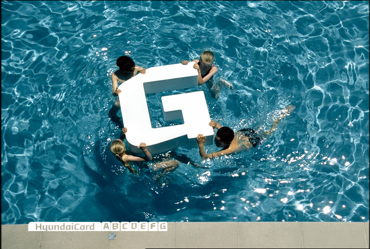
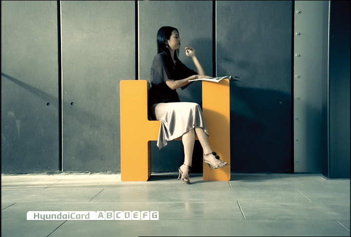
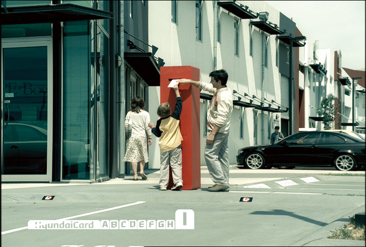
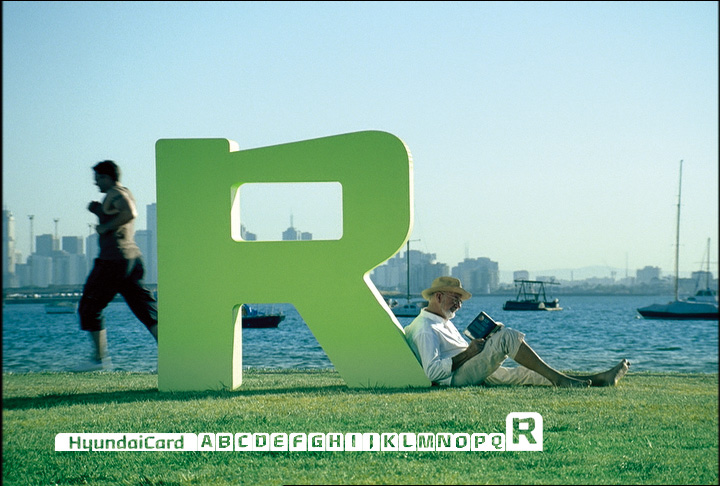
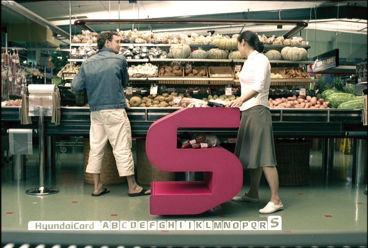
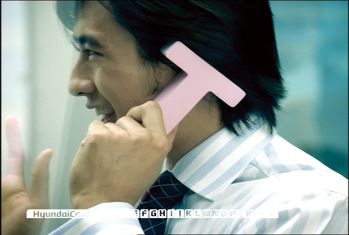
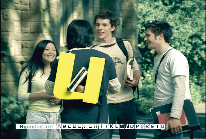
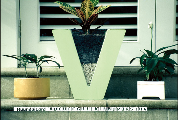
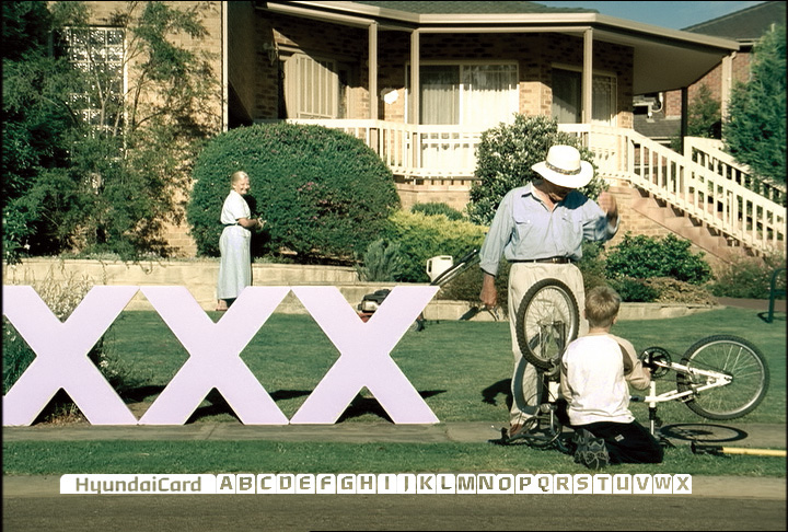
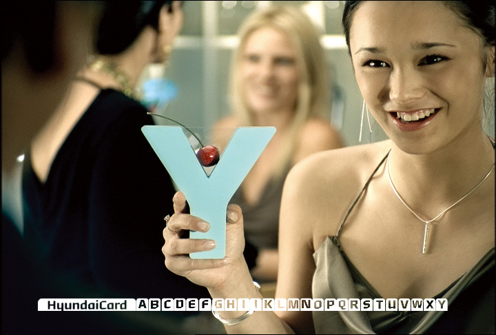
In developing HyundaiCard’s new logotype, various options were explored; to use the symbol or logotype of the parent company Hyundai Motor, one of the best-known names in South Korea with global recognition, or to have no association with them at all. The result was that the Hyundai name of the parent company was retained as the company name, but the symbol was not, while the HyundaiCard company name was to be displayed in the Roman alphabet only. Behind this, lay the aim to eliminate the conventional HyundaiCard image enhanced by the name Hyundai immediately associated with cars, i.e. the card that is beneficial to car owners only, in order to capture a new diverse clientele including non-drivers. Furthermore, to strengthen establishment of the identity, a unique typeface was developed. The logotype, designed in this typeface appears either alone or in combination with an index format.
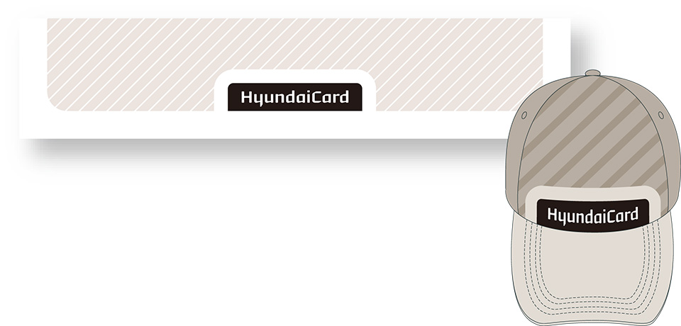
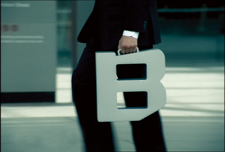
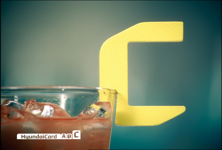
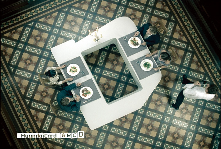
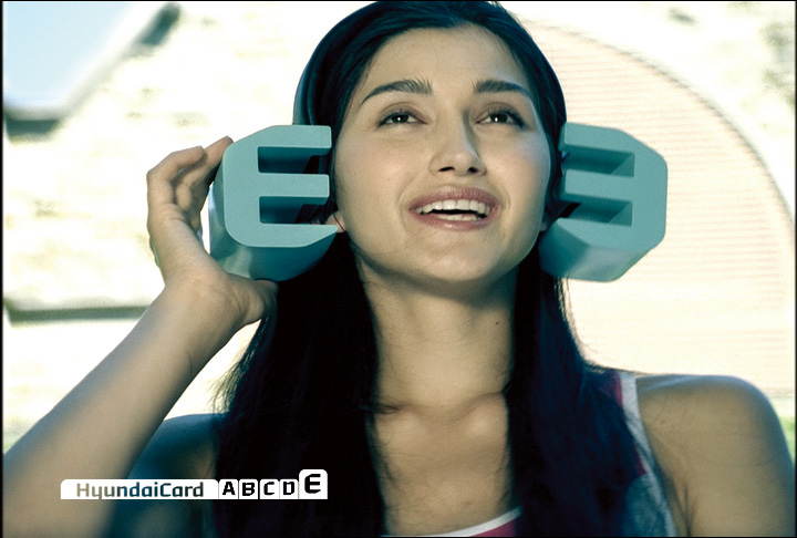
For instance, when the logotype appears in a corporate context (Corporate), it is combined with a grey index bar; when as a brandname, for example on promotional merchandise (Brand), it is seen with a black index bar; and when used as a product brand (Brand Extension), it is used in combination with the letter of the alphabet indicating the card type.
Display of the company name using the ‘H’ from inside the Hyundai Motor oval symbol and a typeface developed from it

HyundaiCard company name only

Design completely unconnected with Hyundai Motor

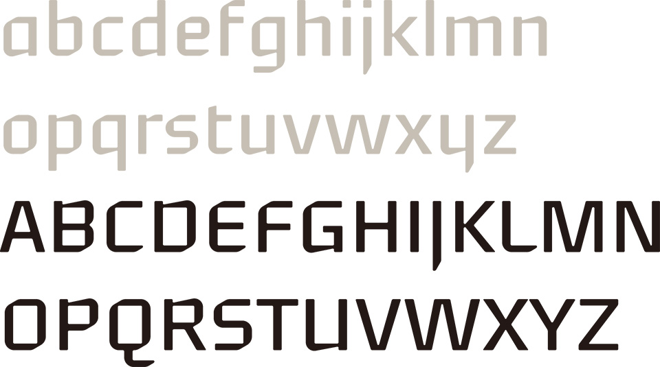
The original typeface ‘Youandi’ serves as the core of the new HyundaiCard’s identity. The name derived from ‘you and I, i.e. the customer and HyundaiCard’, which represents HyundaiCard’s stance that it conveys a message to each and every customer. A fitting anecdote is that when a Dutch member of the development staff pronounced Hyundai in Korean, it sounded like ‘You and I’. This may also be the reason for selecting the name.
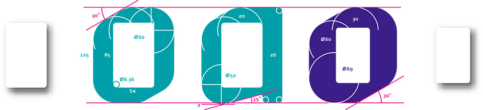
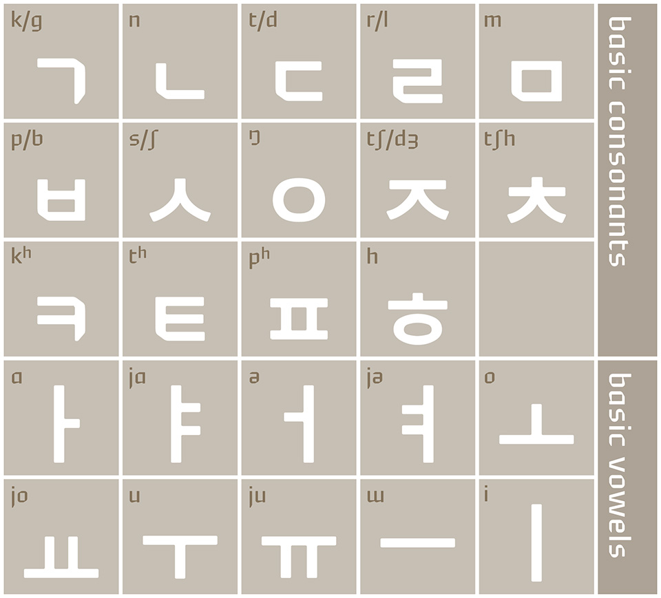
The typeface is designed in a unique form; the counters (inner white spaces) of the letters of the Roman typeface are drawn in the same proportion as the shape of the credit card. The rounded outer edges of the letters follow the same curve as the rounded corners of the card. After development of the design of the Roman typeface, around 10,000 Korean script syllabics consisting of 24 basic letters were developed over a period of half a year.
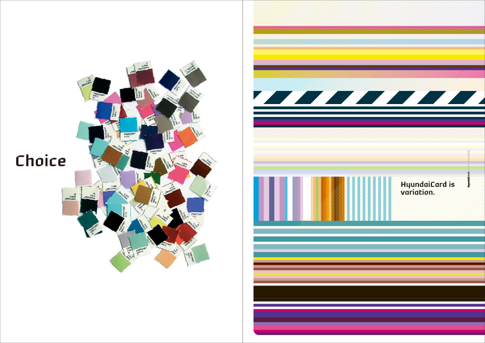
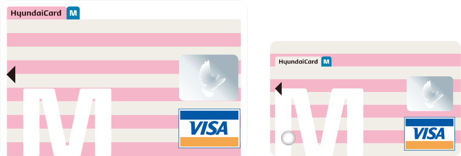
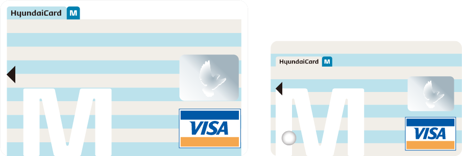
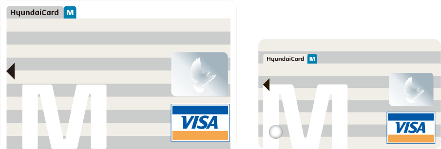
Apart from the original typeface, the basic elements that express the HyundaiCard personality include various colours and a series of stripes executed through a combination of such colours.

“The Look and Feel Guide” is a booklet which puts together in words and images the required profile of the HyundaiCard. It was created to allow all the people involved in its design to understand the HyundaiCard expression. It is not a design rulebook but rather a source of inspiration. Workshops for the staff involved are also organised, which not only convey the technical aspects of design expression, but are also a tool for communicating the goals of the HyundaiCard.
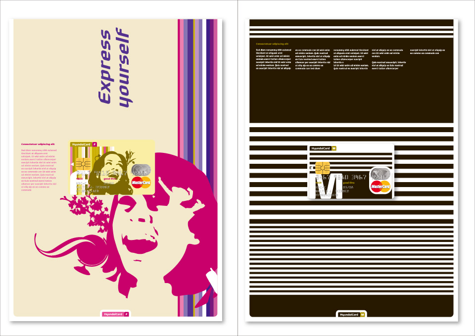
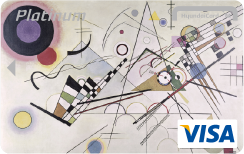
To accompany the introduction of the new corporate identity in January 2004, a new series of credit card designs was introduced incorporating the new logotype and a set of stripe designs which are one of the basic elements. Then, in March 2006, a third phase in the design progression was unveiled with the appearance of a new motif inspired by a Swiss banknote. The card comes in normal and small sizes.
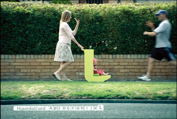
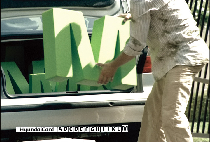
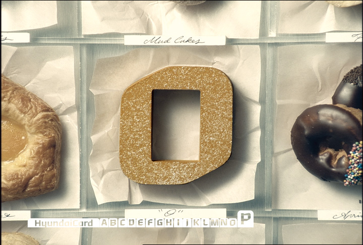
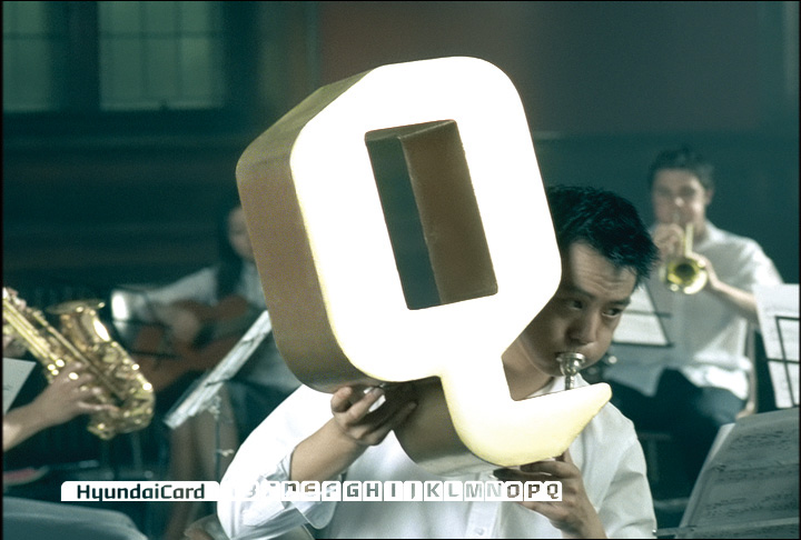
In January, 2004, HyundaiCard launched a striking TV commercial focused on the 26 letters of its Roman alphabet. Extensive use of its futuristic and unique typeface ‘Youandi’, which can be said to represent HyundaiCard’s new corporate identity, successfully promoted the originality of the card.


The printed media of HyundaiCard shows the extension and implementation of the corporate identity for the various communication channels. Advertising design is produced that is relevant to the target customer group, and its content varies in each case, while consistently reflecting the corporate identity. The design of the annual report is developed based on a different theme every year.
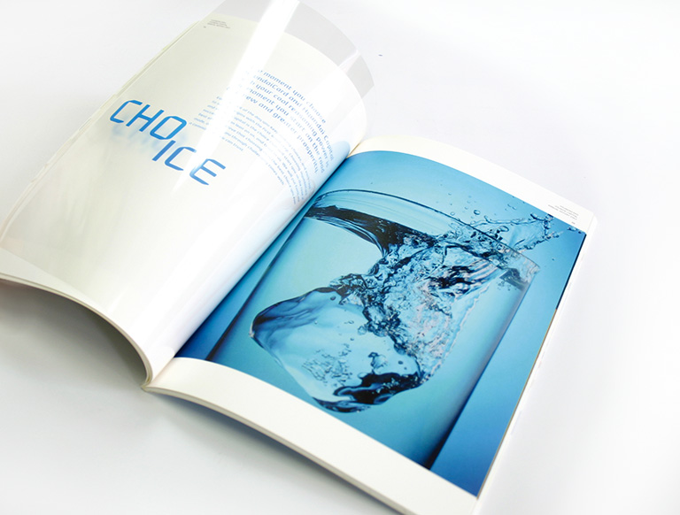
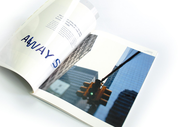
HyundaiCard is known for its visionary approach to design and communication. It is an entity that takes full account of its corporate identity, by creating consistently high quality design and communication, and has really enhanced its image in the Korean market, in a relatively short time.
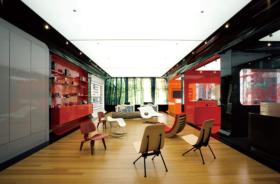
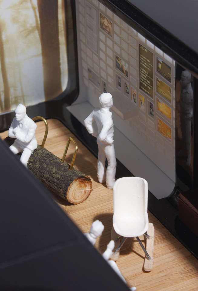
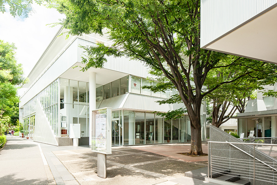
The company is also fully aware that its vision regarding this requires new energy and ideas on a constant basis. This is how it came up with the concept of creating actual, physical places where people can see, feel and experience the essence of the HyundaiCard brand.
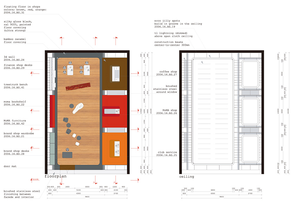
Both the Finance Shop and Brand Shop were designed based on the idea of creating spaces that show the corporate identities of HyundaiCard and Hyundai Capital in three dimensions.
Total Identity managed this project and introduced Concrete, one of the most sought after Dutch architectural designers for this task, and with the collaboration of the two companies, the three dimensional identity was formed.
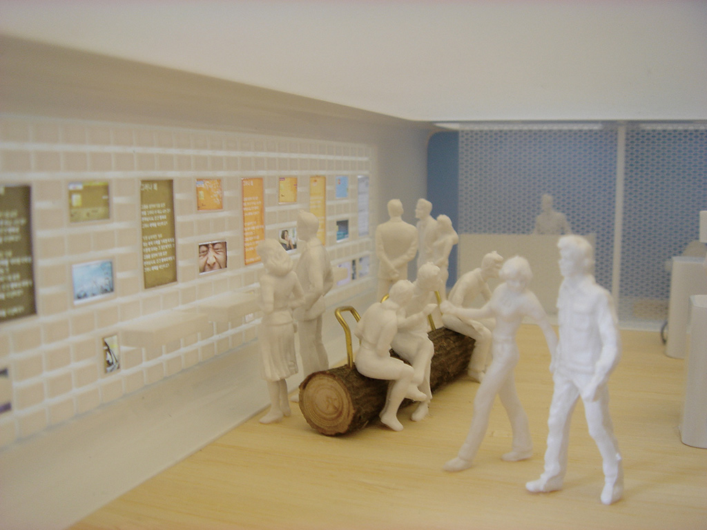
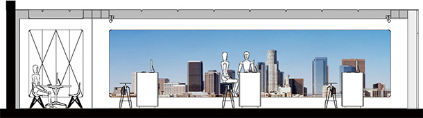
With focus on the Hyundai Capital product portfolio (car finance and lease, insurance, personal loan and mortgage) but with ample space given to the HyundaiCard credit cards, the Finance Shop concept was created. It was planned to be as open and transparant as possible, and was situated in the busy shopping districts of Seoul and other Korean cities. Unlike usual financial products, with their complicated and unfamiliar image, all Hyundai Capital products, having user-friendly instructions, are presented in a readily accessible display.
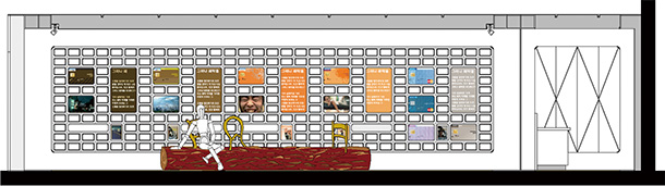
For the Brand Shop, the focus was clearly on the HyundaiCard products but even more on the HyundaiCard brand experience. For example, inside the Brand Shop there are areas reserved for browsing through the collection of the Museum of Modern Art, New York (MoMa), a specialised Coffee shop and other activities that have in common the fact that they all fit the atmosphere and values of HyundaiCard. The location therefore was selected with such experience, rather than commercial activities in mind.

Request Information

現在、ブラウザの拡大・縮小機能を利用中です。
アクサムのサイトエクスペリエンスのために、拡大・縮小をオフにすることをおすすめします。
×