Branding paradigm

12

au

Achieving the Highest Net Market Share Growth through Branding

Pictures from WorldBranding

In the summer of 2000, Japan’s mobile phone market was divided between NTT DoCoMo — the former state-owned incumbent — and several new entrants. It was during this period that three domestic telecommunications companies merged to form au.
Initially struggling to gain traction, au redefined its brand promise and launched a series of distinctive product lines through its own in-house design initiatives. Alongside this, the company undertook a comprehensive overhaul of its service offering, pricing structure, and retail channels.
As a result, au rapidly gained favour among consumers and now leads the market with the highest net increase in brand preference and market share, significantly outpacing NTT DoCoMo.

a.

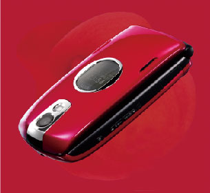
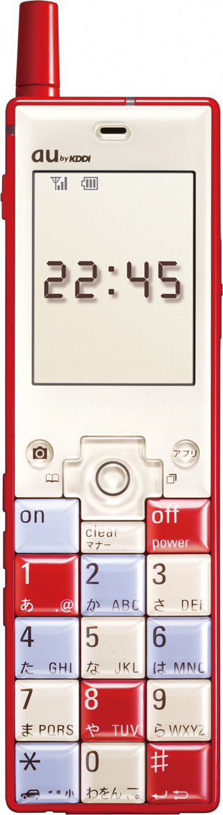
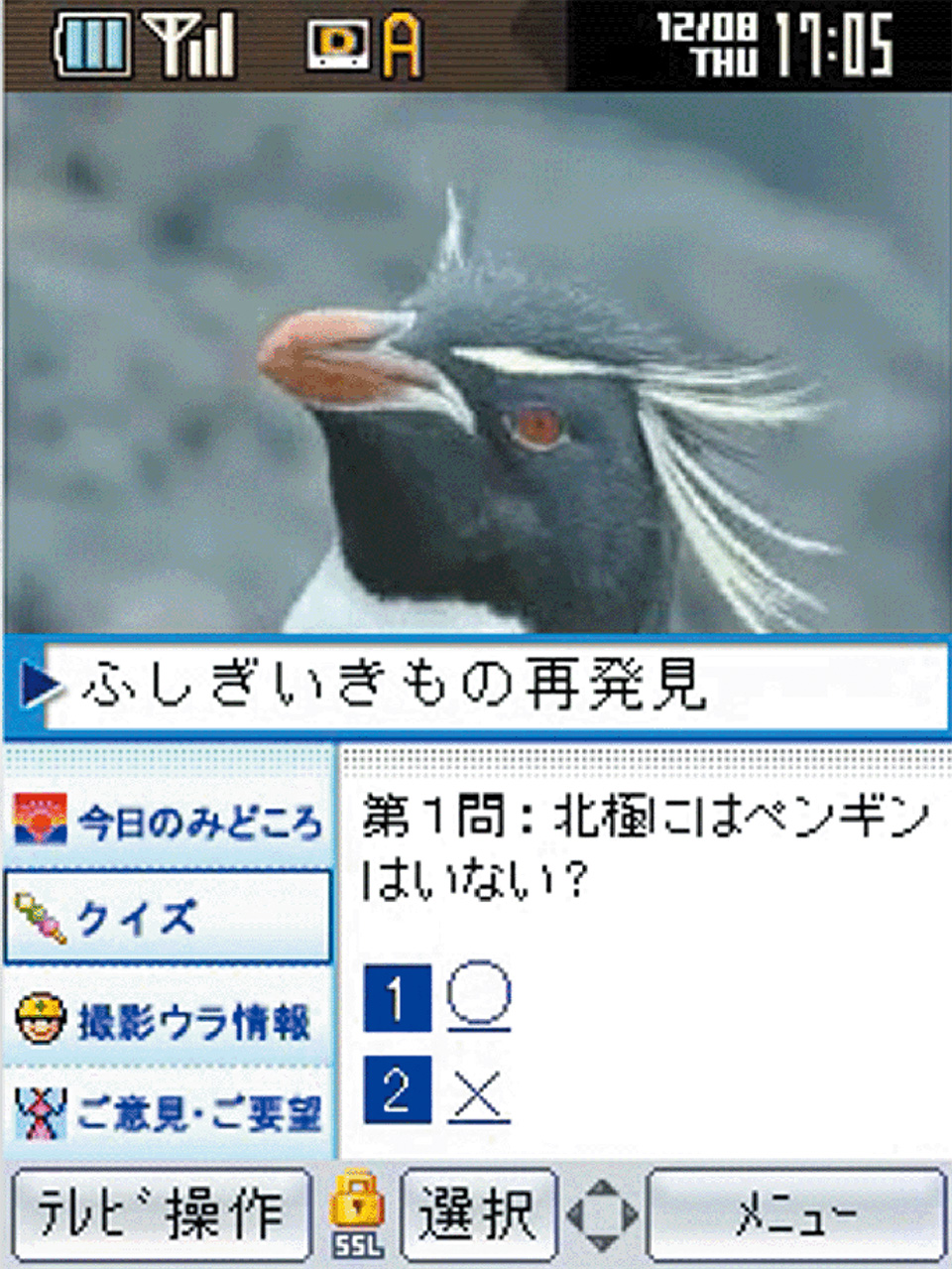
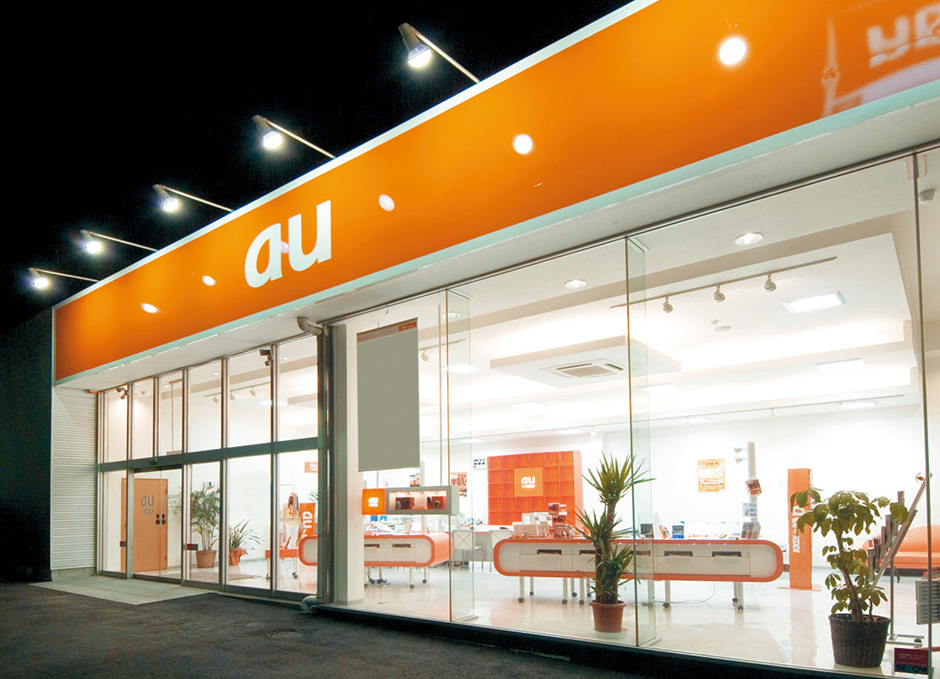
Creation of the mobile phone brand ‘au’

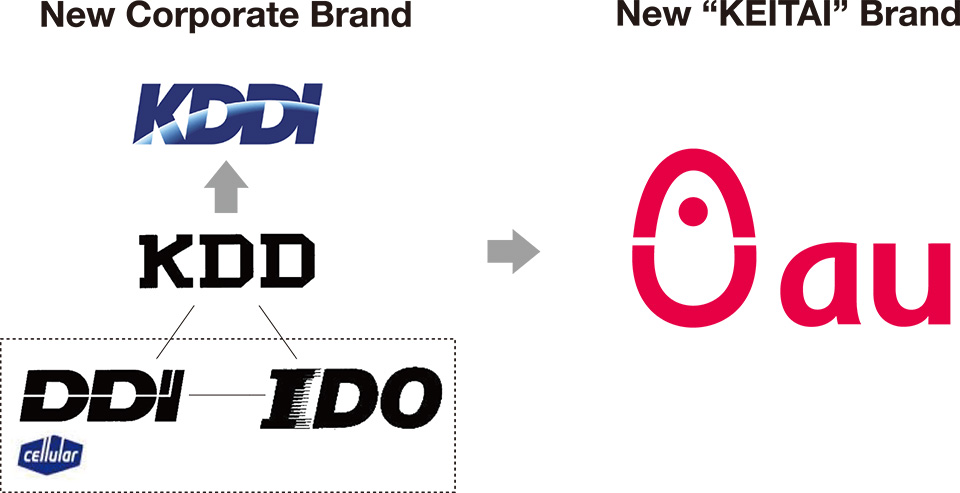
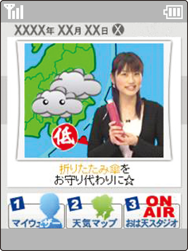
In Japan, mobile phones are an indispensable tool for both work and social life, and the cumulative number of contracts as of November 2006 was around 95 million. When the age group that does not use such phones is subtracted, this represents more than one telephone per person. The mobile phone however was introduced only two decades ago when NTT launched a fully fledged service in 1987 that had evolved from the car phone. In 1988, the Toyota affiliated IDO Corporation established a service and was followed in 1989 by the Kyocera affiliated Cellular group companies (DDI group), bringing a wave of animation to the market. Subsequently, triggered by introduction of the independent sale of handsets in 1994, entry into the market of the Digital Phone, Tu-Ka Digital Phone, and Tu-Ka group companies caused purchase price and monthly charges to drop at a stroke. In a field bristling with competition, all companies had a hard time securing market share, and for a time the only horse in the race was NTT, which attracted customers simply because the public trusted the name. A new development came in 1999 with the merger under the J-PHONE brand, of Digital Phone and Tu-Ka Digital Phone, which had suffered poor business performance. In July 2000, ‘au’ was created as a brand bringing together IDO and the Cellular group companies. The market now entered its current four-brand phase, the other three being NTT DoCoMo, which had already spun off from NTT; Vodafone, the successor brand to J-PHONE; and TU-KA.

‘au’ in the doldrums

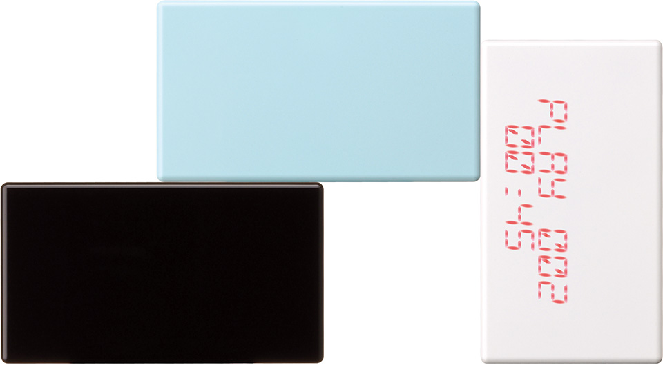
Despite such a new start, ‘au’ recorded a net decrease and right away was faced with a struggle. At the time, the main focus of mobile phone competition was shifting from ‘voice services’ to ‘data services’, and the emotional experience provided by such phones had come to be emphasized. Unable to respond to these trends, ‘au’ had not introduced the products and services that users wanted. ‘Their commercials are fun but their products are too tense’ was a frequent comment. The gap between the image portrayed in advertisements and the actual products also became a problem. As for brand image, while DoCoMo enjoyed a reputation for reliability and J-PHONE benefited from a fashionable image, ‘au’ lacked appealing products and services; introducing a student discount under these circumstances meant that it ended up with the image of a low-priced and low-quality service for students.

’au’ recovery scenario

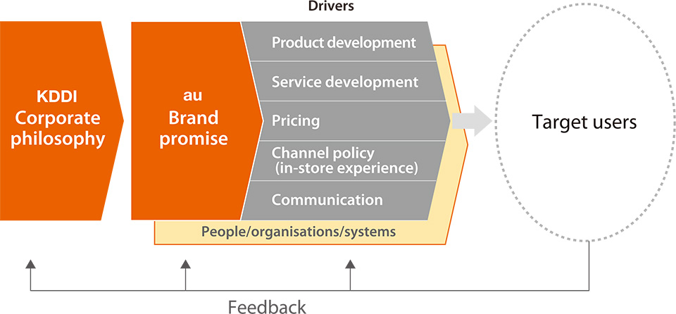
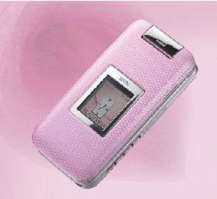
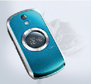
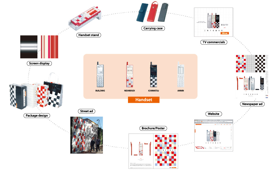
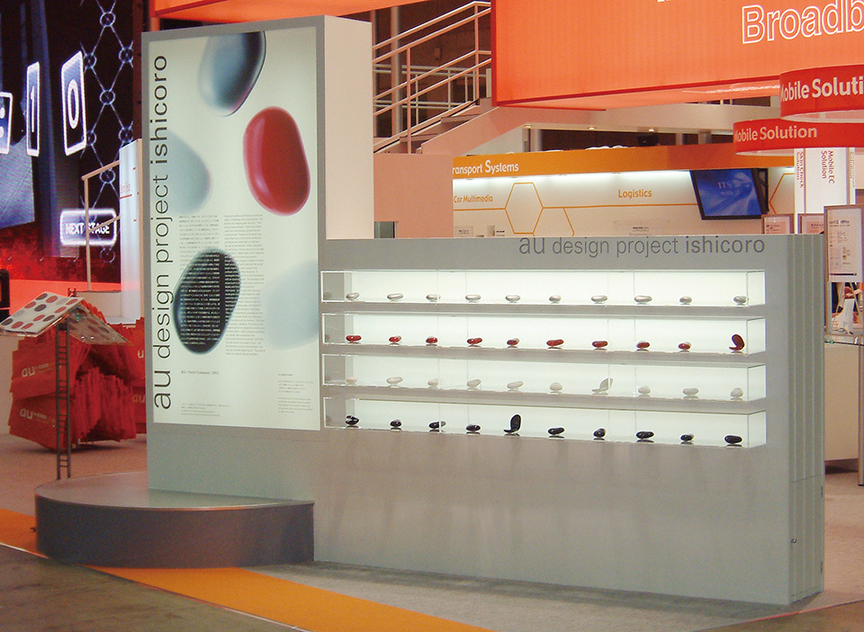
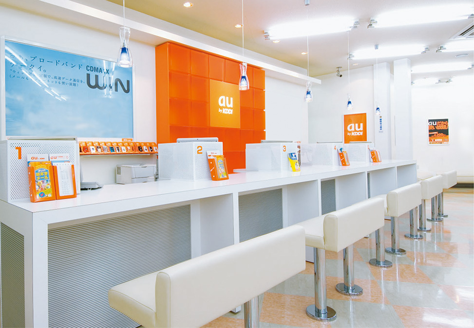
In order to respond with a clear statement of brand value, the target core users were defined as ‘people who already use a mobile phone in their daily routine and want to make their lives richer and more individual’. The value, personality, and brand promise offered by ‘au’ were codified. Additionally, a five-year period was divided into three phases with goals and key strategies formulated as part of the definition of the ‘au’ brand. In concrete terms, building on the foundation that a telecommunications corporation and business enterprise needed to provide as a matter of course (e.g. a stable telecommunications environment, congenial service at retail outlets, products and services that meet user needs), it began to radiate to users a unified ‘au-ness’ by offering something extra. This meant being the first to offer new and unique products and services. By improving its image among users, regardless of whether they had an ‘au’ mobile phone, the company attempted to develop into a corporation seen as having potential. Also, by offering value specific to ‘au’, it made efforts to differentiate itself from other companies and formulated a scenario of superiority through overall brand strength. The ‘au’ brand was vigorously promoted as a combination of all these elements.
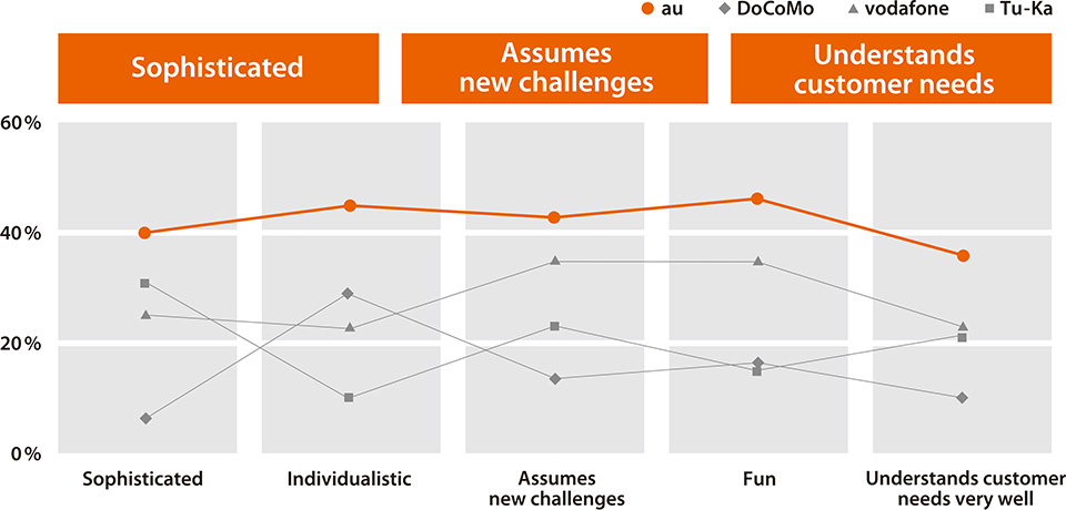
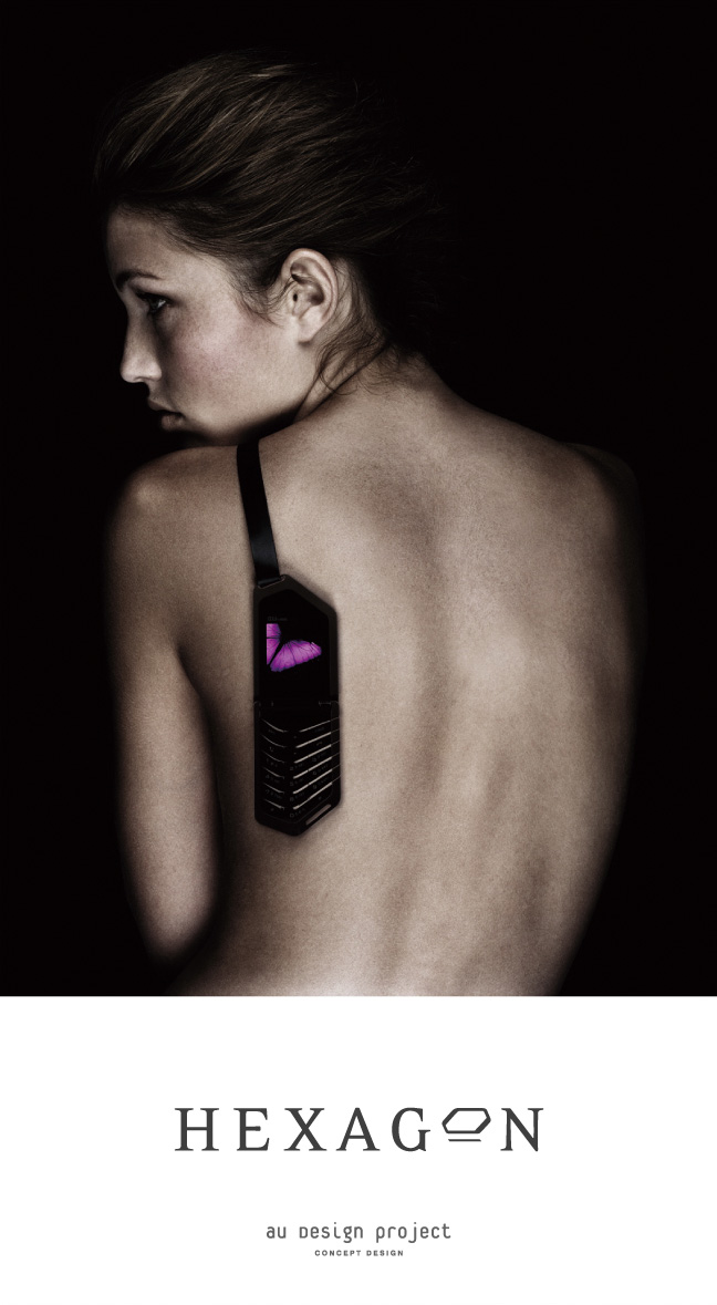
’au’ brand growth

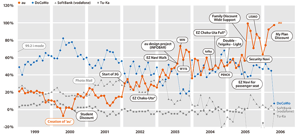
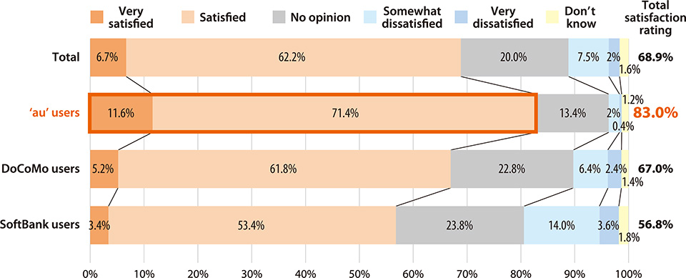
Following launch of a clear statement concerning the ‘au’ brand identity, in addition to design strategies to enhance brand strength, a series of strategies on the service and pricing fronts were also rolled out. These bore fruit, and ‘au’, which at one point had been relegated by the impact of J-PHONE’s photo mail service to number three in the industry, gradually began to win back popularity from the end of 2001. In 2006, NTT DoCoMo continues to boast the greatest cumulative market share, but in terms of net increase, ‘au’ is top for the third year running and has won a rating as ‘the mobile phone company with the highest level of customer satisfaction’. In October 2006, Japan introduced a number portability system which allows users to switch mobile phone company without changing their number. ‘au’, born through the merger of private enterprises, sees this as a chance to make a major stride forward. Determined to consistently move faster than NTT’s DoCoMo, once a public corporation, it is striving to build an independent and strong brand position.

Creation of ‘au’ through three-way merger

In 2000, the merger of three Japanese telecommunications companies (KDD, DDI and IDO) created a new mobile telecommunications business, which was given a brand title consisting of two letters of the Roman alphabet: ‘au’.
The letters ‘au’ are meant to stand for ‘access to you’ and ‘access to the universe’. (The Japanese pronunciation of ‘au’ means ‘to meet’.)

Basic framework for ‘au’ branding

‘au’ branding began with an analysis of the target users. Based on KDDI philosophy, a brand promise compatible with ‘au’ was promoted, which was delivered to customers through the various drivers (product development, service development, pricing, etc.) and integrated across the whole company.

Share of net increase

Invigoration of its brand has allowed ‘au’ to outstrip NTT DoCoMo, which had dominated the market, and has led to consistently improving user expectations.

(Up to June 2000, figures indicate the combined total for IDO and DDI Cellular Phone. This shows that they were facing a sharp fall in the number of subscribers.)
b.

Handset design as part of brand experience

The brand strategy of ‘au’, which took design pro­jects as its starting point, began with the task of rethinking the mobile phone from the design perspective, to embody the undefined image of the mobile phone which people have in mind. Design was thus placed at the core of its brand-building efforts. This meant a withdrawal from simple technology and price competition. The strategies were broadly divided into two lines of development: regular product design and concept design.

Regular product design management

Until then, regular product design had been in the hands of the in-house designers of mobile phone manufacturers, and it had become hard to discern such a thing as an ‘au’ design. To remedy this situation, it was decided to appoint a design director with the role of overseeing the whole product lineup. Rather than accepting design proposals from the manufacturer, ‘au’ would now present design strategies of its own while being involved in design production and management.

Design project as branding

また、2001年3月にはauが目指す携帯電話のデザイン指標として、外部デザイナーによるコンセプトデザインの開発に着手した。コンセプトデザインとは聞こえのよい抽象的な言葉やスローガンではなく、コンセプトモデルという具体的なカタチで「au」ブランドが目指すもの、さらにはKDDIブランドが目指す方向性を対外的にだけではなく社員にも提示し、ベクトルを揃えていくためのものであった。さらに、「auブランドとは何かを具体的に示すためのツール」としての役割も担っていた。そしてテーマは「シンプル&モダン」と「クオリティ&ユーモア」が選ばれた。

‘au’ brand aspirations

Making my life enjoyable, rich and exciting, while bringing out individuality

‘Excitement in Mobile Phones’

Regular products

(design by handset manufacturer)

Design project products

(design by ‘au’)

Design concept:
simple/modern and quality/humour

Benefits of design project

INFOBAR, launched in 2003 created a great sensation not only among general consumers, but also in the design industry. The ‘au’ image was improved at a stroke and the company began to receive evaluations superior to other companies such as; ‘assumes new challenges’, ‘is individualistic’ and ‘understands customer needs’. Recently, it has also been frequently described as ‘innovative’ ‘up to the moment’ ‘stylish’ and so on, and in a survey carried out by the design journal ‘AXIS’ on the subject of ‘corporations and brands considered to have strong design’, ‘au’ was named in seventh position among Japanese enterprises behind corporations such as Sony and Muji. Also, in a survey of user satisfaction with handsets, the company was first by a clear lead.

Design and branding

INFOBAR won customer perception as ‘different’.

KDDI survey: April 2004

Evaluation of ‘au’ design featured in ‘AXIS’

Corporations and brands considered to have strong design

1st Apple Computer Apple Computer (153)
2nd Sony Sony (13)
3rd Bang & Olufsen Bang & Olufsen (57)
4th Muji Muji (36)
5th Nissan Nissan (27)
6th Nike Nike (22)
7th au/KDDI au/KDDI (20)
7th Honda Honda (20)
7th Shiseido Shiseido (20)

Axis Inc. survey: June - July 2004

Handset satisfaction rating

Overall degree of satisfaction with handset was 83% for ‘au’, the highest of all three providers.

KDDI survey: April 2004
c.

Design Project

Mobile phone as fashion item

After carrying out various surveys to explore the reasons for lack of business growth, the recognition crystallized that ‘users do not see the mobile phone as a piece of electronic equipment but as a fashion item’. As life becomes more affluent, consumers seek ‘experiences’ that stimulate the senses, rather than outstanding functions and performance. This is borne out by the worldwide design boom in interior décor and household electric appliances. The mobile phone is not merely a device that provides a network service, but is the most important touchpoint with the user, and its design has become the public face of the mobile phone brand. Despite such market demand for mobile phones with interesting design, ‘au’ design had a very poor reputation. As a result, design and branding were identified as essential aspects for the improvement of business performance.

Designing products that consumers ‘want right now’

In the development of concept design, emphasis was placed on two elements: “concrete representation of the concept which ‘au’ pursues” and ”employment of leading designers”. The design was commissioned to Naoto Fukasawa, who at the time was Head of IDEO Japan, and Takashi Nikaido of Erg Design. The resulting creations were the futuristic and much talked-about designs of ‘INFOBAR’, ‘rotaly’ and ‘wearable’. These marked a departure from the models that looked like prototypes of next-generation mobile phones showing off new technology. In design terms, they aimed to make consumers ‘want one right now’. By demonstrating clearly to the manufacturer the look ‘au’ was aiming for, they were also intended to function as design indicators for the product lineup.

INFOBAR prototype design

Photo: Hidetoyo Sasaki

INFOBAR design ideation

INFOBAR NISHIKIGOI graphics pattern
Nishikigoi means ‘coloured carp’ in Japanese

INFOBAR NISHIKIGOI product design

INFOBAR promotion at trade fairs and on the street

INFOBAR horizontal design rollout

INFOBAR, launched as a prototype in 2001, won tremendous acclaim, and was released for general sale in 2003. Advertising activity employed unprecedented methods. In addition to display events and mass media such as TV commercials, newspapers, magazines, and the web, an integrated image was presented throughout a range of touchpoints from package design and handset stands to street posters and leaflets. Normally, a separate promotion is rolled out for each medium conveying a separate message, but in the case of INFOBAR, the media were integrated, so that whichever of the tools the consumer was exposed to, the same information and image was conveyed, thereby succeeding in building a consistent worldview. This enabled very powerful promotion of the brand, effectively improving brand strength. Also, by giving feedback on the very positive public evaluation of INFOBAR, employee morale was boosted and the in-house climate invigorated.

talby (launched in 2004)

Simple, clean and modern. While talby has all the features which make people who see it want it, there are no superfluous extras. The unique superflat design by world-class designer Marc Newson is ultra-slim and ideal for slipping into the pocket or hanging round the neck. Distinctive for its very high-quality structure and technology, it has a rich feeling of solidity. The name talby derives from a character in one of his favourite science fiction films, Dark Star, directed by John Carpenter. “It’s a really crazy film, but very cool and laid-back with a great sense of humour that makes it lots of fun to watch” comments Newson; talby was the character he had always been searching for. The product shows unique attention to both visual and sound design, and comes with a special neckstrap that fits through the large strap hole.

neon (launched in 2006)

“I approached the neon design not for its shape, but for the meaning of its very existence” says designer Naoto Fukasawa. The experimental feature of making the display appear on a blank surface, which would be impossible on an ordinary product, was very significant. The comment he made during the development that “it behaves and looks like neon” led to the product name. In terms of design, it is so simple and complete that it allows no further paring down; nevertheless, it is not a mere plain rectangle, but is worked into a friendly and gentle shape in the image of a building block. Contributing factors in this are the right amount of radius on the corners, and the shiny colours with the sheen and quality feel of ceramic. Not only the design has received close attention; the product is also distinguished by its very high-performance. The design – envisaging times when it is placed on a desk at home to make an attractive clock, or hooked up to speakers as a music player – and the user-friendly tactile qualities belied by its flat-panel appearance, combine with other features to make this a new-era mobile phone created with consideration for the details of the everyday lives of its users.

ishicoro (launched in 2002)

In the creation of ishicoro, an actual stone was taken from a riverbed and its shape adopted. It was thought that, rather than using artificial lines to create a stone-like form, the non-uniform surface of an actual stone was more likely to encourage users to confirm its form by caressing it with their hand. When the telephone rings, the rectangular shape inside the stone glows simultaneously with an incoming ring tone. This rectangle, which traces the outline of the display panel and is the icon representing incoming and outgoing information, imprints a common memory in the user’s mind. With the shape itself lighting up as an interface that signifies the receipt of information, a more direct link is created. As until now this function was carried out by small LED lights or icon-like symbols on the display panel, there was always the conception that the container and components were separate. A stone in the pocket vibrates, a stone on a tabletop notepad lights up, an indication that information has been received. This is a design in which the object as a whole adapts itself to the behaviour of the environment and people. ishicoro has the appeal of making people want to touch it. The mobile phone likewise has the appeal of a communication tool which people have for a long time wanted. ishicoro tells us that the combination of these two is a new imperative.

Photo: Hidetoyo Sasaki
‘ishicoro’ means just a simple stone in Japanese.

wearable (launched in 2001)

You pick it up every few minutes during the day and when you go to bed you still leave it within reach. Especially among the young, there are more and more people who do not want to be away from their mobile phone for even a few minutes. Since that is the case, why not try to join people and their mobiles together as a unit? When a clue to answering this question was found in ornamental accessories, the result was the ‘wearable’. Message devices with a design based on bracelets and pendants, and pocket-type devices with large monitor screens, were the starting point. Worn casually like an accessory, they could be accessed with a natural unforced movement. With the user 24 hours a day, even the slightest sign of activity need not go unnoticed. This initiates a honeymoon period for people and mobile phones.

GRAPPA (launched in 2002)

On the mobile phone market, new models are constantly being released and disappearing, but the ‘au’ design project, unlike these fashion-driven phenomena, aims to create models which people will become attached to and use for long periods. GRAPPA, for instance, makes use of leather. This reportedly resulted from assuming the different textures and appearances which only leather can produce through mature use. For instance it may become shiny or worn according to the different ways people use it. This can be seen as a pleasure specific to leather products based on an element of sensual warmth that has been missing from mobile phones until now. In addition, the attractive chrome-plated design with its luxury feel, and hinge that allows it to open out flat, create a form of expression never seen before in flip-open mobile phones. With its uncompromising approach to key qualities such as status and elegance, this is a model which evokes a sense of attachment in the user.

MEDIA SKIN (launched 2005)

How much time do people spend in one day interacting with their mobile phone? Nowadays, the mobile phone may well be the closest device to the human body. Put your hand in your pocket and you will notice objects that leave a nice feeling on your palm: wallet, cardholder and car keys. Then there are also other things like the handgrip of a camera, or the interior trim of a car, or a bag, things which people touch many times throughout the day. We use these items, as soft and gentle as parts of our body, without thinking. When considering the shape of a mobile phone to achieve unity between human and object, the search began with the exploration of a second skin which would be close to the human body. Nowadays, in the medical field, the potential of materials like silicon, artificial skin, and gel is being explored. Within this context, the targeted design was one that would be intimately close to the human body like the skin but at the same time fashioned like a handgrip. With its people-friendly form that reflects an attractive aura onto the user and its feel of true quality, MEDIA SKIN succeeds in becoming one with the human body.

Hexagon (launched in 2005)

Precious stones that fascinate the beholder, sensual clothing and lingerie, perfume: these are things which cannot be explained in terms of functionality, things with a psychological effect, things which could be called ‘sensual traps’. In the same way, could there not be a mobile phone that has the same kind of effect as the magic that fascinates the opposite sex? Isn’t it time for a mobile phone with a sensual design that is an extension of a person’s expression of eroticism? In the future, technology will shift its direction from evolution through forward progress to evolution through depth, addressing the emotions internal to the individual. Originally a tool manufactured for communication, in order to come closer to human emotions, the mobile phone could well adopt a design with the strength to make the user forget that it is an industrial product. The mobile phone is already becoming a fashion item which one chooses by looking in the mirror to see whether its design suits.

d.

On the service provision (merchandising) front, ‘au’ continues to pay keen attention to the extent of people’s attachment to the mobile phone not merely as a communication tool, but as an item which adds fun and enrichment to everyday life. It is natural that the services which ‘au’ offered ahead of other companies are concentrated in the areas of music, images, games, navigation, and shopping. These include Japan’s first music distribution, delivery of various images including TV programmes, and a shopping service allowing people to buy things whenever they want using the special advantages of the mobile phone. These services are not isolated items but are created as part of the ‘au-ness’ based on the concept ‘Excitement in Mobile Phones’ and are coordinated with other services, the handset, and the user fee. Services that appeal to excitement i.e. emotion or the five senses mean fun games or convenient and reliable navigation. It is not merely a question of being convenient to use, but always explores the desired emotional reaction of the user. Based on trust and reliability and adding enjoyment, emotion and excitement, differentiation from other companies is achieved to create a brand that could only be ‘au’.

Advertising promotion for online music service "LISMO!"

Music

‘au’ sees the mobile phone as an emotional tool in everyday life and has launched LISMO, a comprehensive music service which for the first time in Japan seamlessly links mobile phones and PCs. LISMO stands for Listen Mobile Service (‘LIS’ is pronounced like the Japanese word for squirrel, ‘risu’). The service is explained in an easy-to-follow and impactful way through the use of a squirrel character.

EZ Chaku-Uta® / EZ Chaku-Uta Full®

In December 2002, the EZ Chaku-Uta® service was launched, which allows songs to be downloaded as a ringtone.

In November 2004, the EZ Chaku-Uta Full® service followed. This attracted attention as the first music download by mobile phone, and is now very popular as a service allowing users to download their favourite songs in full, and enjoy them anytime, anywhere in high sound quality.

LISMO!

This is a comprehensive music service launched in January 2006. Its varied range of music centred on Japanese pop can be downloaded onto a mobile phone or easily purchased by PC. Payment can be made together with the monthly mobile phone fee.

Image

This includes a service allowing the terrestrial digital broadcaster ‘1 Seg’ and current analogue broadcasts to be viewed anytime, anywhere by mobile phone; as well as a service providing regular automatic updates on a wide range of items including music, news, weather forecasts, entertainment, and shopping, giving users access to the latest information.

GPS-based navigation

Navi Walk, which allows users to locate their position on a map, is the first navigation service in the mobile phone industry, and is now available in a more realistic and easy to follow form, thanks to 3D navigation. EZ Navi for the passenger seat is a service that allows the occupant of the passenger seat to assist the driver, while Security Navi allows the location of children to be checked for purposes of safety and security.

Shopping

These services include the ‘au’ Shopping Mall which allows users to enjoy shopping with one hand anytime, anywhere, selecting from among a range of products, and ‘au’ Auctions, which provides a simple means of making bids, advertising items for auction, and sales, using nothing more than a mobile phone. Additionally, there are services for the purchase of books, CDs, games and tickets, as well as a travel booking service.

To allow customers to access music and image content, games and navigation services that ‘au’ offered ahead of other companies, without having to worry about fees, and to make people familiar with the ‘au’ worldview, the company has worked to introduce innovative pricing including the industry’s first fixed-fee system for data transmission.

‘au’ pricing is seen as an important brand driver acting as a motive for users to subscribe to and maintain a long-lasting loyalty to ‘au’.

The fixed-fee system launched in 2003 was in fact such a pricing that permits users to appreciate the service without worrying about cost. There are also fee plans uniquely typical of ‘au’, such as Indefinite - Period Carry Over which arose from an approach of always focusing on the customer, and auMy Home Discount made possible by its being a general telecommunications corporation. Meanwhile My Plan Discount was introduced as part of the concept of a ‘Family Discount even for singles’ to allow people who were attracted by ‘au’ but had subscribed to Family Discount schemes with other companies to experience ‘au’ without concern regarding cost.

At the same time, for the purpose of future development of service and related initiatives, ‘au’ faced the task of securing a certain level of profit. The approach chosen by ‘au’ was not to plunge the industry into price-cutting competition, which would leave the whole industry exhausted, but rather to establish healthy profitability based on a price structure acceptable to users, which would be more likely to encourage adventurous development of new services.

Discount services on basic fees and call fees

Indefinite - Period Carry Over
This service allows users to carry over with no time limit, any unused part of the monthly call fee, under their designated monthly fixed fee plan.
My Plan Discount
Users who commit to two years’ continuous subscription enjoy a 36.5% discount on the basic fee in the first year and 38.0% in the second. Customers subscribing for 10 years receive a 50% discount.
One - year Discounted Subscription
With a unit of one year for the contract period, a 15% discount is offered on the basic fee for the first year. The discount increases for each year of continued use to a maximum of 35% on the basic fee.
Family Discount
When members of a family use an ‘au’ mobile, there is a 25% discount on the basic fee. Calls between family members are subject to a 30% discount (or, combined with the Call Designation Discount, 60%). C-mail between family members is free of charge. Excess free-of-charge call credit can be shared among the family within the relevant month.
auMy Home Discount
When calling from an ‘au’ mobile phone to the home land-line phone via KDDI, there is a 50% discount.

Packet Discount

Double - Teigaku
This is a fixed charge system offering both e-mail and EZ web (internet service) from 2,000 yen a month each (2,100 yen including tax). No matter how often these are used, the maximum charge is 4,200 yen (4,410 yen including tax). Also available is the Double Flat Rates Light service starting at 1,000 yen a month (1,050 yen including tax).

’au’ shop design

Based on a theme of white, store design uses the brand colour orange to add accent. Even on a street with a jumbled profusion of bright colour, an ‘au’ store can be spotted immediately. At the same time as projecting an uncluttered image, the design succeeds in imparting an impression of brightness, vitality and fun, which makes people want to drop in and have a look. The store interior is frequently checked for cleanness, order, layout, welcoming feel and ‘au-ness’, with the aim of always maintaining a congenial store environment. In the case of moving (merger, restructuring or relocation), it is carried out while giving attention to users’ convenience in terms of their traffic lines.

‘au’ customer service

In-store customer service is based on a high level of knowledge in line with user requirements, together with service with a heartfelt smile. Customer service is designed to create a good impression, even for customers having a competitor’s phone. This is achieved through development of training manuals and relevant education, increase of store staff, and the assigning of floor advisors. To raise the motivation of store staff a system known as Smile!WIN is operated and enhancement of standards is promoted through Customer Service awards. In addition, staff are encouraged to attain qualifications with titles such as Professional Staff and Thoughtful Staff to reinforce their sales skills and their customer service abilities.

Smile!WIN

To bring a smile to the faces of customers who visit an ‘au’ store, importance is attached to having the staff welcome them with a heartfelt smile. To give a heartfelt smile, staff must have a high level of knowledge and service skills, and must themselves be fans of the ‘au’ product. The series of activities for conveying this to customers is called Smile!WIN.

現在、ブラウザの拡大・縮小機能を利用中です。
アクサムのサイトエクスペリエンスのために、拡大・縮小をオフにすることをおすすめします。

×