
proud statement of identity as a Scandinavian
airline company.
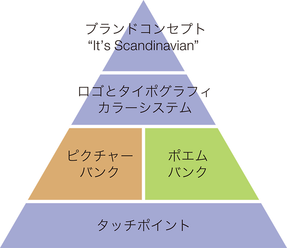
Branding paradigm
01
Pictures from WorldBranding
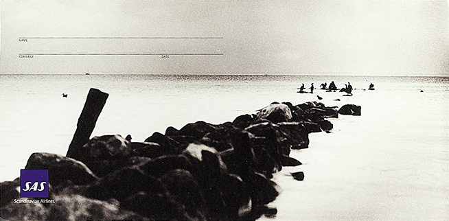
A long-established airline jointly operated by the three Scandinavian countries for over 60 years found itself facing severe financial difficulties amid intensifying market competition. In response, the company made a bold strategic shift, repositioning its target audience from business travellers to families and embarking on a comprehensive brand renewal.
At the heart of this renewal was the concept: “It’s a Scandinavian.” This entailed a redefinition of what truly embodies Scandinavian identity — reimagined from the perspective of future customers. That essence was found in thoughtful hospitality, Arne Jacobsen’s iconic chairs, culinary and musical culture, and the purity of Scandinavian water and air
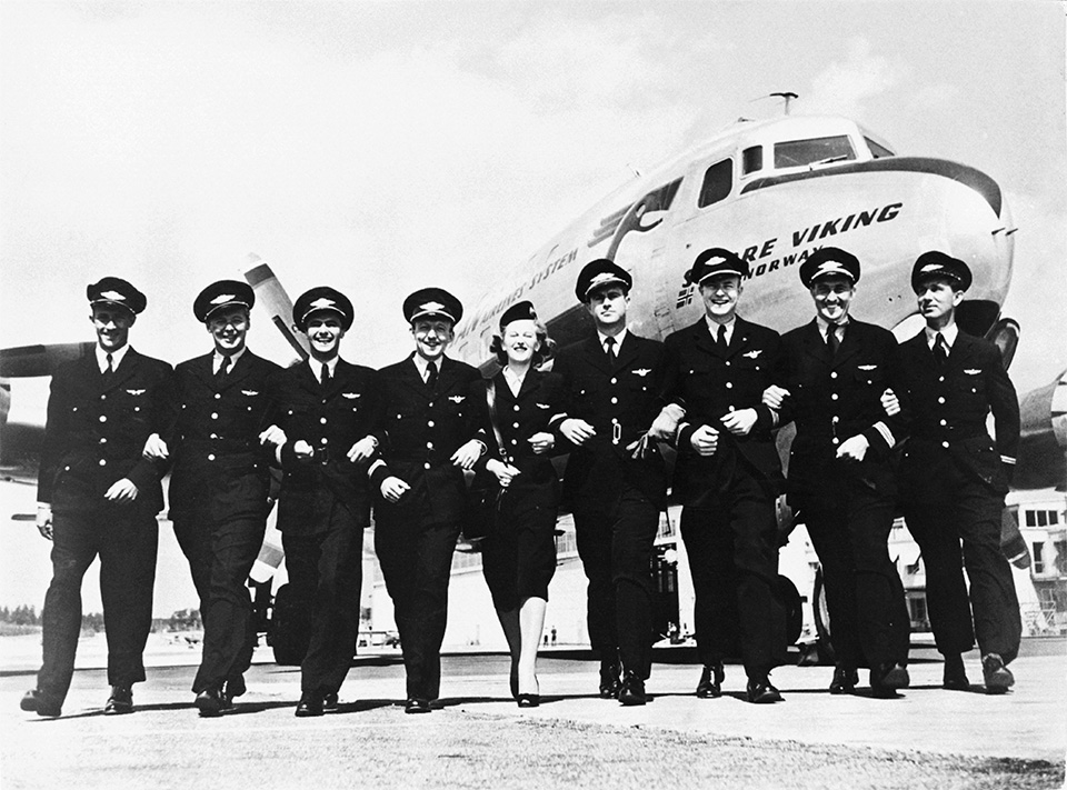
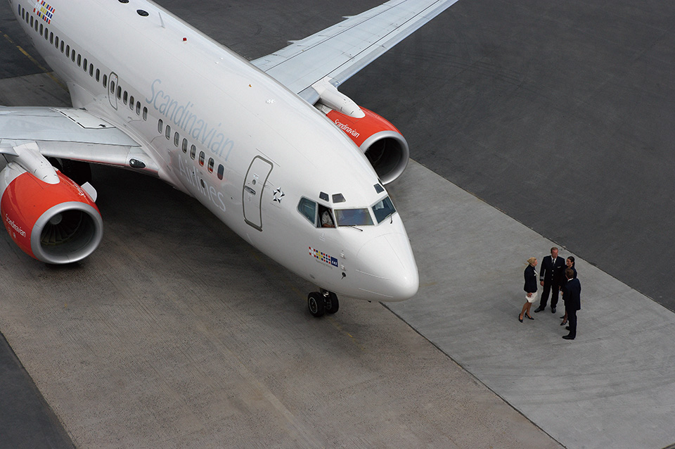
Scandinavian Airlines (SAS), an airline company with 60 years of history, is operated jointly by the three Nordic countries of Sweden, Norway and Denmark. Viewed from the front like a human face, its aircraft carry on their ‘cheeks’ the Scandinavian Unity symbol, which is a representation of the flags of the three nations. The airline, with its head office in the Swedish capital Stockholm, is the national flag carrier with 50% of its shares owned by the three national governments. Stockholm’s Arlanda International Airport is the base for flights to America, while Denmark’s Copenhagen International Airport serves flights to Asia. The airline has built up a wide-ranging network serving not just the Scandinavian Peninsula, but also the rest of northern Europe and the three Baltic nations, while extending to other European countries, America, the Middle East, Asia and Africa.
The SAS Group includes under its umbrella a number of airline companies in northern Europe and the Baltic nations, and as a member of the Star Alliance Group to which the Japanese airline ANA also belongs, it is strengthening ties with partner airline companies. The Group’s business interests are wide-ranging and include air cargo, travel agency services, and hotel operation.
With the intensified competition of the mid-1990s, the previously successful Scandinavian Airlines also began to be dragged under by the competitive storm. With worsening business results and passenger drift, what was needed if the airline was to survive was the creation of a new brand, through an updating and redefinition of the customer of the next century. It was decided to widen the target customers to include families and others, and turn the airline which until then had focused mainly on business travellers, into one with universal appeal where anyone could feel at home.
The task of formulating a renewal concept began in 1996 with the drawing up of a list of items requiring redesign. For the renewal of flight cabins, airport lounges and other areas, the starting point was the issue of how to create a space where people feel at home. The US-based Dublin Group was commissioned to undertake a fixed-point observation exercise extending to 2,000 hours. Observations and recordings were made of human movements right down to the details of what kind of posture passengers assumed when seated for long periods.
Through this process, the core concept to be communicated to the target customer was identified as ‘It’s Scandinavian’.
1997年、この一大プロジェクトをStockholm Design Labが担当することになった。彼らが選ばれた理由は、SASが必要としていた「スカンジナビアらしさ」を彼らが理解していたことによる。
What was required for this massive brand renewal project were three things, strong design, an easy to understand brand image, and a clear vision. Based on the idea that the brand value would emerge from the ‘Scandinavian-ness’ that SAS wished to express, creation of the SAS brand identity began.
Stockholm Design Labのやりかたはそれまでのデザインの方法論とは全く違い、「Interactive (互いに影響しあう)とConnecting(つなぐ)」。つまり実際に関わる人々のアイデアが渾然一体となり、それをさらにつきつめることで、最高の結果を得ることをめざした。
In formulating the design, the most important thing was to make customers and everyone else understand that ‘This is Scandinavia’s airline company!’. When they see the SAS logotype, everyone understands that they are with Scandinavian Airlines, however, the team concentrated on image creation with the idea of finding a subtle way of saying ‘Scandinavian’ without the logo. Moreover the design had to be aesthetically pleasing and also fulfill a functional purpose. Once the public face of a company has been created, it is not easy to change. For this reason too, it needed to be a design that would continue to evolve and would not age.
In order that the entire Group would share the same look, and their identity would be communicated already in their image and style, the ‘Scandinavian-ness’ was emphasised in all elements from graphics, typography and photographic style to colour.
Nowadays, the SAS Group enjoys a reputation as the world’s most design-conscious airline company. Its refined design and intelligent approach have continued to evolve after the full renewal project. The items initially subject to renewal in 1997 came to more than 2,000, but the figure has now passed 2,600.
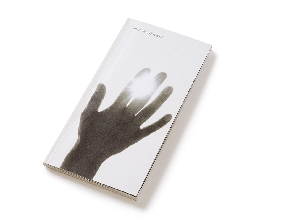
When the concept of ‘Scandinavian’ was explored, a variety of ideas emerged. Here we see the cover of a book that brought these ideas together.
The hand is a symbolic representation of something that has been handed down through the generations by the people of Scandinavia – the spirit of ‘Care’.
This concept book is filled with ‘Scandinavian-ness’. The traditional essence of Scandinavia is represented by frankness and embraces care, reliability and innovation. This essence has been distilled over centuries amid the beauty of a natural environment rich in greenery.
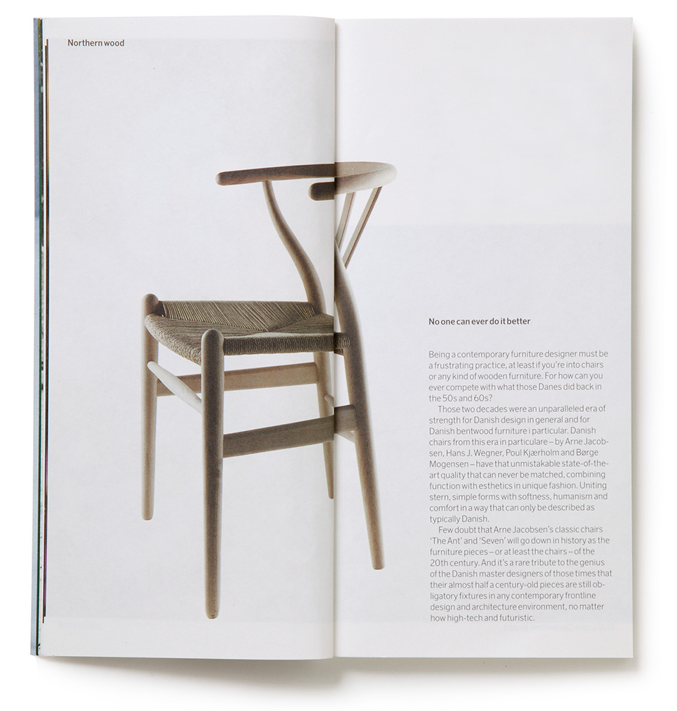
In the Danish chair designed by Hans Wegner,
the beauty of the material, form and the functionality are again typical of Scandinavia. The chair
was designed in the 50s and 60s, but even today it does not appear old-fashioned. This illustrates the same idea as the design concept of agelessness that SAS aspires to. Always pursuing and creating novelty is part of the innovative spirit which is another distinctive feature of Scandinavia.
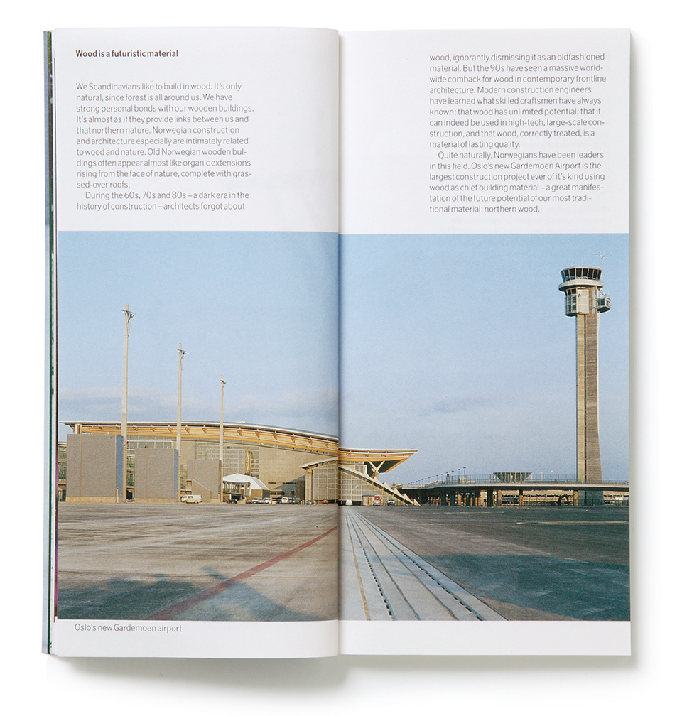
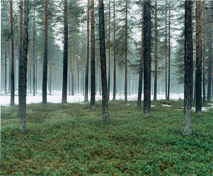
The rich greenery of the forest. The people of Scandinavia feel a strong attachment to ‘wood’ and have always used this natural material. There was a period from the 60s to the 80s when using wood was considered old-fashioned, but since the 90s it has been rediscovered. This is partly because of the heightened interest in nature that people have nowadays, but also reflects wood’s warmth and limitless potential as a material. Even most contemporary architects have much to learn from skilled craftsmen who have always known such quality. The wood of northern Europe is an ultramodern i.e. futuristic material, as well as Scandinavia’s most traditional material.
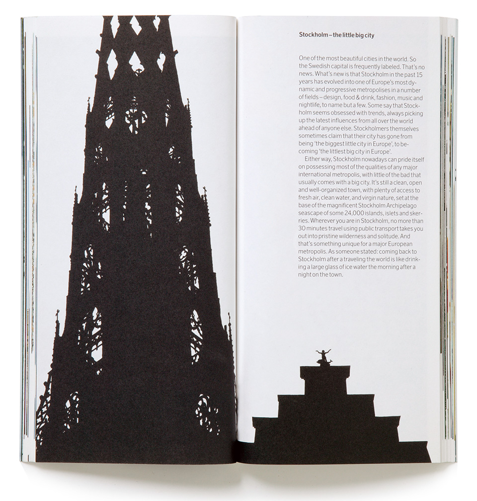
Stockholm is one of the most beautiful cities in the world. Often referred to as a ‘little big city’, it is clean and well-ordered, and has moved a step ahead of any other European city in the fields of design and fashion, food and music. At the same time it has not sacrificed its fresh air and clean water. Travel 30 minutes from the city centre by public transport, and you find yourself in a pristine wilderness. Unpretentious but retaining its beauty, informal elegance is the essential mood of Stockholm. Coming back to Stockholm after traveling the world is like drinking a glass of fresh ice water the morning after a night on the town. Another aspect that says: It’s Scandinavian.
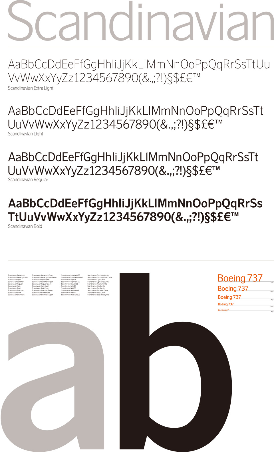
The SAS logotype designed in 1947 by Rune Monö was modified in 1998 by Stockholm Design Lab. The logo that was to be the SAS mark of identification was required to be of a simple, functional design expressing informal elegance and needed to make a straightforward statement of the brand concept. In the simple logotype formed by an ‘A’ flanked by two ‘S’s, the S letters look the same, but are in fact placed at a subtly different angle.
SASの株主であるスウェーデン、ノルウェー、デンマークの3国の国旗をシンボライズしたScandinavian Unity
は、3国のナショナルキャリアであることを示している。機体などのTouchpointsでSASのデザインシステムを補完している。
また、オリジナルのTypeface「Scandinavian」を開発した。このTypefaceは広告などすべてのコミュニケーションのほか、機内誌・機内放送・パンフレットなどTouchpointsのすべてに使われているが、このTypefaceを持ったことでブランドパワーがより強化された。レギュラーのほか、ボールド、ボールドより太いブラック、ライト、エクストラ・ライト、イタリックの5種類が使われている。この字体、カンパニーカラーを目にしただけでSASだとわかる。
ロティス(Rotis)というTypefaceを特別に作り替えたものがScandinavian Airlinesと機内用のポエムの1部に使用されている。エアバスの機体にこのTypefaceを使ってシルバーで書かれたScandinavianの文字は、光の角度で見え方が変わる。
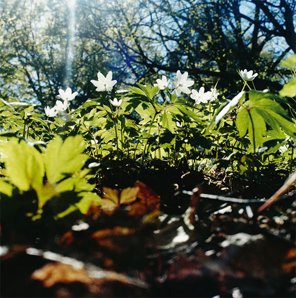
Picture BankはSASのコアエレメントとして選ばれた写真群をさすSAS独自の呼び方だ。
1988年からスカンジナビアの写真家たちが依頼され、年に2回、スカンジナビアのエッセンスとも言うべきものをカメラで捉える。森であったり人であったり、花、湖、雪、昆虫、動物……Natureにあるものすべてが被写体になる。カラー、白黒、セピア……そうして集めた写真の中からScandinavianを表現するものを選択し、データベースとしてたくわえていったものがPicture Bank。それはパンフレットの中やwebサイト、広告などあらゆる場面で活用される。ブランド表現のためのコアエレメントとして重要な位置を占めている。

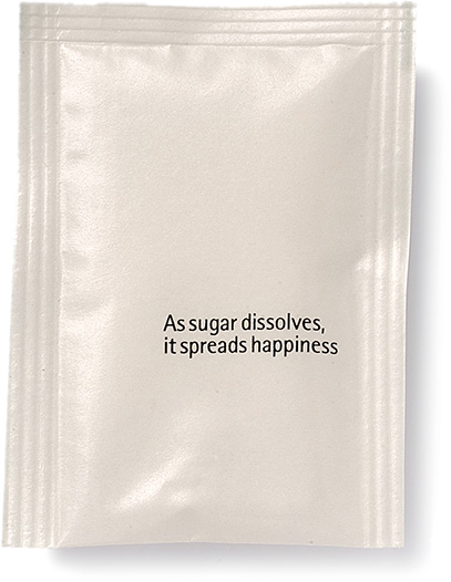
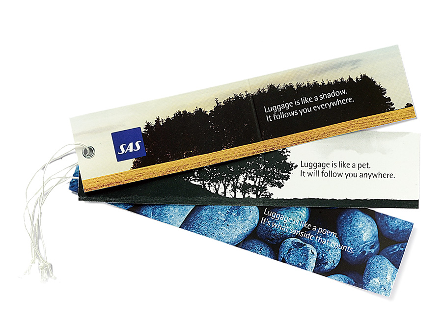
Picture Bankと並んで特徴的なのがPoetry Bankだ。感じたままに短いポエムを作り、それをデータベースに蓄えている。
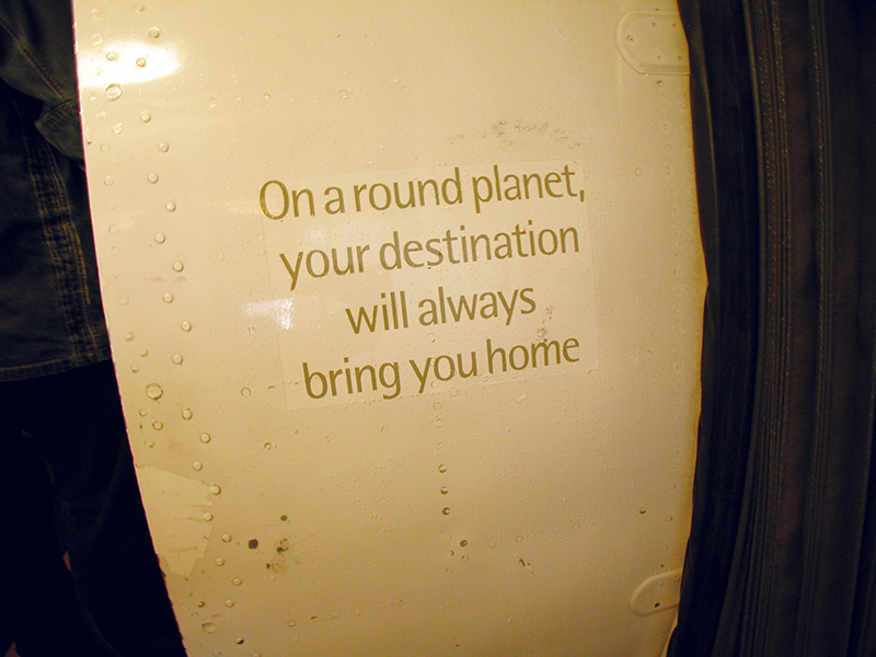
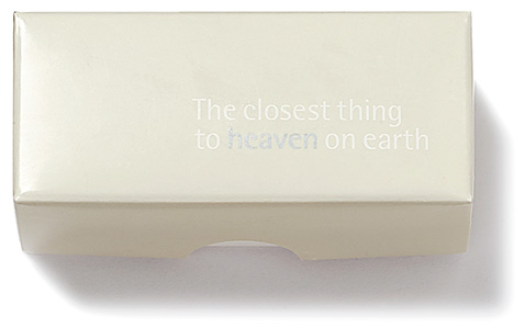
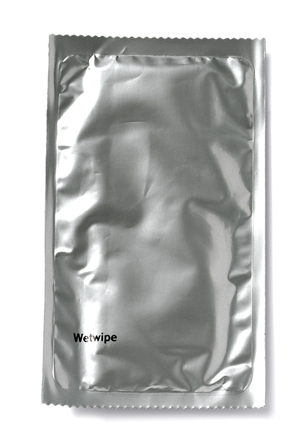
These poems, too, are used in a range of environments. When boarding an SAS flight, the customer sees a short poem written in warm grey lettering on the outside of the aircraft body beside the door. For instance ‘On a round planet, your destination will always bring you home’. This imparts to the customer a little of the sense of the spirit of Scandinavia for the flight ahead. If they have a hot drink on board, the sugar sachet that is provided with the drink carries a poem such as ‘As sugar dissolves, it spreads happiness’.
The SAS poems form an integral part of the SAS identity. Together with graphics, colours and pictures they unite to create a strong, unique identity with possibilities for many different forms of expression. The SAS poems are perhaps not poetry in the traditional sense, but function more in the form of a greeting, a glint in the eye.
Each poem gives SAS the opportunity to create a dialogue with the customer. They are gentle reminders that SAS is foremost about people – our customers and ourselves.
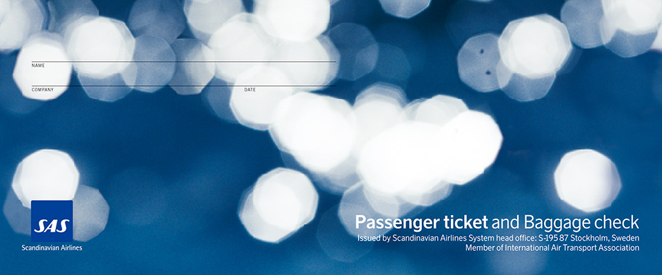
The SAS poems are for application on corporate items only. Some examples: passenger documents, corporate brochures, annual reports, the SAS Travel Book and inflight items.
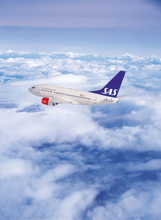
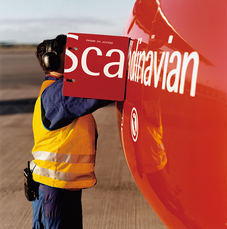
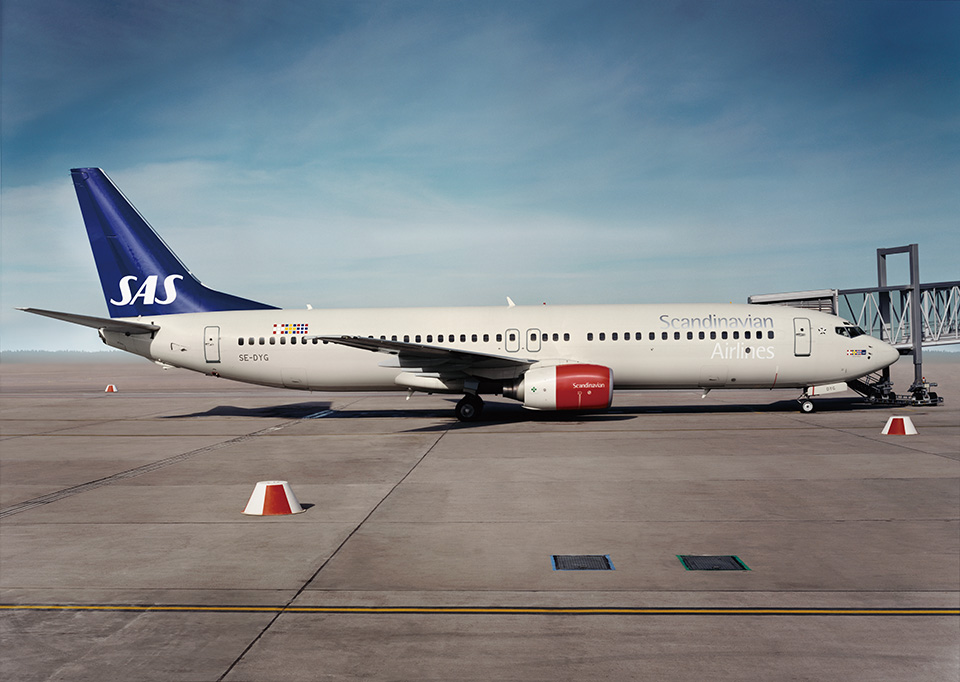
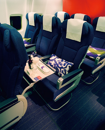
The aircraft is one of the strongest carriers of the brand and its identity. The exterior design is based on the advanced technical design of the aircraft, while refined, specific detailing underlines reliability and quality.
The fuselage is a warm grey, and the tailfin a strong blue with the logo as large as possible at the bottom. Silver and white are used for the name Scandinavian Airlines, the appearance of which changes according to the weather, season and time of day – sometimes very subtle, and sometimes very strong. The engine cowlings are red for contrast, giving a striking impression when seen from the ground.
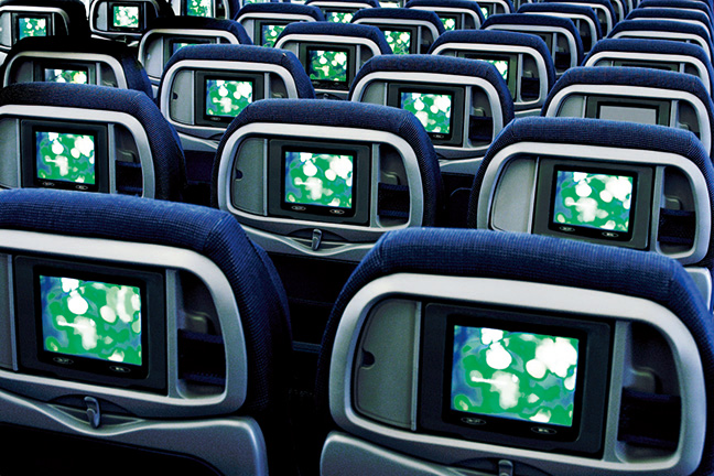
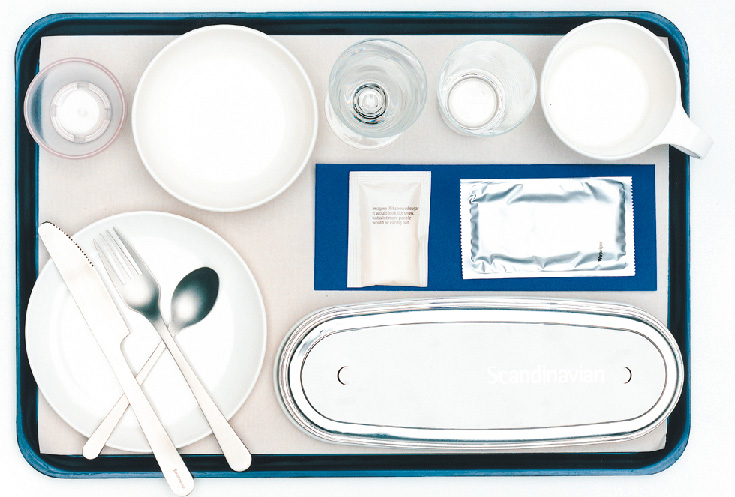
Even without seeing the logo, more than 75% of customers recognise the SAS cabin fittings and tableware of inflight meals.
With the idea that making the aircraft body lighter would also reduce the amount of fuel used, the plates and other dishes are made of melamine. SAS’s unique coffee cups, a cross between a coffee cup and mug, are stable and easy to hold.
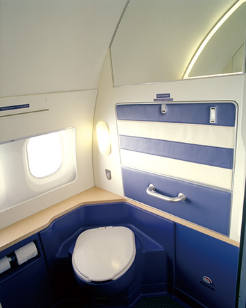
Onboard toilets are spacious and SAS was the first
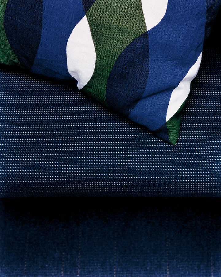
to provide them with a window. They are also fitted with a board for changing nappies, another expression of the spirit of caring. The pillows too are playfully designed while colour coordination extends to the headrest covers.
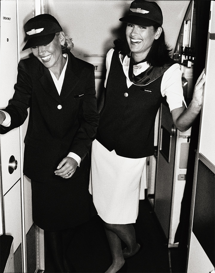
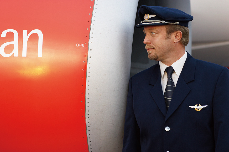
When customers board an SAS aircraft, they notice that the flight attendants are not wearing the same uniform. With its soft look, the uniform is called the wardrobe, and includes a shoulder pad-free jacket, skirt, blouse, turtleneck sweater, waistcoat and other articles. The hair barrettes and aprons also come in several varieties. Flight attendants coordinate these as they wish.
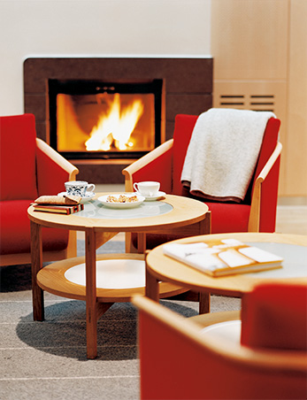
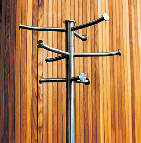
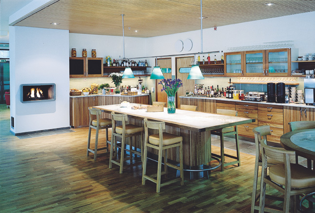
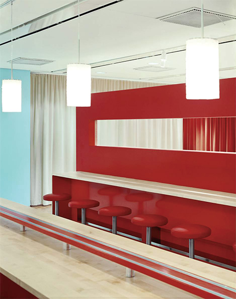
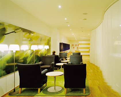
SASの表現したかった「スカンジナビアらしさ」のひとつが、思いやり。Spirit of hospitalityもこれに通じるものがある。乗客がくつろげる空間をいかに提供するか、トーマス・エリクソンのコンセプトは「リビングルーム」。カラーと素材にこだわった空港のラウンジはリビングルームのようで温かみがあり、95%以上、Natureの素材が使用されている。中でもストックホルム空港のラウンジは、どこかの家庭のキッチンとリビングそのままに3.8メートルの白木のテーブルが据えられ、暖炉が燃えている。生花が置かれ、フライト待ちの乗客がいつまでも居たくなる居心地の良さだ。コートかけやライティング、棚など、細部にいたるまで神経が行き届いている。あるラウンジの入口にはラテックスで作った像が置かれている。「人は気になるものには触らずにはいられないんだ。アートって気になるものだと思わないか?」と言うエリクソン。気になるから好奇心でみんなが触る。ラテックス製だから揺れる。首が取れたりして3体めになるが、ずっと置き続けるそうだ。
Request Information

現在、ブラウザの拡大・縮小機能を利用中です。
アクサムのサイトエクスペリエンスのために、拡大・縮小をオフにすることをおすすめします。
×