
- The Danish flag
- Visualising the national identity
Branding paradigm
05
Pictures from WorldBranding
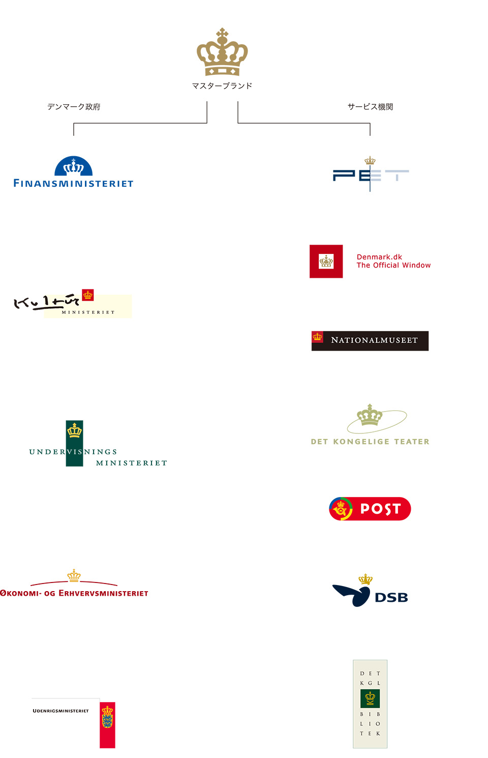
The Kingdom of Denmark, with a population of 5.4 million, is a small nation that demonstrates remarkable strength and distinctive appeal in both industry and culture. This uniqueness is supported and symbolised by a series of branding initiatives implemented across governmental ministries and public service institutions — including the national railway, postal service, libraries, and theatres.
Each organisation expresses its identity through individualised interpretations of the crown motif, freely adapted to suit its character. This approach reflects a distinctive model of governance and public service — institutions created by the people, for the people — underscored by a sense of civic pride and democratic spirit.
Symbols and icons have historically been used as a strong and easy way to recognise and identify a country. During the French Revolution in 1789 the three colours of the Tricolore flag symbolised the new ideas of Liberty, Equality and Fraternity. Since 1794, the flag has been the best-known visual representation of the French Republic and in more general terms of everything French. When India’s Mahatma Gandhi and his followers in the first half of the 20th century were creating the Indian nation, they needed a strong visual symbol that could serve as a rallying point for the resistance movement. They chose a flag with colours that represented the major religions and a thousand year old symbol to stress the essence of India.
Today these national flags and symbols seem natural and obvious and make up an important part of the whole national identity.
Another part of the national visual identity is made up of symbols that exist in our every day lives. Some of these symbols are historical national icons, as was the case in India, that are perceived to be relevant by the inhabitants. Traditionally, a public institution carries these symbols as a mark of pride and identification, which links to a specific country.
With private companies growing internationally and thereby increasing their global visual presence, public institutions become more important as carriers of a visible national identity. Furthermore, the strength of the national identity has an impact on the number of tourists and the level of investment flowing to the country.
The country of Denmark has approximately 5.4 million inhabitants, with 1.8 million living in Copenhagen. Despite the small size of the country, it has an established “brand” both within and outside the country. What constitutes the coherent national brand for Denmark, and how can it be flexible enough to accommodate the entire nation?
Kontrapunkt, a leading design agency in Denmark, was challenged with this unique opportunity to create a coherent national brand for Denmark, while still making each public institution a unique entity. The result has been a comprehensive public branding system, which has created new standards for public sector branding.
A national identity is supported through national institutions within society and can be divided into four main groups.
Public institutions have a central role in upholding a national identity, as they are the official window to citizens and other countries. Ministries, State organisations and municipalities have all historically used symbols of the State as their identification symbol. Hence, while representing different roles of the State, they also communicate the national identity.
Public companies include the postal service, railways and airports. Traditionally, these public companies were run by the State, but a strong tendency towards privatisation has been evident within the last decade. However, as these companies still perform vital functions in society, they have immense importance and carry much value for the national brand.
Cultural institutions include museums, libraries and theatres. As the national brand continues to evolve and develop, cultural institutions hold a leading role in negotiating and transferring the national identity to citizens, visitors and foreign countries.
The capital of Denmark is Copenhagen. The capital and other significant cities support the national brand and function as the economic, political and cultural powerhouses of the nation. You might have heard the phrases“ Wonderful Copenhagen,” “I love New York” or “the city of cities – Paris”. Different associations emerge when we think about these cities, and they are closely related to the national brand.
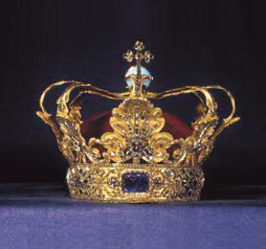
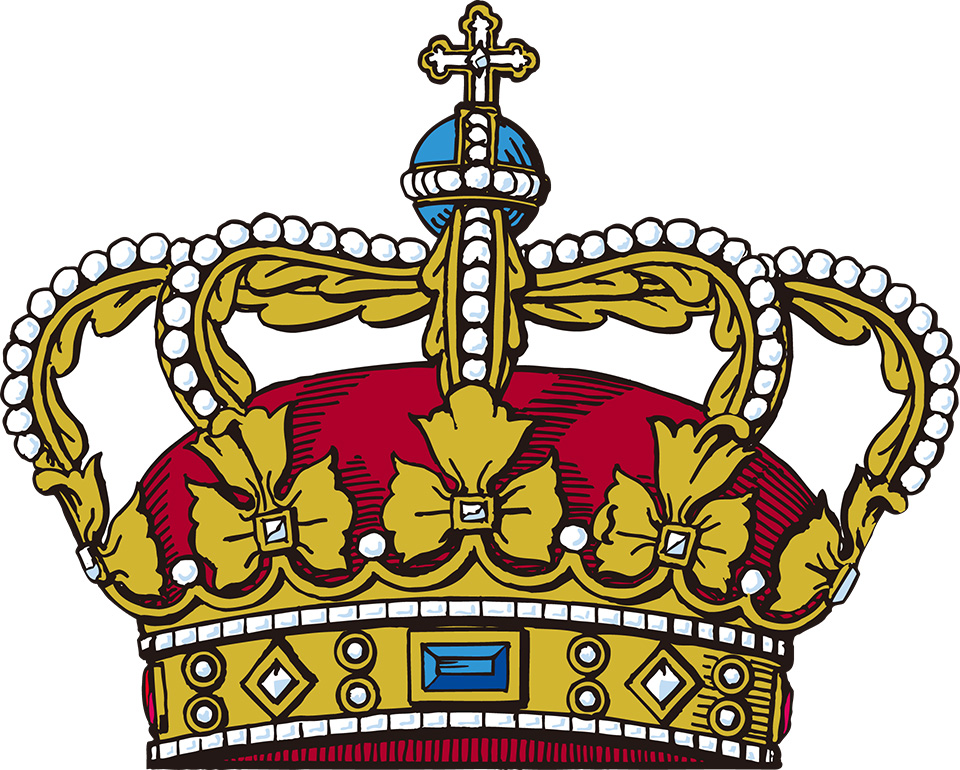
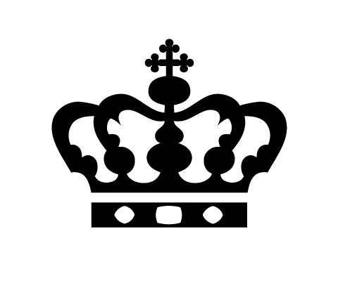
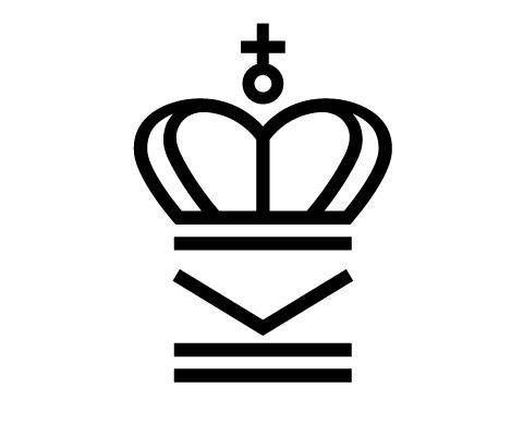
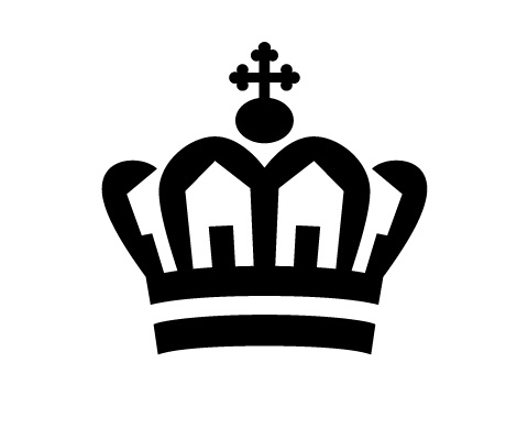
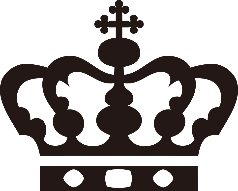
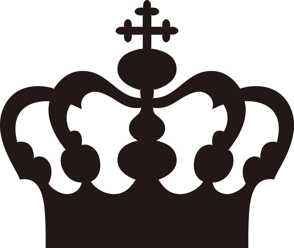
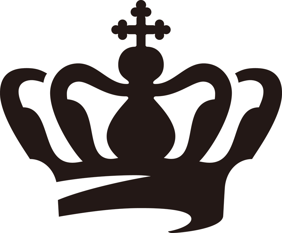
The Danish crown is well recognised and appreciated among the Danish people. It signifies heritage and trust because it represents the Danish monarchy, which has a thousand year old history - one of the oldest in the world. The crown was a natural choice because it is a powerful symbol and has many meanings in Denmark. Other European countries have also embraced the crown, so the challenge was to visualise it and infuse it with a Danish touch.
The design of the Danish crown is an “open design.” As long as it respects certain criteria, it can be adjusted to fit many different needs. New versions of the crown require the approval of the National Archives. The guidelines state that it must relate in appearance to the Crown of Christian V with five visible braces, the orb and the cross.
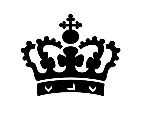
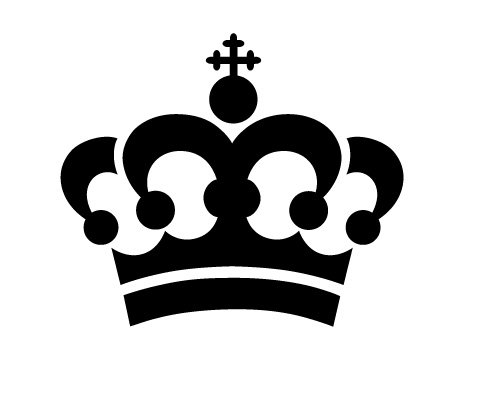
When designing logos for the Danish State, Kontrapunkt attempts to achieve not only an aesthetic expression, but also an indication of the responsibilities of the institution in question.
Hence, we have often included symbolic references to the institution in the physical form of the crown. For example, the crown for the Ministry of Education can also be seen as an open book, and the crown for the Ministry of Housing and Urban Affairs appears to be made of gables.
In branding terms, the national brand of Denmark is a flexible sub-brand system. Each institution and division has its own distinctive identity and logo, yet they all use the crown as a central theme. The adaptable crown and the distinctive identity of each public institution make them more relevant and closer to the citizen – they give the authorities a human touch while clearly communicating their function. This reflects the change of function of the State: From an authority ruling the nation to a service-minded State that interacts closely with its citizens.The State is in an ongoing evolutionary process, and branding and design play an important role in this development. The next generation of public institutions is already in the making.

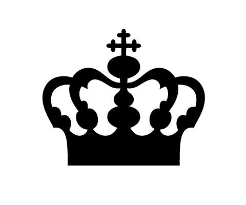

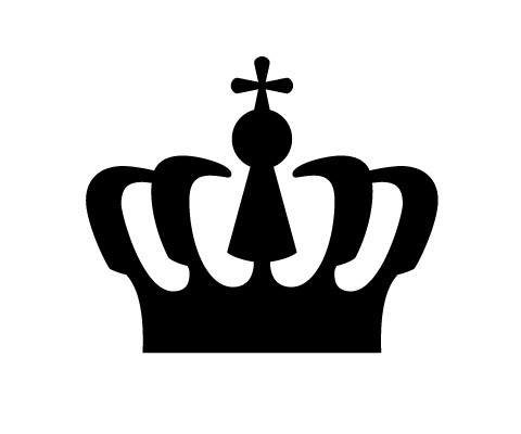
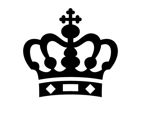
When designing logos for the Danish State, the objective has been to achieve not only an aesthetic expression, but also an indication of the area of activity of the institution in question. Since the 1994 design of the Royal Danish Library crown, symbolic references to the institution the crown represents have often been included in its physical form. For instance, the crown for the Ministry of Education can also be seen as an open book and the crown for the Ministry of Finance contains an implied keyhole.
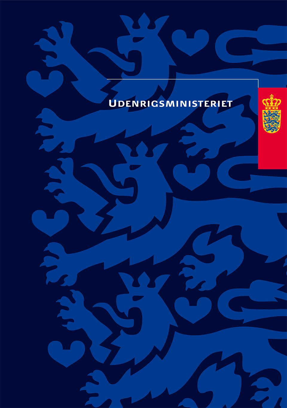
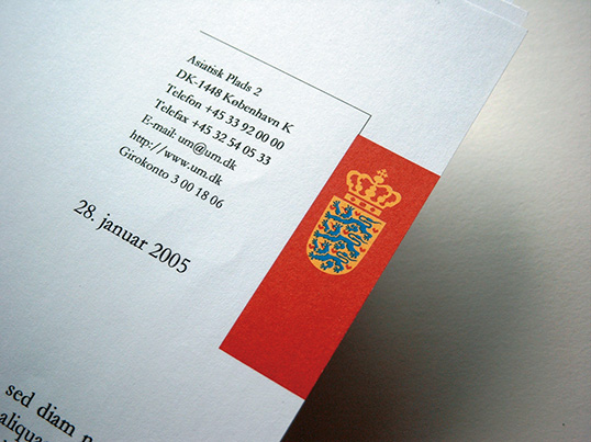
A typeface was designed for the ministerial logo used by the Ministry of Foreign Affairs. The typeface is a contemporary interpretation of Danish typeface tradition. It has a frank, Danish robustness, which goes well with the redesigned Coat of Arms.
The Coat of Arms is placed in a red rectangle, associated to the Danish flag, alluding to the country the ministry represents. The blue colour of diplomacy surrounds it.
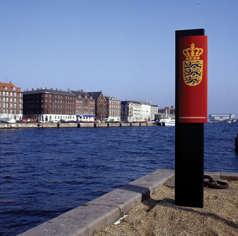
In a well-functioning design programme, it is important to create graphic elements that are easy to use, and then to use them consistently.
The stationery and brochures of the Ministry of Foreign Affairs are connected visually by recognisable graphic elements. The logo is always placed to bleed off the right side of printed surfaces.

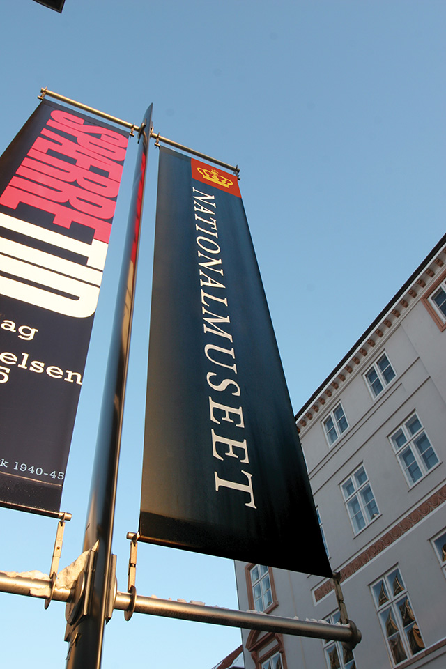
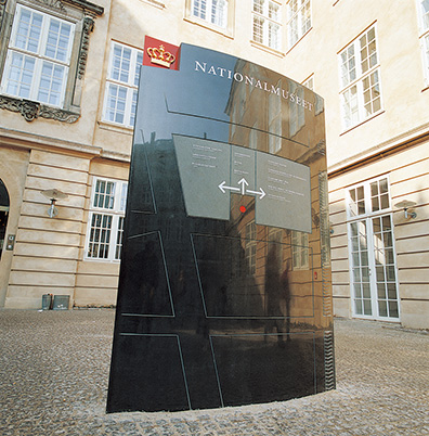
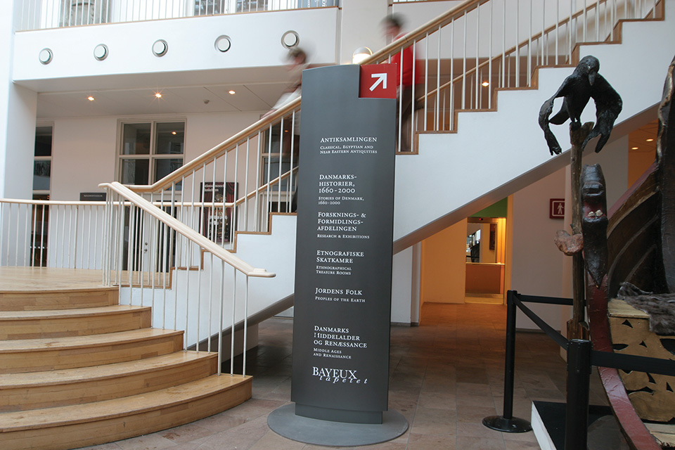
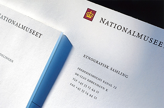
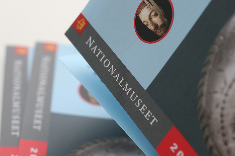
The visual identity of the National Museum must reflect the country´s traditions and still be able to communicate in a contemporary language. This is achieved in the logo and signs by composing the historical elements of the crown and typography in a tight, modernistic form. The red square, which frames the yellow crown, places the old symbol of the monarchy in a highly contemporary and useful form.

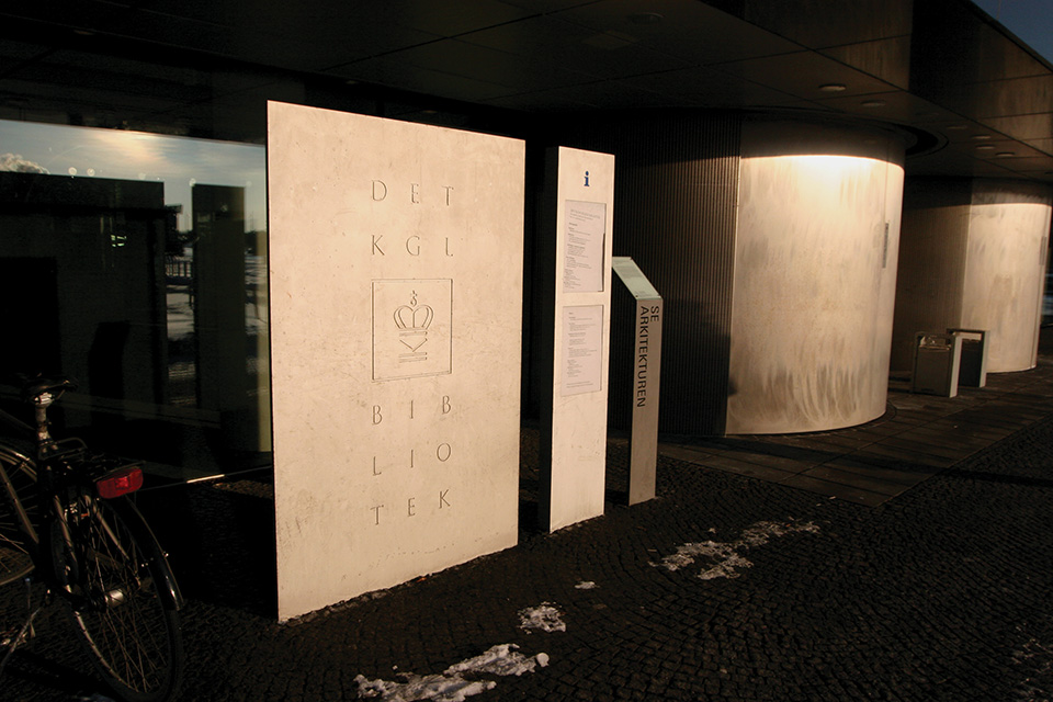
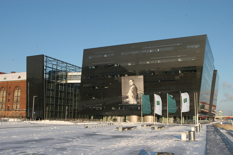
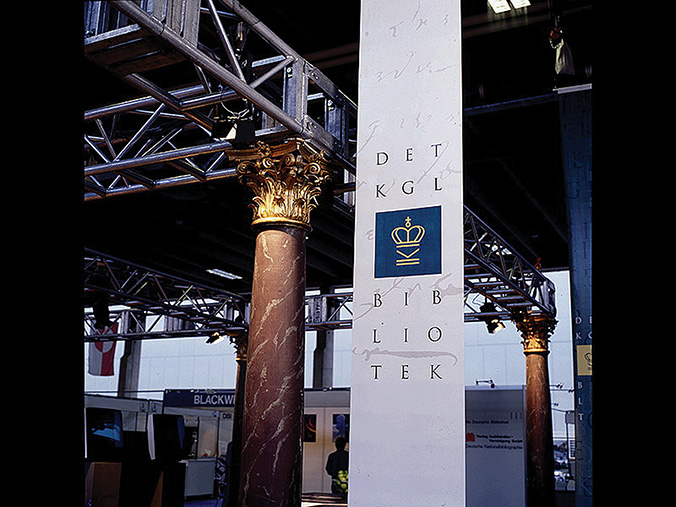
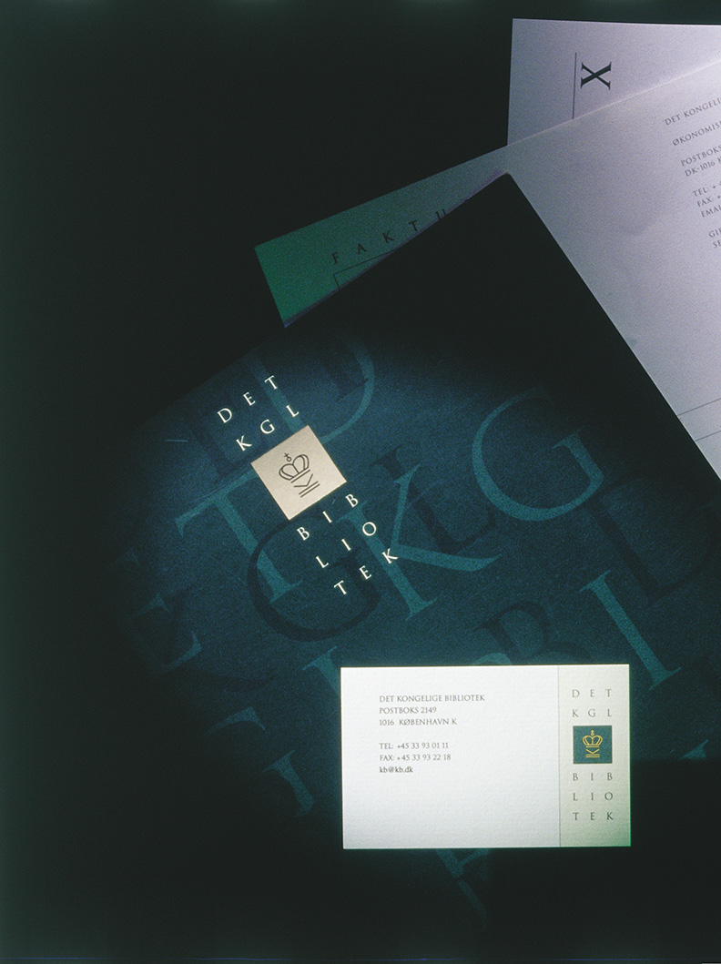
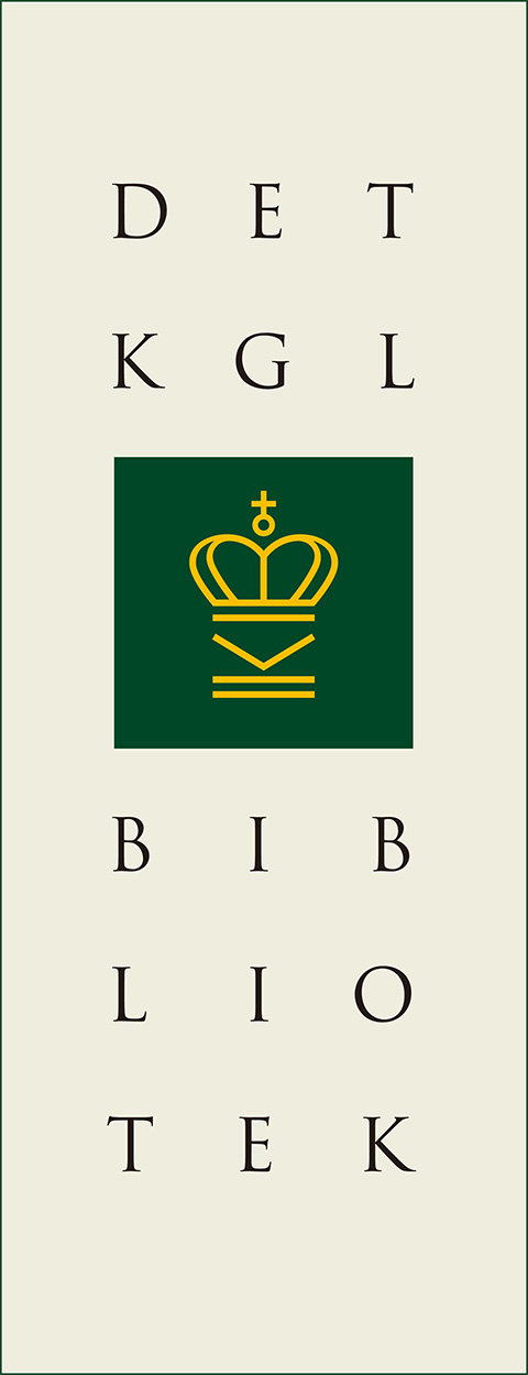
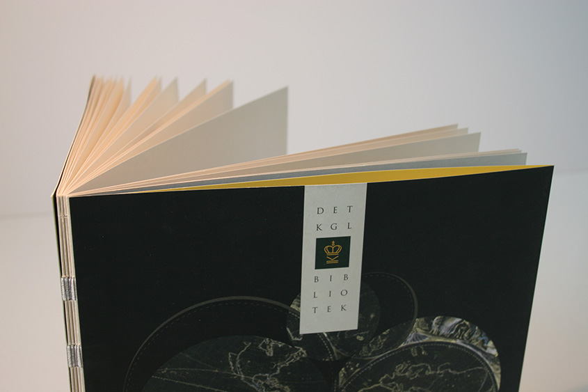
The Royal Library was founded more than 350 years ago. Its principal task is to collect and store historical documents. Collections are accessible to researchers and others, and the organisation is an active promoter of culture, attracting new generations of library users. The library has large exhibition areas, a hall for concerts, meetings and lectures, and ample space for the display of its extensive collections.
The library needed a new corporate identity that at the same time would express cultural heritage, research and modern communication. The solution was modern-classicist: A combination of the stylised crown and the historical typography in an untraditional set-up. The logo is reminiscent of a classic European identity stamp on the back of a book, chosen to signal intellect rather than commercialism.
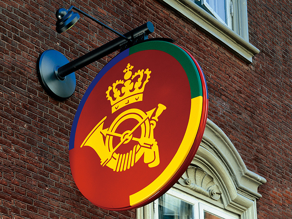
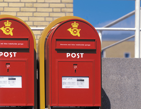
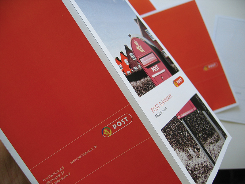
When Post Denmark went from being a government service to an independent public corporation in 1995, it needed to communicate its new status and strategy to the world. The organisation needed a distinct logo that signalled tradition, Danish identity and modern business.
The Dutch Postal Service’s head of design, professor Ootje Oxenaar, suggested a partnership between Kontrapunkt and the Dutch Studio Dumbar.
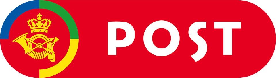
In the new logo, the red and yellow of the House of Oldenborg continue to dominate. The emphasis is shifted from the crowned coach horn to the word “Post.” This makes the logo more able to survive potential future changes in the business structure. The four letters in “Post” were specially designed to reinforce the character of the new brand.
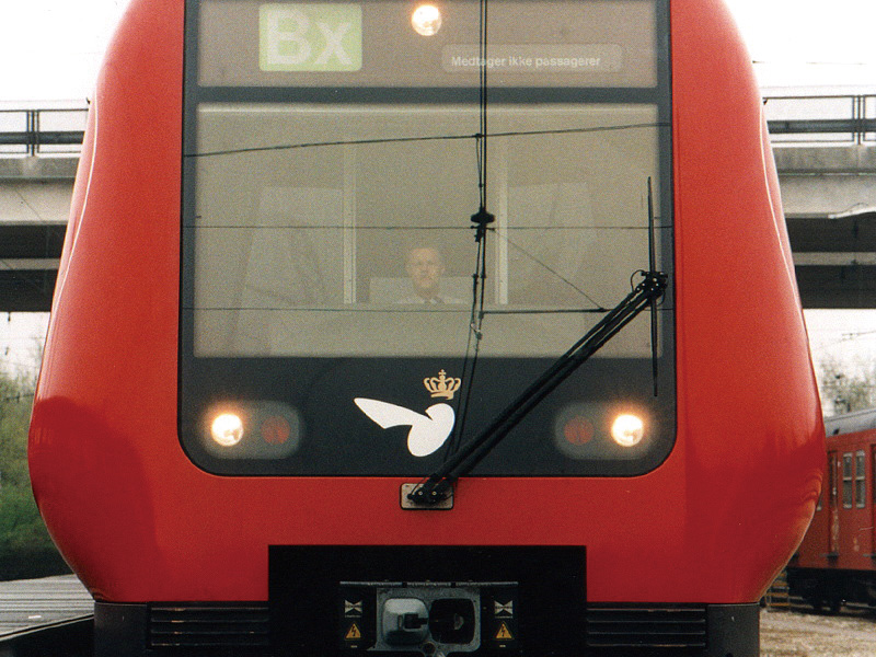
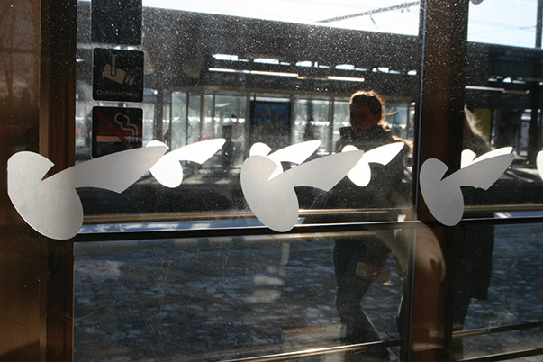
While sketching the new logo for the Danish National Railways, one symbol kept coming up:
The 150 year-old crowned and winged wheel, a symbol that dates back from the birth of the railroad, when trains revolutionised transportation. The winged wheel symbolises development, speed and the dream of travelling.
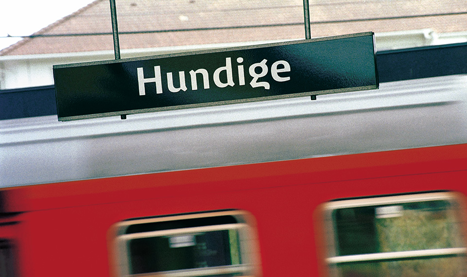
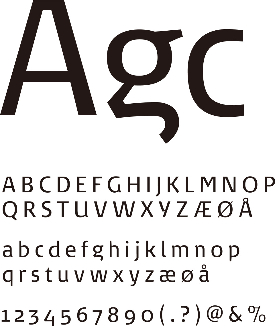
>Typography is a key identity marker for DSB, because so much of the communication with customers is in writing on signs, trains, stations, notices, schedules and in ads. Customers should recognise DSB even in the absence of the name and logo.
In the new and more organic design, the logo depicts DSB as a company focused on human aspects rather than technology.


A coherent national brand for Denmark

Request Information

現在、ブラウザの拡大・縮小機能を利用中です。
アクサムのサイトエクスペリエンスのために、拡大・縮小をオフにすることをおすすめします。
×