Branding paradigm
06
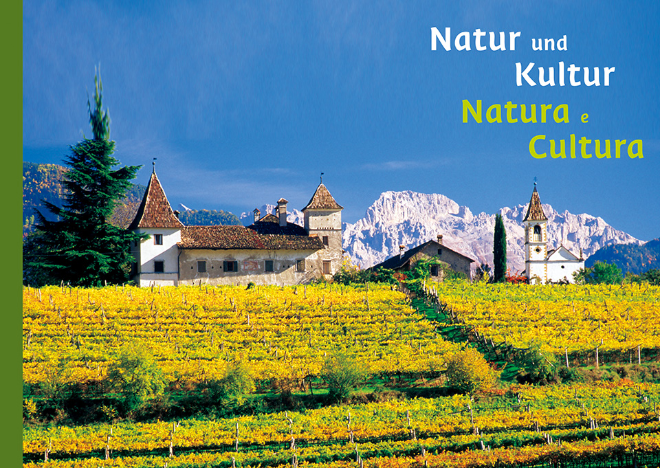
South Tyrol
Enhancing Brand Value across Agriculture, Tourism, and Industrial Products
Pictures from WorldBranding
Today, it is not only companies but also regions that find themselves exposed to intense competition. Located in northern Italy, South Tyrol (the Autonomous Province of Bolzano) responded to this challenge by unifying its agricultural produce, tourism, and industrial products under a new umbrella brand: South Tyrol.
At the core of this initiative was a clearly defined brand value — “A place where the Alps meet the Mediterranean, where spontaneity coexists with reliability, and where nature and civilisation live in harmony.” This branding effort evolved into a broad-based movement in which diverse regional stakeholders actively participated.
As a result, the initiative successfully gained the support and emotional engagement of local citizens, producing significant and lasting impact.
- a.
-
Brand Architecture
Countries and regions compete for the business of consumers and tourists since they are both vacation destinations and producers of goods. The autonomous region of South Tyrol wanted to gain a competitive edge by showing, through a powerful shared brand identity, its combined strengths as a land of pleasure and a tourist destination. The region joined forces with MetaDesign to develop a South Tyrol umbrella brand.
South Tyrol has embraced the challenges of increasing competition, which is forcing regions and products to adopt a clear position, pool their resources and send unambiguous messages to target groups. Origins are becoming an increasingly decisive competitive factor. The newly developed corporate design system and the new South Tyrol umbrella brand have provided the tourism industry, service sector and the high-quality products of South Tyrol with a powerful, unique shared visual presence. The umbrella brand has made South Tyrol a pioneer in Europe.
- b.
-
Branding Process
Brand strategy
In the branding process, the commission defined South Tyrol’s core values and positioning with the assistance of MetaDesign. These values needed to reflect the unique and special features of the region, its inhabitants, as well as its products and services. They also had to represent principles that all the commission’s members could identify with. In addition to clarifying identity, the commission described what distinguishes South Tyrol from other regions. An extensive market analysis showed possible ways of creating distinctions while confirming the findings of the group process: no other region or country combined Italian and German traits as uniquely as did South Tyrol. Heartfelt, rough-hewn, warm, rich in contrasts and tradition—this is how South Tyroleans characterize their home. The positioning statement, which is based on these values, concisely expresses this identity: “South Tyrol is the contrasting symbiosis of the alpine and Mediterranean, spontaneity and reliability, and nature and civilization.”
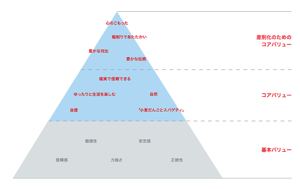
Brand pyramid
ブランドがひとつの地域全体の、観光業から数々のAgricultural products、工業製品までを包括的に束ね、ひとつの傘の下におさめた例はそれまでになかった。また南チロルのような、多様性を内包した文化と複雑な歴史的背景をもつ場で、ブランドがこのような取り組みを行った例も初のことだった。新しいThe umbrella brandは、目標を達成し、大きな成功をおさめた。このThe umbrella brandの力に気づき、これを取り入れて活用する企業やブランドの数は増え続けている。新しいBrand Architectureの中には、事業者が選べる使用方法のオプションが用意されており、ブランド提携から、The umbrella brandのビジュアルとの完全な融合まで、幅広い選択肢が提供されている。南チロルの人々の共感を得たThe umbrella brandは、いまや商店の棚から観光キャンペーン、広告看板までを席巻するまでになった。
• DIFFERENTIATORS
The tip of the pyramid contains the values that lend the brand clear contours. They describe what makes South Tyrol unmistakable and unique. Like the region’s inhabitants, the brand is heartfelt, rough-hewn and warm. It is rich in contrasts, like nature, and looks back on a long tradition, like the culture of South Tyrol. These values express the distinct quality of both the region and its products, and constitute the brand image.
• CORE VALUES
The brand core embodies both the culture of the brand and the values lying deep within it. “Dumplings and spaghetti” reflect this culture, emphasizing the region’s specific qualities. The pace is unhurried in South Tyrol, and its inhabitants enjoy their lives. This is why the brand radiates tranquillity, despite its contrasts and diversity. It is also credible and genuine.
• BASIC VALUES
The basic values provide a foundation upon which all other values build and draw. The base of the South Tyrol umbrella brand is vigorous and reliable, and it stabilizes the brand.
BRANDING PROCESS
A successful umbrella brand requires a sharp image with defined values and a clear positioning. The brand values and brand positioning form the heart of brand strategy and provide a basis for developing the brand’s visual identity, which encompasses a logo, a color palette and typography. These basic elements give the brand its distinct look.
ブランドの成功に向けて第2のカギとなるものは、Brand strategyを反映した、一貫性のある視覚イメージである。The second key requirement for brand success is a consistent image that reflects brand strategy.
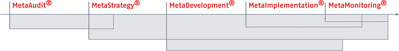
Based on this understanding of brands and design, we will present, in what follows, a highly simplified description of the approach taken in the umbrella brand project.
1. ANALYZING THE MARKET, THE COMPETITION, AND SOUTH TYROLEAN BRANDS
The project began with an extensive analysis of both the market and the competitive environment with a focus on visual identity, communications and positioning. In addition, project participants took stock of the most important brands in South Tyrol and conducted interviews with select brand managers.
2. ANALYZING BRAND IDENTITY AND POSITIONING
Building on these findings, project participants defined the identity of the umbrella brand and described what makes South Tyrol unique. The values that the umbrella brand needed to represent in the future were defined and arranged hierarchically in a brand pyramid. The positioning was summarized in a single sentence.
3. DEFINING BRAND ARCHITECTURE
The current state of brand architecture was described based on the analysis of existing brands in the tourism and agricultural sectors.
The relationship between the brands was analyzed, and brands that would not be used in the future were eliminated. Finally, a target situation was defined.
4. DEVELOPING MOODBOARDS
The design process began with the development of moodboards, which, using colors, shapes and imagery, led to the first visualizations of brand identity. The moodboards not only laid the foundation for the development of the design system, but also re-verified brand identity.
5. DEVELOPING THE BASIC ELEMENTS OF CORPORATE DESIGN
Afterward, the basic elements of the new visual identity were developed—the umbrella brand, the South Tyrol panorama, a typeface and a color palette. Sample applications were designed, including advertisements, brochures, packages and merchandising items.
6. PUBLIC PRESENTATIONS
In over ten presentations, the results of the strategy and design process were introduced to representatives of the government, the different sectors of the economy, South Tyrol advertising agencies, the lead agencies of major brands, and the press. Strategy and design were optimized and finalized based on their feedback.
7. DEVELOPING AND DOCUMENTING PILOT PROJECTS
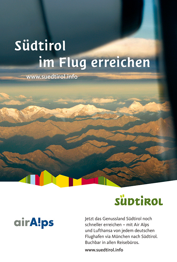
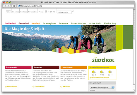
In collaboration with the agencies representing major South Tyrolean brands, MetaDesign developed the first pilot applications, ranging from advertisements, brochures and packages to endings for TV commercials and the new website at www.suedtirol.info. The results were documented as a basis for implementation.
8. IMPLEMENTATION
The South Tyrol regional government passed a resolution approving the umbrella brand. The implementation process began with the development of a body of regulations by the Umbrella Brand Advisory Board. Rules were defined for the licensing and use of the umbrella brand, and a multi-stage monitoring system was developed.
The umbrella brand
For years, marketing officers in South Tyrol had been using a symbol to identify their products.
The tourism industry also had its own logo. But neither of these symbols offered the potential for a shared platform. Synergy effects were lacking, and the different areas did not benefit from one another’s communication activities. All this was to change. A working group was set up with representatives of the regional government, the most important agricultural sectors, and Südtirol Marketing Gesellschaft (SMG). Together with the working group, MetaDesign laid the foundation for the new umbrella brand. The brand had to satisfy various user needs and also enable the numerous products to communicate consistently while complying with the strict regulations in EU directives.
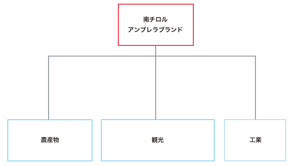
Never before had a brand brought together a region, its tourism industry and numerous agricultural and industrial products under a single roof. And never before had a brand done so in a region like South Tyrol with its diverse cultural and political landscape. The new umbrella brand has achieved these goals with great success. A growing number of companies and brands are recognizing and benefiting from its potential. The usage options that MetaDesign has developed within the new brand architecture range from co-branding to complete integration into the umbrella brand’s visual presence. After winning the hearts and minds of South Tryoleans, the umbrella brand is now conquering store shelves, tourism fairs and even billboards.
ブランドがひとつの地域全体の、観光業から数々のAgricultural products、工業製品までを包括的に束ね、ひとつの傘の下におさめた例はそれまでになかった。また南チロルのような、多様性を内包した文化と複雑な歴史的背景をもつ場で、ブランドがこのような取り組みを行った例も初のことだった。新しいThe umbrella brandは、目標を達成し、大きな成功をおさめた。このThe umbrella brandの力に気づき、これを取り入れて活用する企業やブランドの数は増え続けている。新しいBrand Architectureの中には、事業者が選べる使用方法のオプションが用意されており、ブランド提携から、The umbrella brandのビジュアルとの完全な融合まで、幅広い選択肢が提供されている。南チロルの人々の共感を得たThe umbrella brandは、いまや商店の棚から観光キャンペーン、広告看板までを席巻するまでになった。

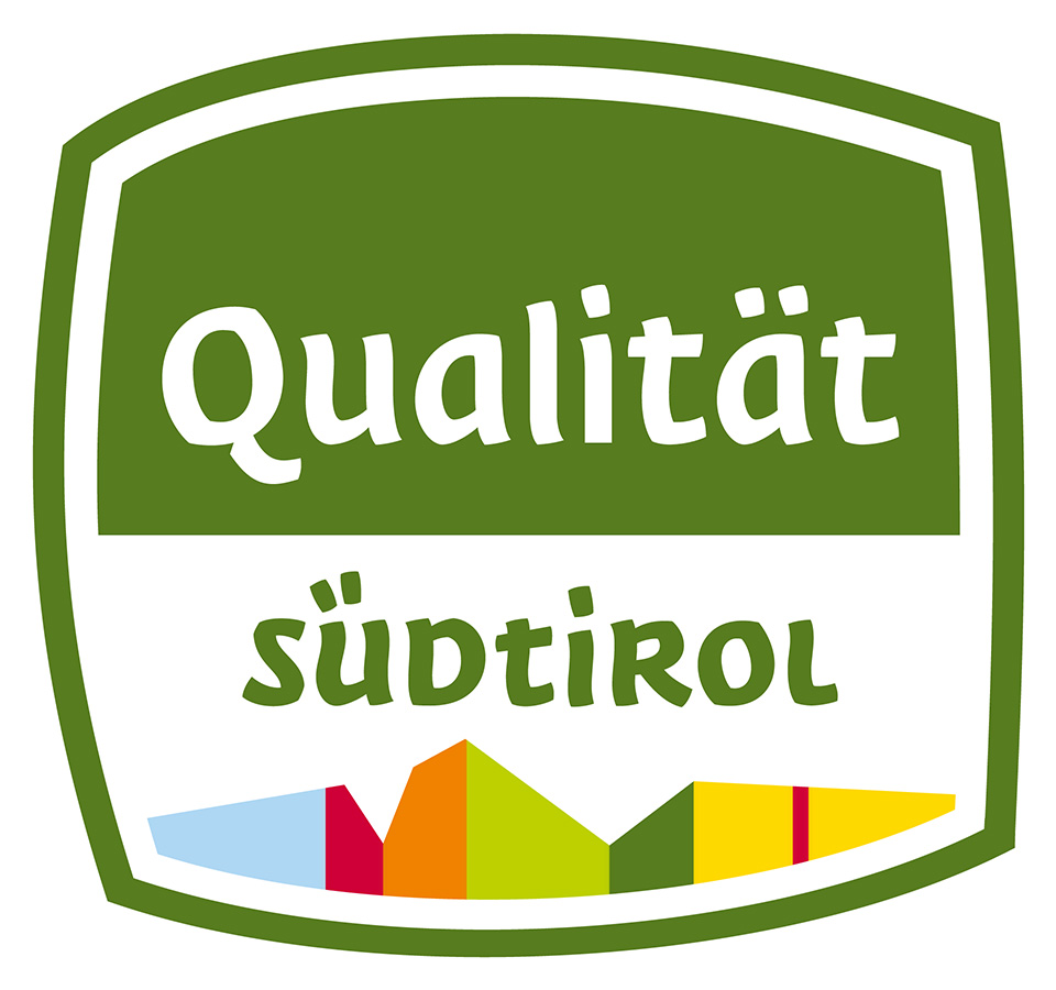
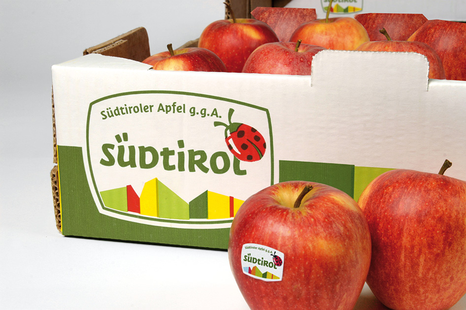
Seal of quality
The new South Tyrol seal of quality ensures product origin and quality. It identifies typical regional specialties and agricultural products and guarantees a higher level of quality than is required by the EU.
- c.
-
Basic Elements

A typeface for the region
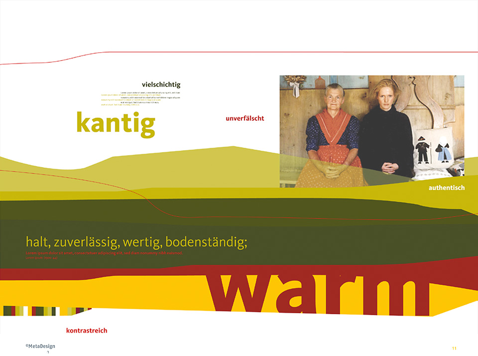
“Rough-hewn and heartfelt, like the land itself”— this is how South Tyroleans perceive their region.
A typeface was specially designed for South Tyrol to express these qualities. As part of the comprehensive branding process, the “Südtirol” font represents a central element in the new brand identity.
At an early stage in the umbrella brand project, MetaDesign had the idea of designing a high-quality, distinctive typeface for exclusive use by South Tyrol. The lively, handwritten style of Südtirol conveys energy and authenticity while consistently communicating the values of the new umbrella brand: heartfelt, rough-hewn, warm, and steeped in tradition. The typeface was inspired by Schwabacher, whose roots go back to the fifteenth century, and MetaDesign attempted to create a modern interpretation of this classic. Südtirol combines angular, rustic lines and a friendly modern overall impression. It optimally expresses the personality of South Tyrol and brings the region to life in all the media in which it is used.

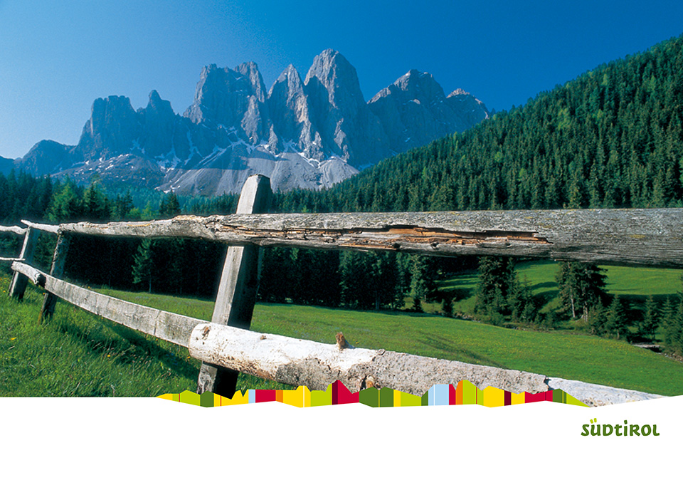
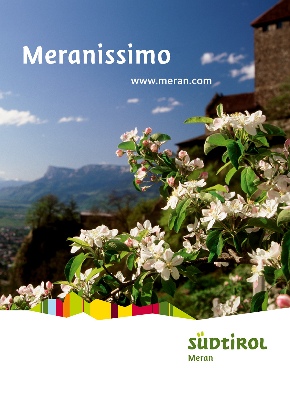
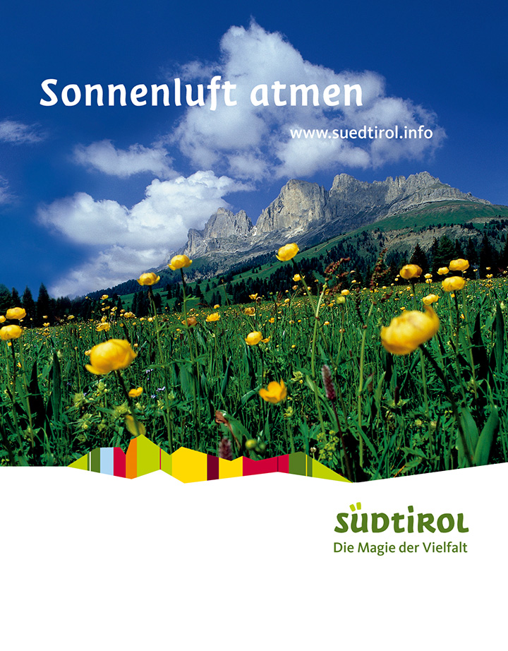
DESIGN ELEMENTS: THE SOUTH TYROL PANORAMA
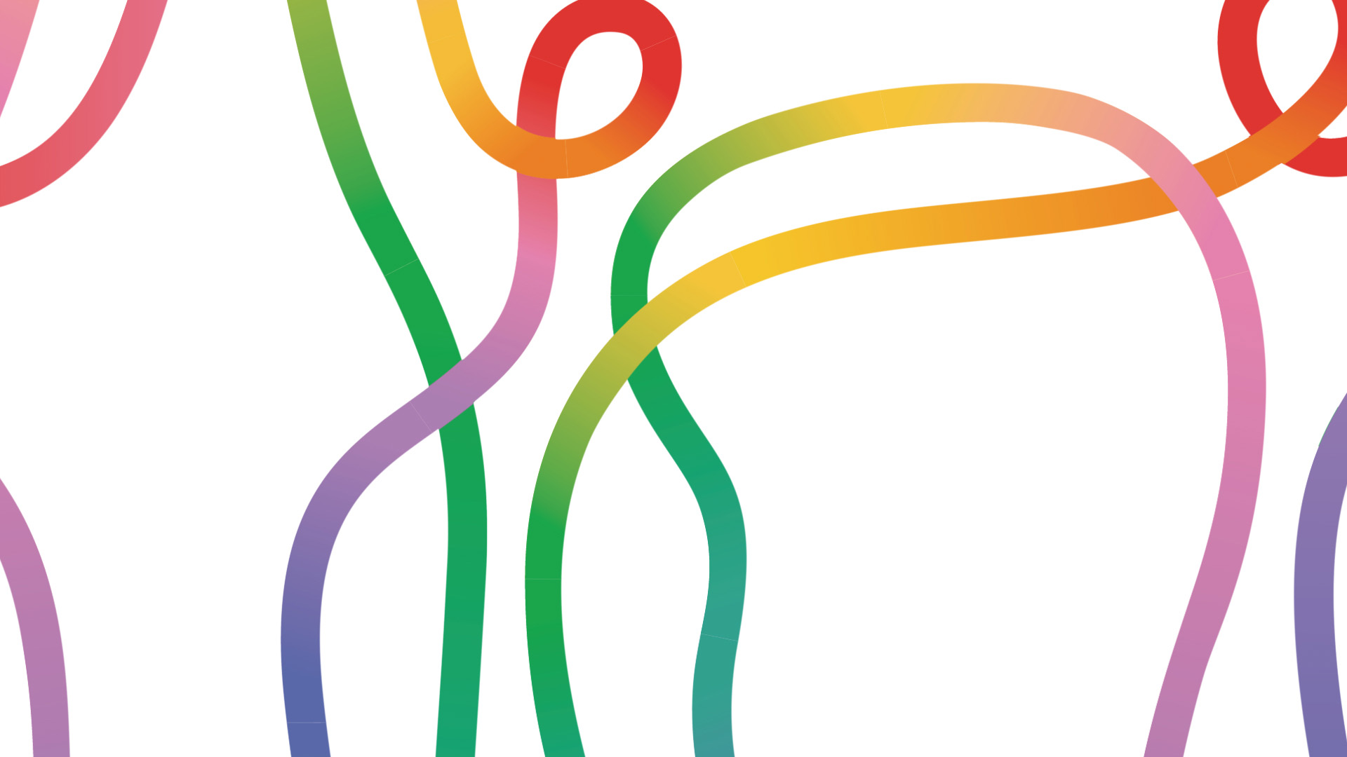
The unmistakable profile of the Dolomites inspired the “South Tyrol panorama.” Together with a color palette that captures the nuances of light and color in the region, the distinct shape of this central design element plays an important role in all brand applications.
Colors convey a mood or an emotional state much more effectively than any other element. A brand’s color palette mustn‘t be based solely on passing fads or personal tastes. It should follow logic and forge a link to brand values. The natural environment and diversity of South Tyrol are reflected in the color palette of the new umbrella brand.

↓

+

+

- Fixed application
- In the fixed application, the umbrella brand and the South Tyrol panorama form an inseparable unit.
- Modular application
- The visual identity of the South Tyrol umbrella brand is reflected in the modular application. It consists of the umbrella brand, the panorama and the Südtirol typeface.
- d.
-
Brand Identity Development
PRINT MEDIA
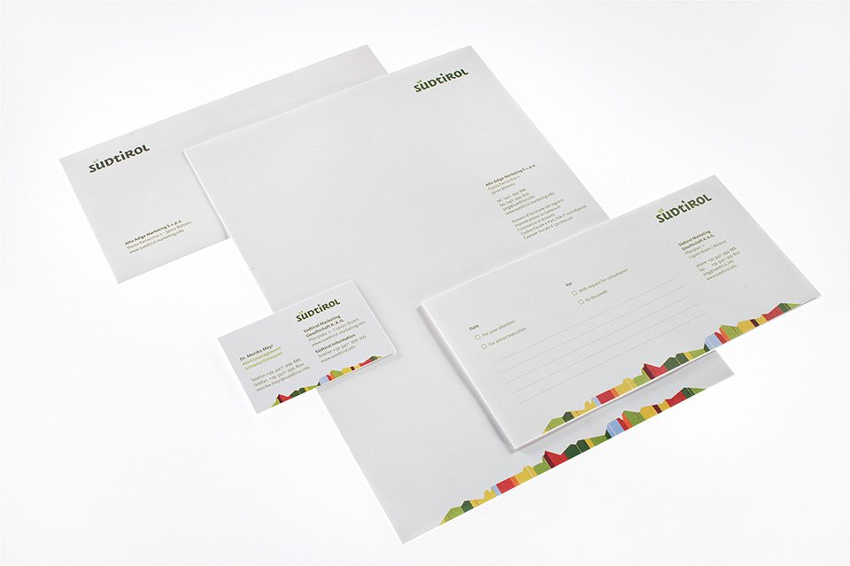
Print Media
Umbrella brand print media
When the umbrella brand was launched, various print media were produced to describe the new visual identity clearly and comprehensively. The entire process had to be transparent in order to ensure acceptance by the large, diverse target group.
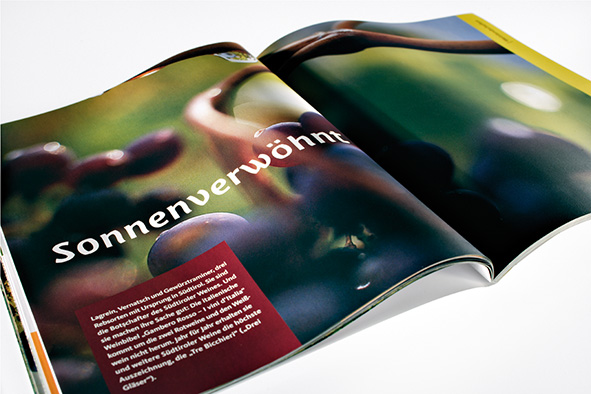
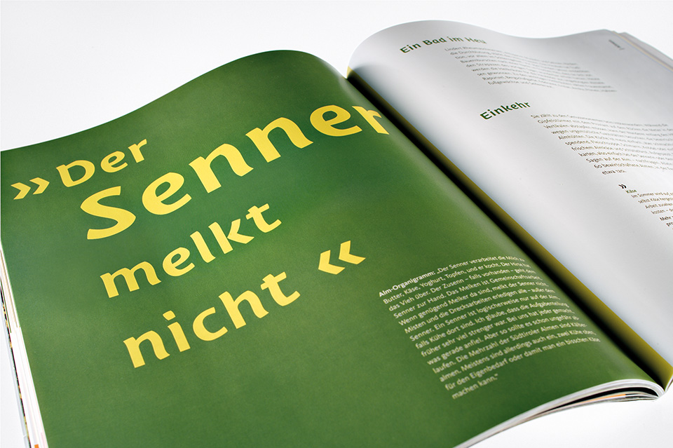
Print media for tourism
Active vacations and family holidays are not mutually exclusive in South Tyrol thanks to the region’s rich contrasts. Mountains and water, summer and winter, nature and culture—South Tyrol exerts a great fascination due to its great diversity.
The South Tyrolean hotel and restaurant industry is famous for its hospitality and outstanding quality. The umbrella brand, identifying the sender of the brand message, combines the region’s strengths and contributes to its success.
The design elements are used in a variety of media, and their different combinations produce a lively yet homogeneous brand image.
Products
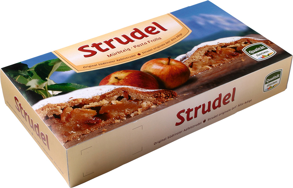
Agricultural products
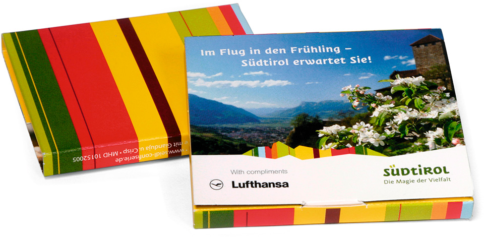
The South Tyrol umbrella brand makes a promise about origins, character and quality, a promise that unites tourism and agriculture under a single roof. It is setting standards for both other regions and the EU, and spearheading efforts to market regions and countries. The umbrella brand was also incorporated into a South Tyrol seal of quality, which allows existing brands to appear under a common roof without giving up their individual identities. At issue is not uniformity but a mutual image transfer by means of a visual framework and a common brand message.
By the end of 2005 the umbrella brand had been licensed to over 1,000 businesses.
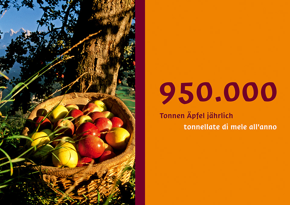
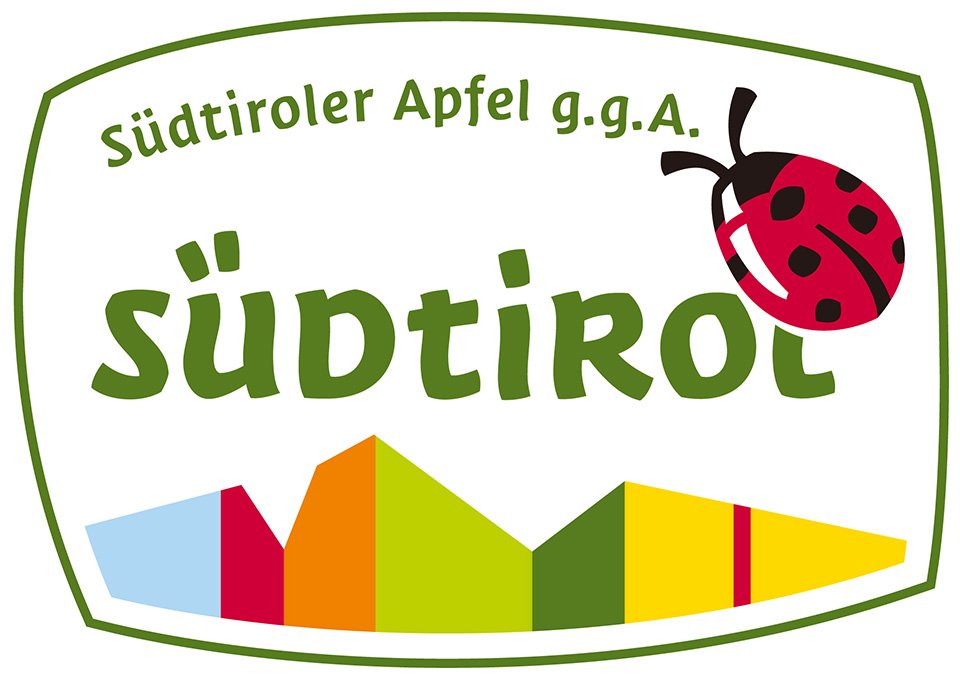
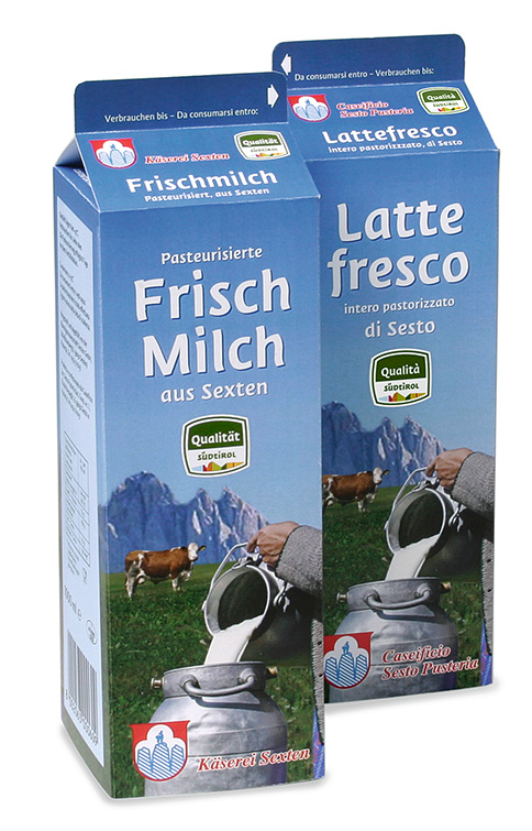
Nowadays, products and services are increasingly interchangeable, and the apple industry is no exception. Consumers are demanding transparency and reliability. With its branded apples, South Tyrol offers a guarantee of quality and origin. Displaying the name “South Tyrol” as a “protected geographical indication,” the apples enjoy special EU protection.
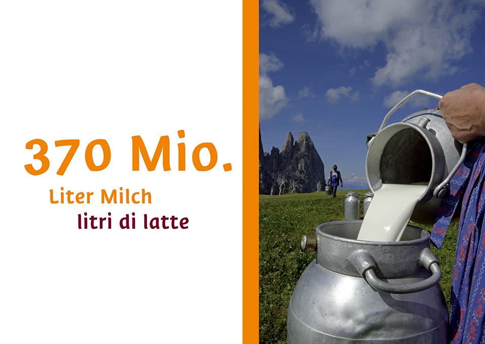
Is it any wonder that South Tyrol milk is a special pleasure? South Tyrolean cows lead an enviable life, breathing healthy mountain hair and grazing in succulent meadows. All of this is now ensured by the South Tyrol seal of quality, which appears on all the region’s dairy products, including milk, cheese and yogurt.
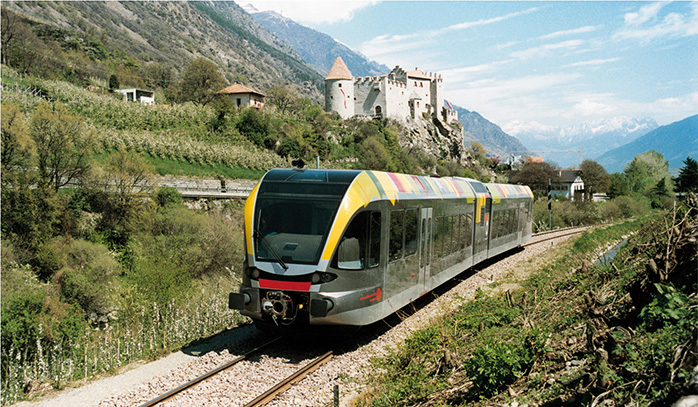
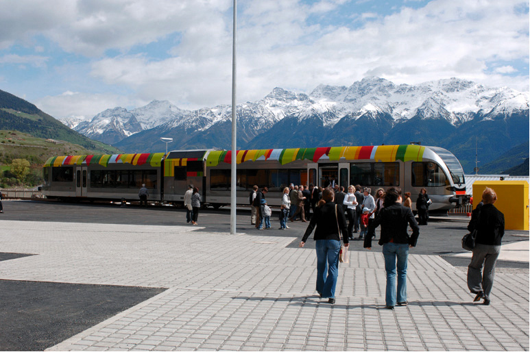
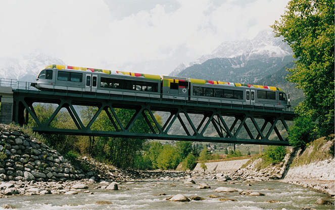
Vinschger railway line
The new Vinschger railway line began operation on May 5, 2005—or, more symbolically, on 5/5/05. But whereas the train may be new, the route looks back on a long tradition: nearly ninety-nine years earlier, on July 1, 1906, the great-great-grandfathers of today’s train enthusiasts stood beside the track or waved from the first train leaving Meran station for Mals.
The new brand identity is reflected in the train’s exterior design, which shows the pride and confidence people feel for the new visual presence.

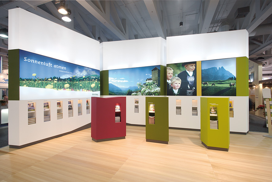
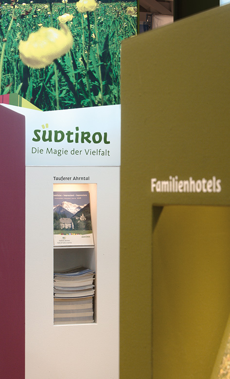
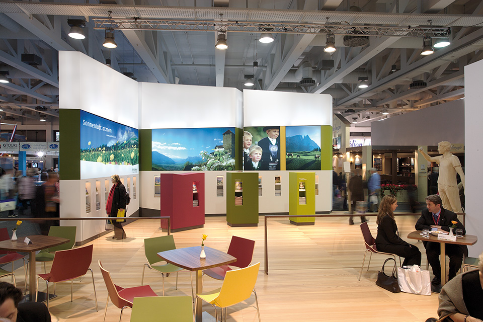
Trade Fair
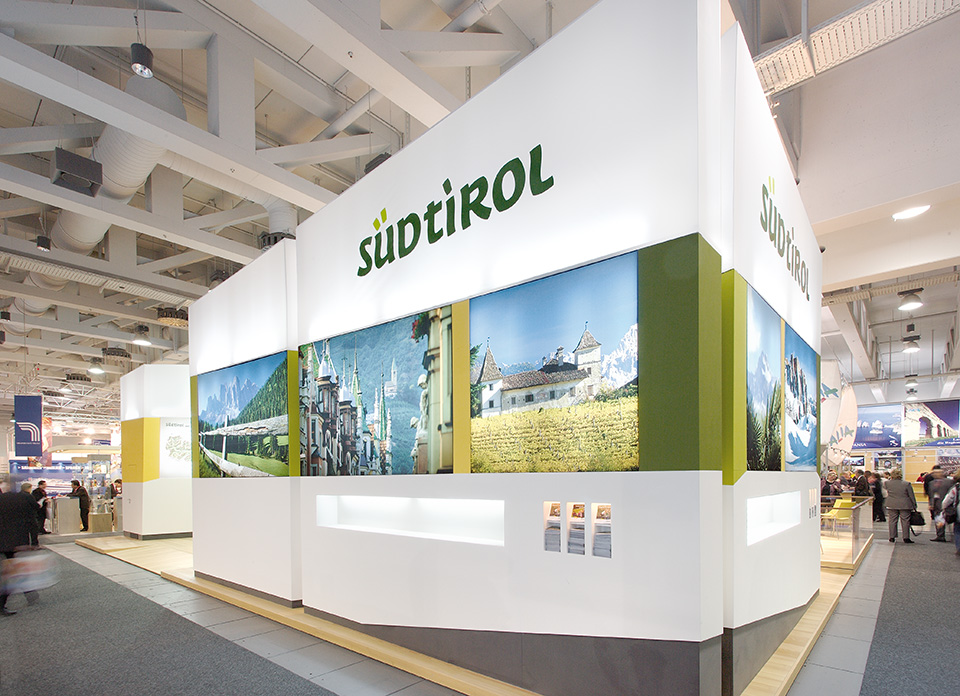
Trade Fair
Communication involves much more than tourist publications or comprehensive literature concepts. Trade fair stands, such as the one shown here at the ITB fair in Berlin, are also being “branded” with the region’s distinct new identity. The stands enable people to experience South Tyrol’s fresh color palette, timber smells and hospitality well beyond its borders.
Electronic Media
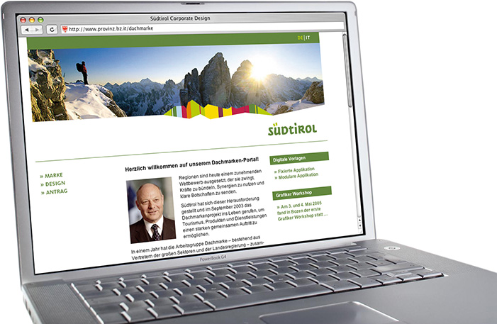
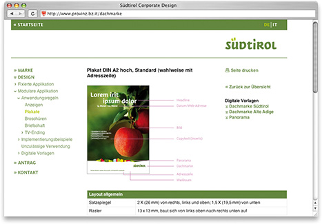
The umbrella brand portal at www.provinz.bz.it/dachmarke clearly describes how the brand evolved. Interested parties can gather information on all aspects of the process and view the high-quality results. The portal is a central element in
the communications campaign to launch the
new brand.
The brand portal also makes available all important design guidelines as downloads, as well as extensive information on the implementation of corporate design. Roughly 90 visitors use its content offerings each day, and by the end of 2005 a total of roughly 30,000 people had visited the site.
Results
- The new umbrella brand has been available since January 1, 2005, at www.provinz.bz.it/ dachmarke. By the end of 2005, it was licensed to over 1,000 companies and organizations.
- In the same period, the brand portal received over 30,000 visitors, or about 90 a day.
- In November 2005, the new seal of quality was approved by the EU.
- Implementation is currently underway in the sectors.
- Since 2006, the first products have been available on store shelves.
in germany the shared visual identity was honored with the if communication award 2005.
In italy, the tv commercial won the respected advertising award grand prix della pubblicità 2005.