Branding paradigm

10

Danske Bank Group

Financial Professionals Dedicated to Supporting Everyday Lives

Pictures from WorldBranding

Danske Bank was formed through the merger of three Danish banks along with institutions from Norway and Sweden, making it one of the most powerful banking groups in the Nordic region.

Following the merger, the group faced brand confusion at the retail level. In response, existing brand values within the group were reassessed, and a new conceptual foundation was established — centred on “contemporary Nordic sensibilities” and “simplicity.”
Rather than aiming to stand out conspicuously in the urban landscape, the bank embraced a more understated role: that of a financial professional quietly supporting the everyday lives of individuals — a trusted, behind-the-scenes presence.

a.

A new standard for branding projects

After a period of powerful growth and an increase in consolidation activities, Denmark’s largest financial company, the Danske Bank Group, faced a number of branding challenges. This growth had resulted in a muddled expression and confusion about what the Group stood for. Senior management decided to initiate a branding project to create a coherent identity that could link the different business segments together. The purpose of the project was to clarify the position of the Group in the market and to create a well-planned brand architecture.

Kontrapunkt, the leading design agency in Denmark, worked closely with the Danske Bank Group to design a clear concept for repositioning the Danske Bank brand. A unique naming system was developed and a visual identity programme created that made it possible to give the entire organisation and all its branches a unified appearance, while at the same time allowing the individual companies in the Group to keep their distinctive characteristics.

The branding project has attracted international attention for its consistency and creativity and is often cited as one of the most successful Nordic corporate branding projects. It has set a new standard for the branding of major companies and institutions.

A market characterised by intense consolidation

The Nordic banking world sector was in a state of intense consolidation throughout the 1980s and 1990s. Danske Bank as we know it today is the result of a merger in 1990 between three Danish banks: Den Danske Bank af 1871, Kjøbenhavns Handelsbank and Provinsbanken. Most recently, Danske Bank has expanded through mergers with the Norwegian Fokus Bank, the Swedish Östgöta Enskilda Bank and the mortgage bank Real Danmark.

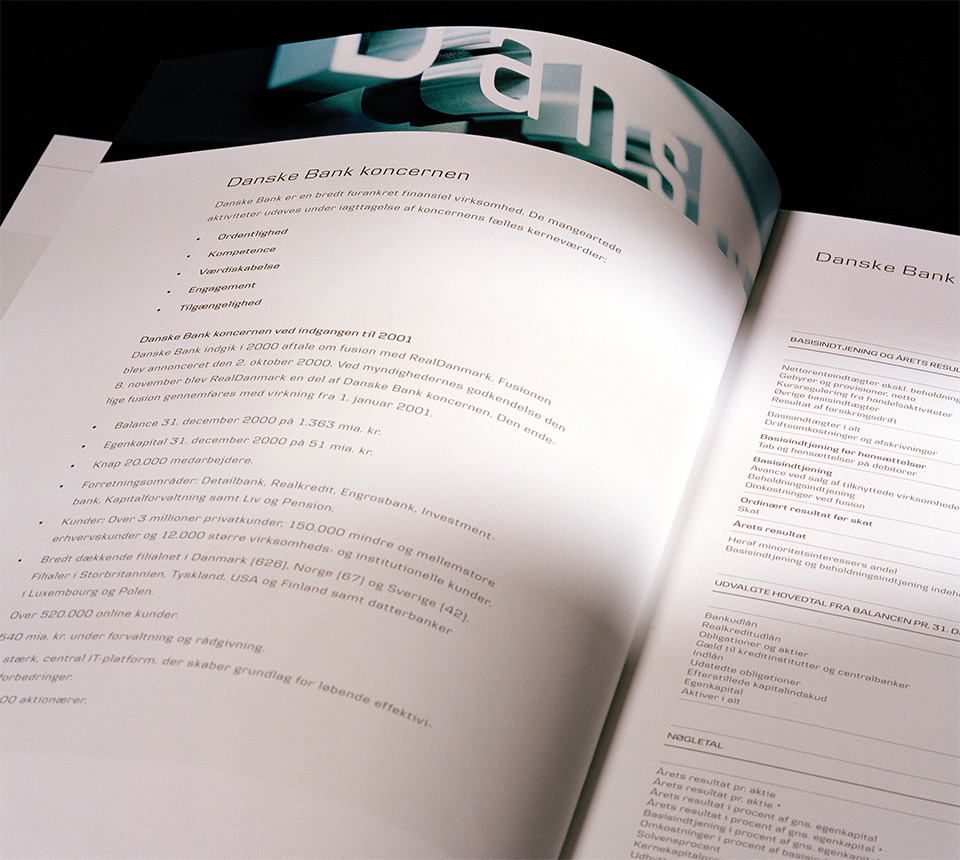
Today, the Danske Bank Group serves over three million private customers and a large portion of the business, industry, public and institutional clients in the Nordic countries. With its approximately 20,000 employees and the largest number of branches in Denmark, more than 60 branches in Norway and about 50 branches in Sweden, Danske Bank is one of the most significant financial groups in the Nordic countries.

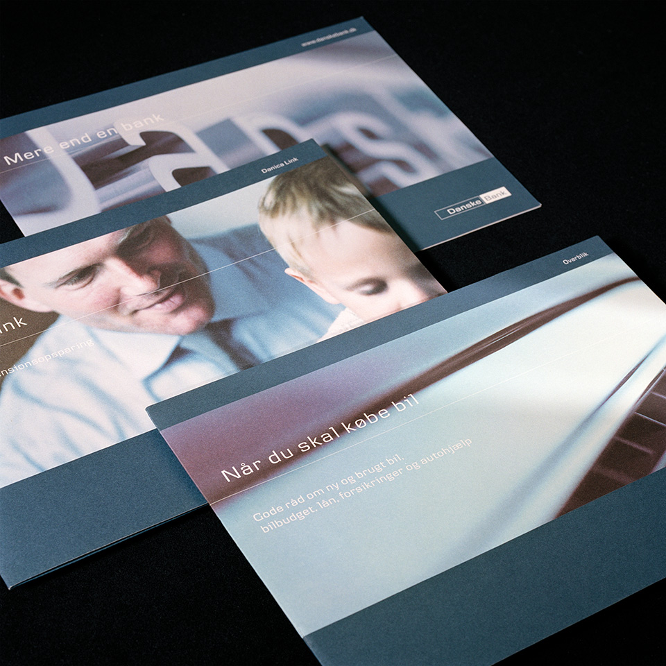
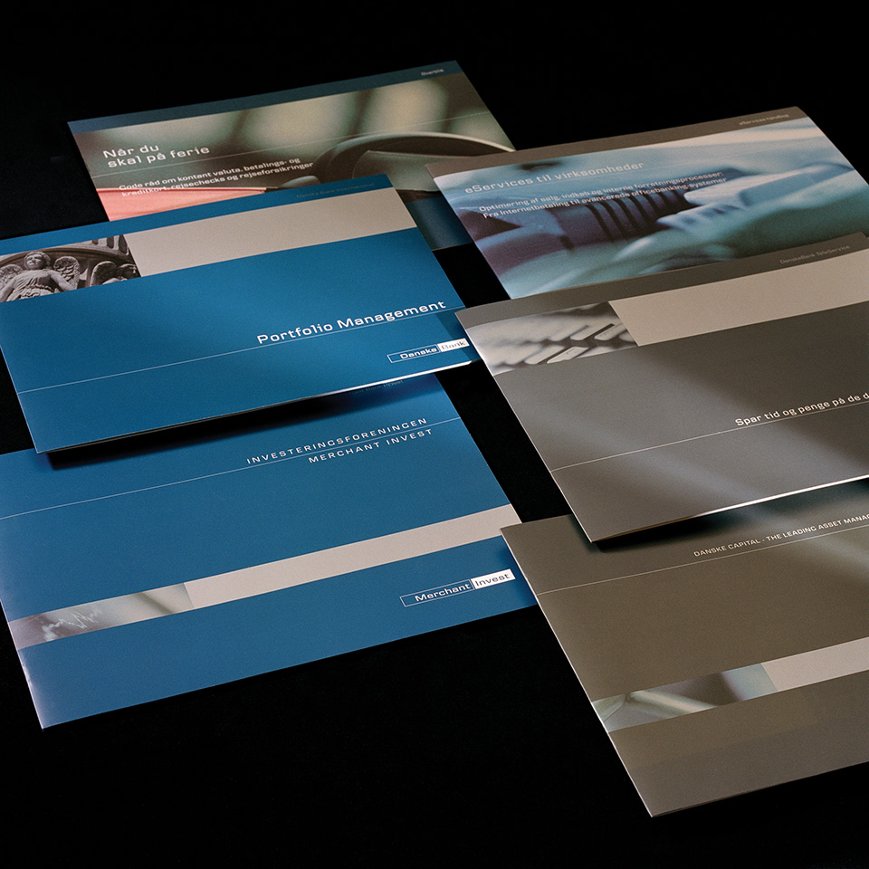
The branding project was initiated after Danske Bank merged with Fokus Bank and Östgöta Enskilda Bank. At that time, the Group did not project an image of a unified organisation and its appearance was incoherent and out of date. To achieve a stronger market position, the Group decided to create one brand for the entire Group, including all companies and areas of activity. The goal was to harmonise and modernise the Group’s appearance and to present all stakeholders in the bank’s markets with a coherent expression in all communications and all types of media.

Finding, not inventing values

The branding project began with an internal value clarification process. The Group refined a set of values that formed the basis for the branding initiative and that served to position the Group in the financial market. The values – integrity, commitment, accessibility, expertise and value creation – were to be reflected in both internal and external communication. That way they would contribute to ensuring a distinct correlation between the actual behaviour of the bank and the promises the bank makes to the outside world – between the Group’s identity and its brand.

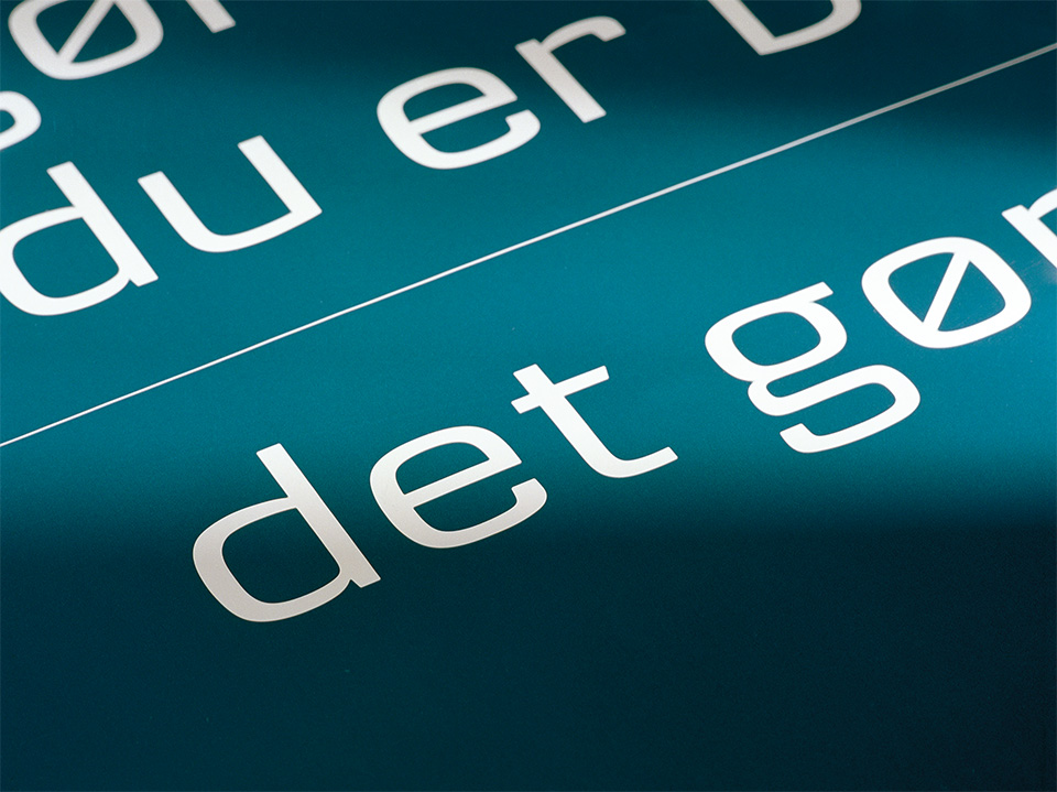
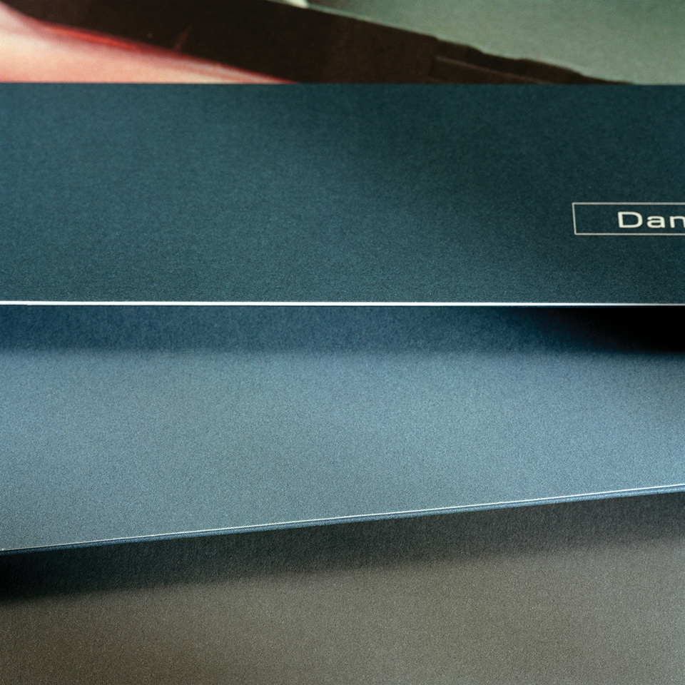
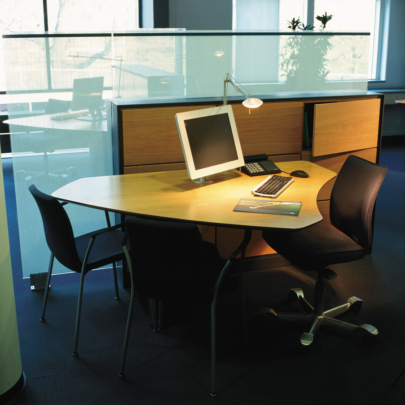
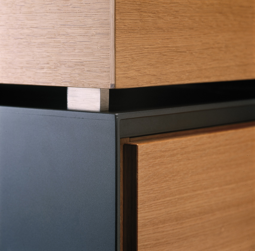
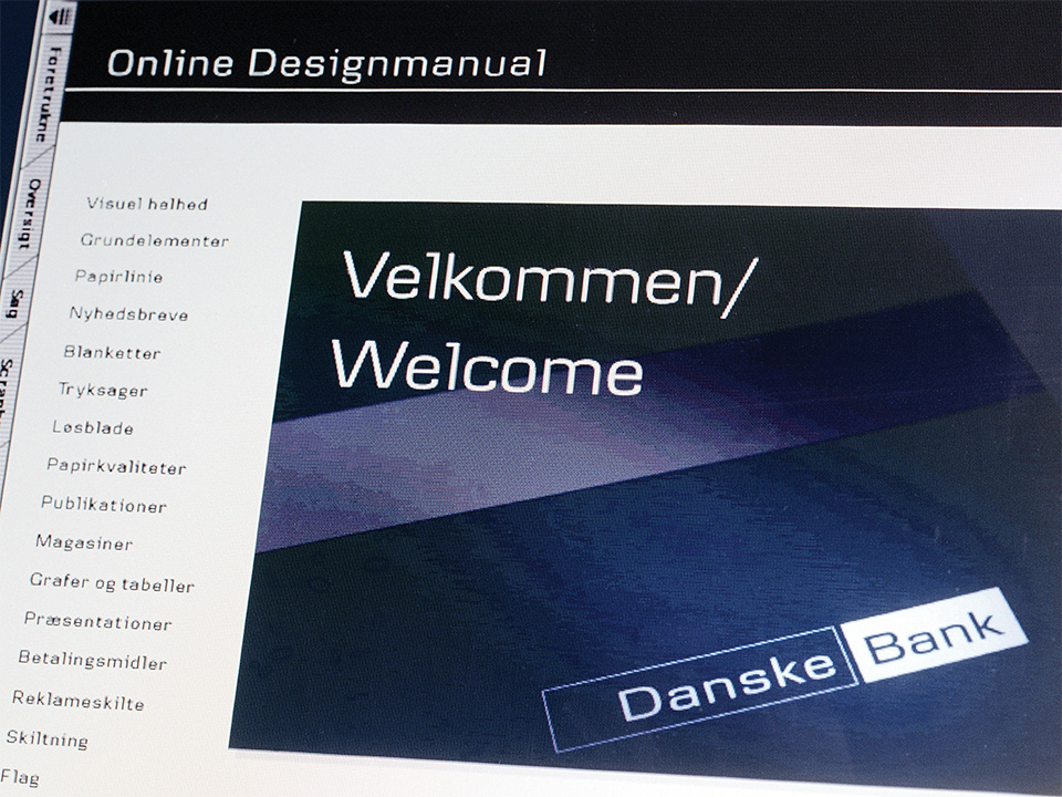
As a supplement to the values, Kontrapunkt and Danske Bank developed a core concept – simplicity – to act as the measuring point for the development of the bank’s visual identity. Every single design element developed for the Group has been held up against the desire for simplicity. In this way, the overall core concept has ensured coherence and unity in the brand.

A modern nordic expression

After the market position and the overall brand architecture was in place, the design programme was developed.

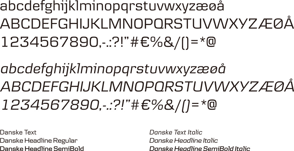
The collaboration between the bank and Kontrapunkt has been characterised by a very high level of ambition, which is reflected in several of the design solutions – the brand includes all of the Group’s focus areas, which are thoroughly and carefully prepared down to the smallest detail.

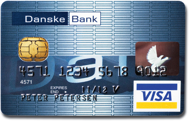
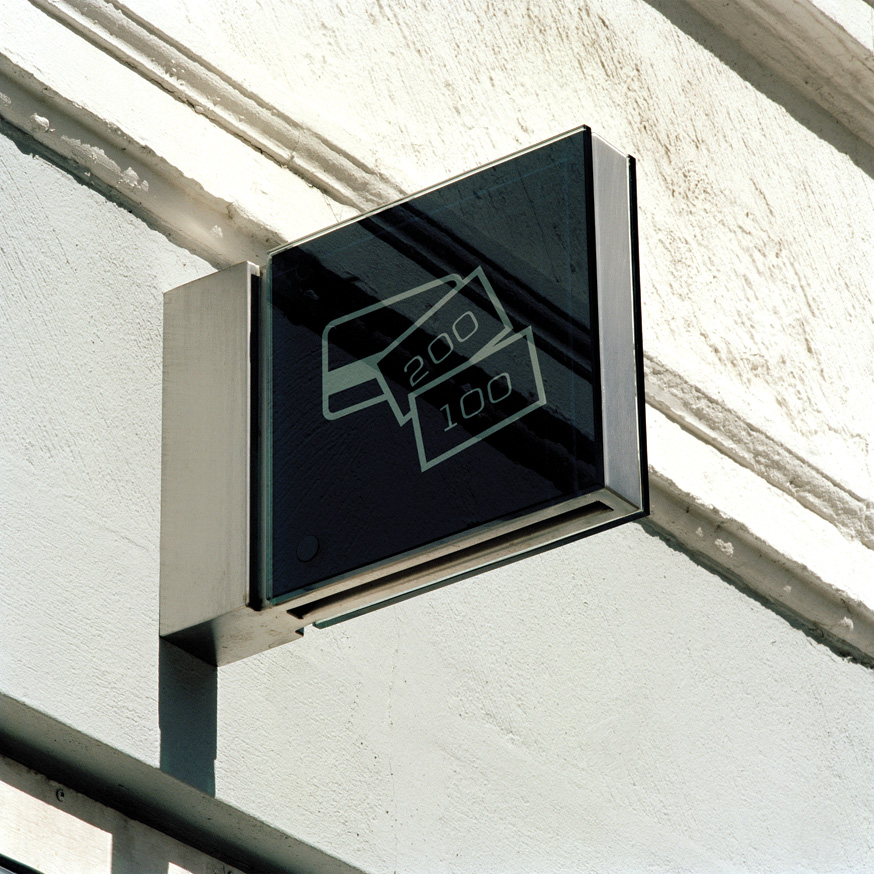
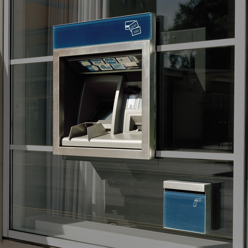
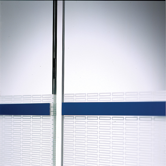
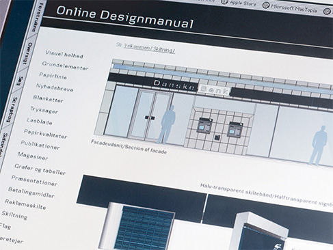
The Nordic foundation was important because the Group’s principal activities are Nordic. In addition to this, inspiration came from various means of payment – bank notes, cheques and credit cards – which have contributed a horizontal artistic idiom to the design.

The result is a simple Nordic and modern design with a classic quality that can represent the Group for many years to come.

The brand must be observed

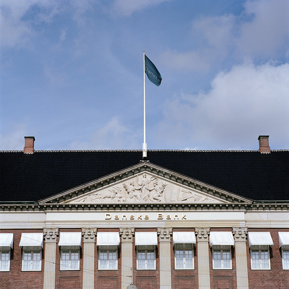
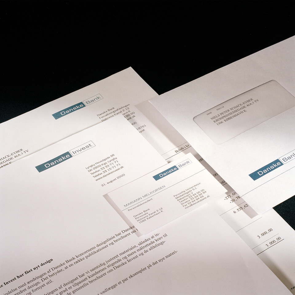
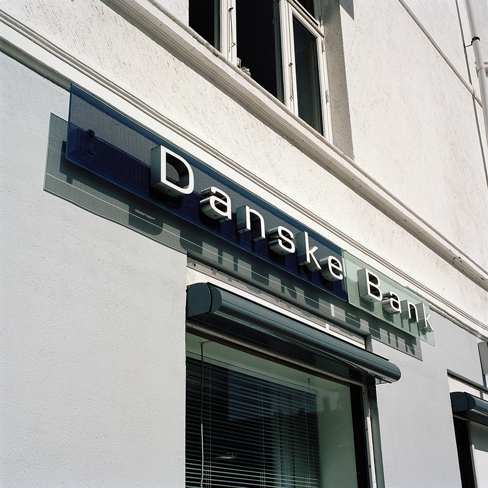
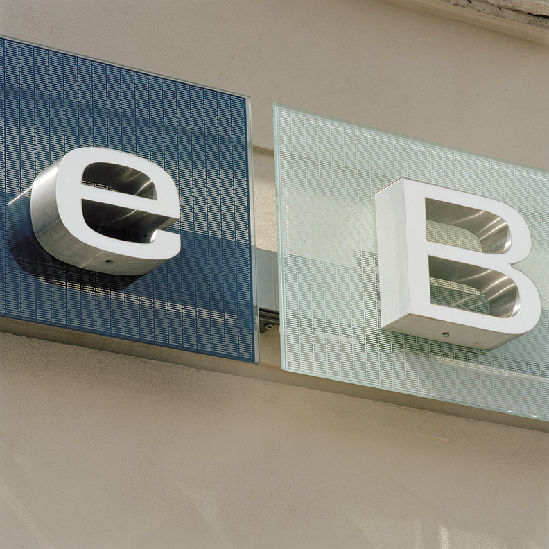
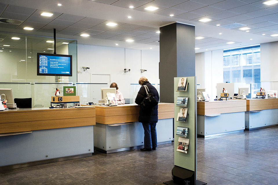
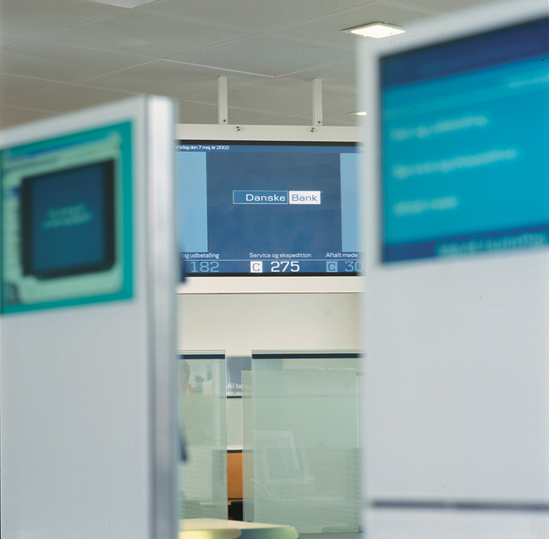
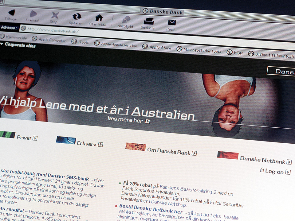
In autumn 2000, practically from one day to the next, customers were presented with Danske Bank’s new look.

In the branches, all material with the old design was replaced in one day with printed material in the new design. From that same day, all customers received redesigned correspondence from the bank. The old facade signs were taken down and the new signs put up immediately. After a month, all the facades had been replaced. The bank’s communications – advertisements, PR material and campaigns – helped to underpin the change from the old design to the new, modern and coherent brand under the slogan “Do what you’re best at – we do”.

The design was initially introduced in Denmark, and subsequently in Sweden and Norway.

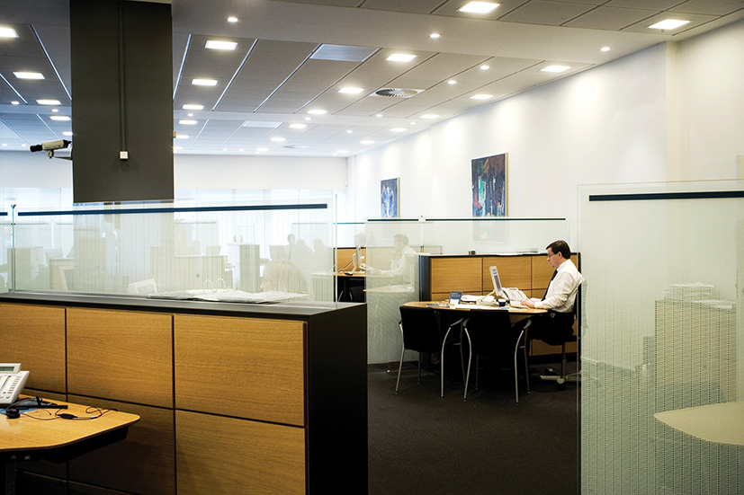
A new design and new communications are, however, far from enough to create a strong brand. The employees must also live up to what the brand promises. The bank’s set of values has therefore become a concrete tool for maintenance, development and quality improvement of the bank’s work. The set of values has been put into practice through a set of measuring points for each value, thus acting as an active management tool for both the management and employees. This has helped to ensure that the Danske Bank brand is observed both internally and externally.

The world knows what this bank stands for

Branding has meant that the bank today projects a simple and straightforward profile that distinctly reflects the essence of the bank and its areas of activity.

All of the bank’s communications have become stronger and the messages clearer and more coherent. The culture has been strengthened throughout the organisation, as present employees know their workplace better and new employees can be recruited based on a more proactive and clarified image of the bank. Current and potential customers of the bank now also know what the Group stands for.

革新的なBrand architecture

Assisted by the values and the core concept, Danske Bank established a brand architecture that could systematise the Group’s large number of companies and products. It was important to create a single visual entity across all of the markets in which the Group operates, while at the same time maintaining the local anchoring in Sweden and Norway.
Danske Bank adopted an innovative and flexible brand architecture that made it possible to include the various company names in the same visual concept – the company and product name might change, but the design and colour remained the same.
This high degree of flexibility gives the architecture and the visual expression a timeless quality. Names can be changed and new ones can easily be added to the current structure without having to make changes to the design.
More than 50 different logos have been designed for the bank, each of which is available in four variations – thus the brand architecture consists of more than 200 logos.

The logo design system is recognisable at all levels – vertically within the corporation as well as horizontally between national borders

Danske Bank - Brand Architecture

Masterbrand
Examples of operating companies, retail
Denmark
Sweden
Norway
Ireland
Examples of subsidiaries and divisions
Denmark
Norway
Ireland
Products
b.

Danske – a unique typography

A unique typography for the Danske Bank Group, called Danske, has been developed. The typo­graphy is an essential identity-bearing element in the visual presence of the entire Group and is a stringent and relatively easy way for the bank to differentiate itself visually from other players in the market.

Danske, which represents an entire font family, expresses the fundamental concept of the entire design programme by virtue of its simplicity, its horizontal design and its subdued and timeless expression.

The typography is used throughout the Group, thereby ensuring visual coherence and unity.
Danske brings identity and ownership to all of the bank’s written messages and is a refined way to brand the Group – even in cases where the Danske Bank logo does not appear.

Identifying photos

A distinctive and common photo style has been developed for Danske Bank.

The photo style focuses on simple, graphic photos with content that can be quickly decoded. The photos are very detailed and portray a story or emotion precisely. The cool Nordic tones dominate all of the Group’s photos and add identity and recognisability to all of the visual material produced in the bank.

To maintain the photo style, a photo brief has been developed for use by photographers, which correlates photo techniques with the values of the bank, and acts as a guide every time a new photo is taken for use in the bank’s communications.

Horizontal line – a recurring design element

A thin horizontal line is used as a characteristic design element in a large portion of the bank’s overall design and communications. In addition to emphasising the horizontal design, the line is used as a highly active element in the bank’s mass communications, typically in association with texts where the line naturally separates the bank’s messages into a heading and subheading.
In this way, the line becomes an easy way to add a sense of order to the bank’s messages, the end result being a distinct and consistent appearance.

Classic colour scheme

The primary colour of the Danske Bank Group is blue. An important aspect of the development of the new visual identity has been to maintain the existing goodwill of the customers and employees. To this end, the blue colour scheme ensures a certain amount of affiliation to the original visual identity of the bank, though today in a light and modern expression.

The new blue colour is used for all of the Group’s logos and appears throughout the design programme – especially in communications to the bank’s private customers. A grey colour scheme has been established for the bank’s business customers.

Various publications with the unique picture style of Danske Bank

Different shades of the blue colour in print

c.

Touch point

Printed Media

Simplicity and functionality in the printed media

The bank has established guidelines for all of its printed material – stationery, forms, magazines, publications, brochures, etc.

The greatest challenge in the design of a very large number of printed items has been to ensure a uniform expression while at the same time taking into consideration the extensive technical restrictions of the bank’s printing systems.

Another essential task has been to rationalise and improve functionality in all customer-oriented materials. Printed items have been made simpler and more user-friendly to give customers an overview of the bank, thus making it easier to use the bank’s services and offers.

The printed blue colour is used when addressing private customers whereas the grey colour is used for business customers

Examples of the Danske Bank stationery

The corporate pattern of rectangles is used on credit cards

ONE OF DENMARK’S MOST EXTENSIVE SIGNAGE PROGRAMMES

An important element in the Danske Bank Group’s design programme is the signage of their entire network of branches in Denmark, Sweden and Norway, incorporating simple, subdued signage that makes use of exclusive materials.

The extensive signage programme includes elements such as sign bands, projection signs, cash signs, cash dispensers, receipt bins and door handles.

In association with signage, a new decoration concept was also developed for the front windows of the branches – everything the customer meets on his or her way into the branch is thus an important part of the signage programme.

Exclusive materials were chosen for the signs – glass in combination with steel and aluminium – which underpin the exclusive and subdued aspects and ensure that the signs do not change character with time.

The choice of glass has anchored the bank’s signage programme in a classic signage tradition but with a modern expression.

The transparency of the glass makes it possible to mark the entire storefront of the branch with a sign band – without the sign band carving the front into two parts. In this way, the signs incorporate naturally with the bank’s buildings and street life in general.

From traditional branch to modern banking store

ダンスクバンクは、現代的な銀行のあり方を視覚的にも空間的にも再定義した。ダンスクバンク・グループの各支店には、全く新しいコンセプトのInterior designが採用され、国境や支店組織を超えて機能するバンキング・ストアとなった。また、銀行と顧客の関係をより良いものにすることに焦点が当てられた。顧客とその顧客の応対をする銀行員との間でコミュニケーションが強化されるようにと詳細にまで気を配られた、開放的な環境が創り出された。

This has resulted in, among other things, a changed flow in the branches; new zones and service elements have been introduced. Self-service, product and service zones are areas where the customer can actively obtain information about all of the bank’s services and offers. At the same time, the traditional counter has been replaced by a so-called service point, a free-standing table that makes it easier for the bank employee to meet the customer on the customer’s own terms.

新しいInterior designのコンセプトのなかでもうひとつ重要なことは、新しくコンサルティングテーブルを設けたことである。銀行員がカウンター越しに顧客と応対する従来の方式に替わって、リラックスしながら信頼関係を持って話しができる空間が生まれた。

The interior materials form the same horizontal lines that characterise the rest of the design programme
The corporate pattern decorates the semi-transparent glass wall, which shields off customer rooms for private conversations.
The corporate pattern is based on the logo form

Electronic Media

Electronic design manual – a dynamic tool

In addition to developing the design concept and providing advice in connection with the development of Danske Bank’s website, Kontrapunkt has developed an extensive electronic design manual that gathers and communicates all guidelines on the use of the Danske Bank Group’s design programme.

The electronic manual gives the bank’s employees and cooperative partners access to a dynamic and simple tool that can be updated easily and is relatively cost free, thereby helping to ensure optimal use of the design in the future.

Danske Bank’s electronic design manual received special attention in connection with the Danske Design Prize 2001 for its functionality and high degree of practicability. These characteristics mean that the manual will become an important catalyst for the use of Danske Bank’s new design. To this day, the bank’s visual expression is consistent and in accordance with the ideas behind the design of the Danske Bank

現在、ブラウザの拡大・縮小機能を利用中です。
アクサムのサイトエクスペリエンスのために、拡大・縮小をオフにすることをおすすめします。

×