CHAT NOIR
Brand Development Marking the 50th Anniversary:
Proposing a Lifestyle Enriched by Café Culture
Company Profile
Chat Noir Co., Ltd.
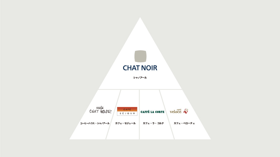
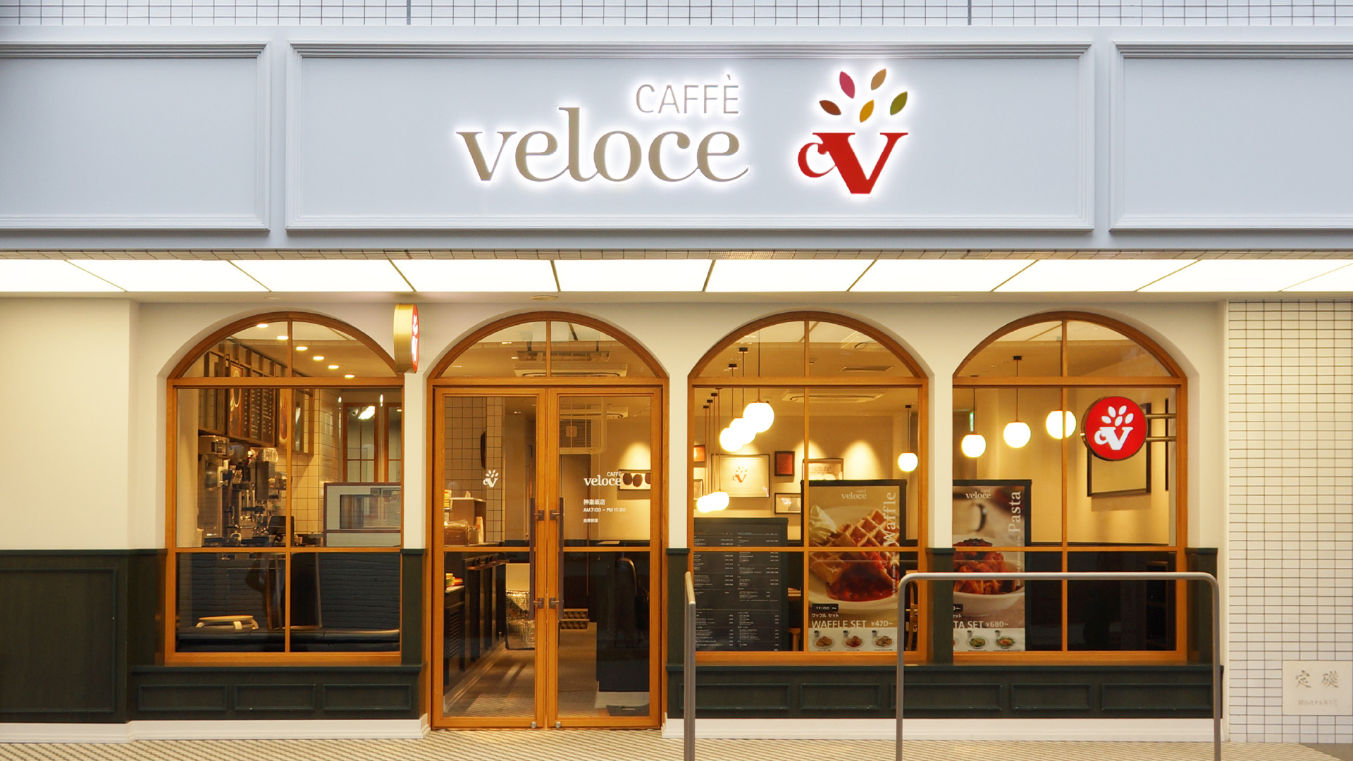
Operator of the café chain Caffé Veloce, Chat Noir Co., Ltd. was known for its strong presence in the café industry. In 2021, the company transitioned to C-United Inc., with a renewed focus on the coffee business.
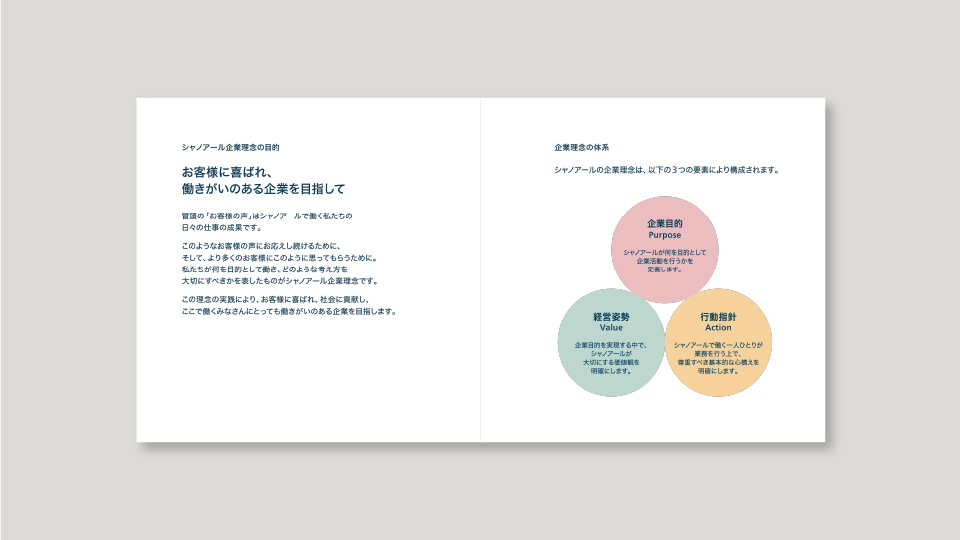
In response to the increasingly competitive café industry, marked by a surge in new market entrants, Chat Noir undertook a comprehensive review of its business in 2015, coinciding with its 50th anniversary. As part of this strategic shift, the company launched a corporate branding initiative alongside the rebranding of its flagship café chain, Caffé Veloce.
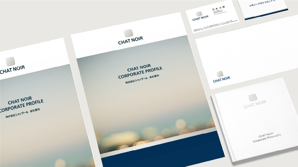
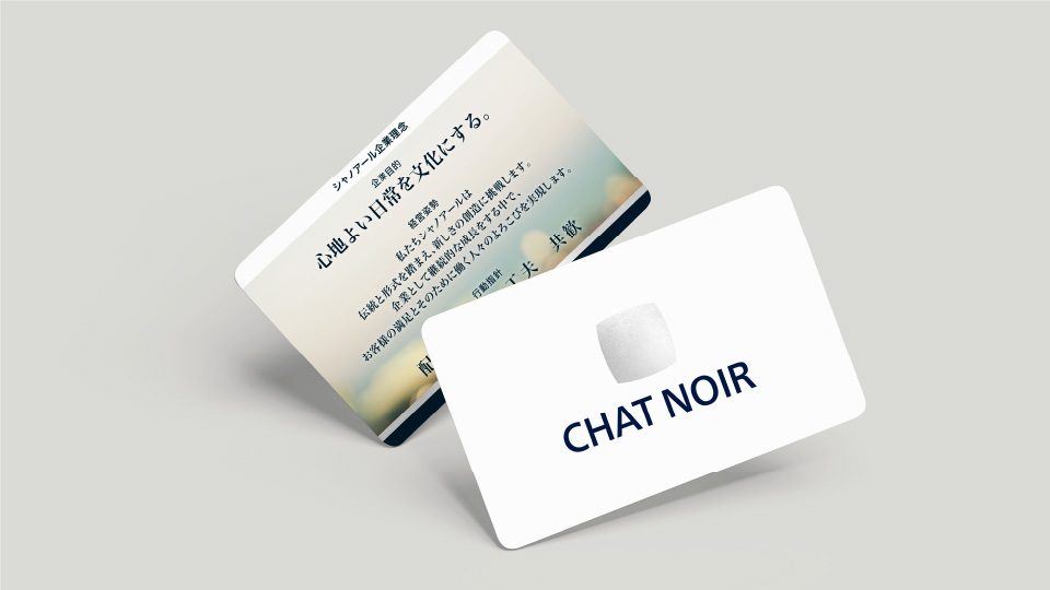
The corporate branding programme involved revisiting the company’s core philosophy, developing a new corporate logo, and implementing an internal engagement plan. These efforts were positioned not merely as design updates, but as a strategic transformation aimed at driving change across the entire organisation.
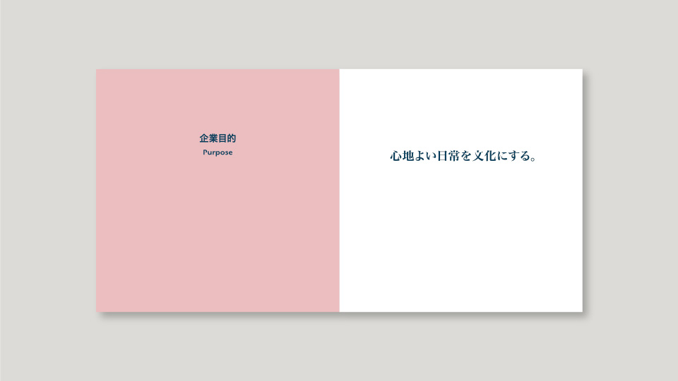
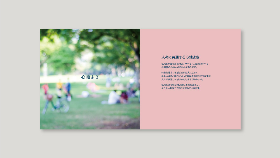
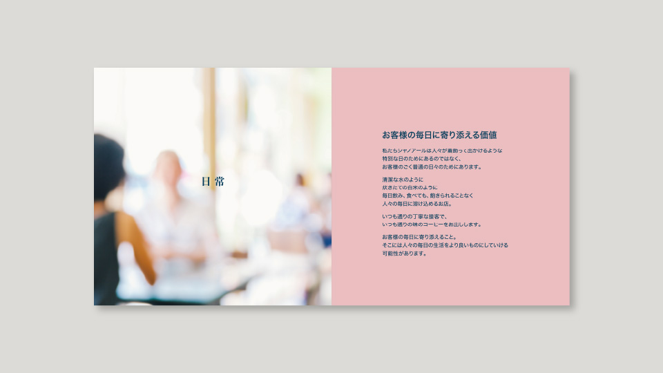
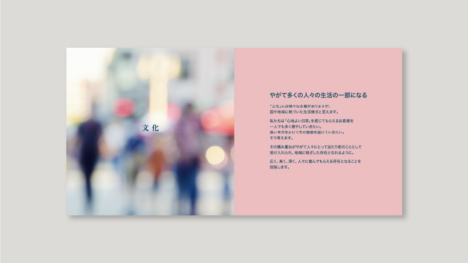
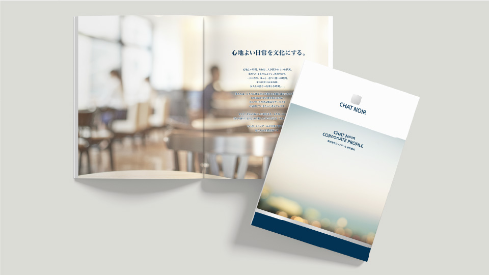
To visually express its new corporate philosophy — “Turning Comfort into Culture” —
Chat Noir revisited its cultural foundations, rooted in the long-standing ambition to bring the rich café culture of Europe into everyday life in Japan. Building upon this legacy, the company established a new corporate vision and introduced a renewed logo and design system that embodies its values and aspirations.
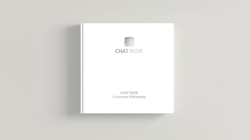
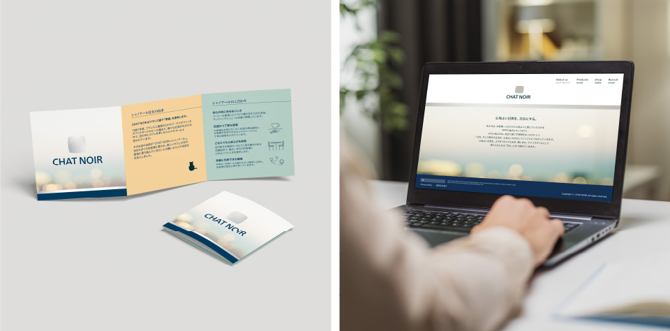
This transformation extended beyond visual identity. The initiative included the development of brand applications and internal tools such as a concept book and employee engagement programmes, all aimed at aligning internal mindset with the new philosophy. The project was strategically positioned as a company-wide change initiative to drive long-term cultural and organisational transformation.
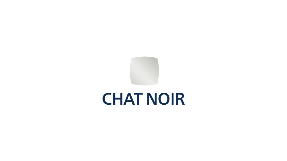
Logo Design Concept:
To embody the company’s ethos of embracing tradition and form while striving for innovation, the logo combines a square — representing tradition and structure — with a circle, symbolising freedom and comfort. The colour silver was chosen to represent the company’s aspiration to continually create something new.