SEIYU
Branding and Spatial Design for a New-Style Japanese Supermarket
Company Profile
Seiyu Co., Ltd.
A nationwide supermarket chain in Japan, operating 254 stores across the country.

Branding and Spatial Design for a New-Style Japanese Supermarket
A nationwide supermarket chain in Japan, operating 254 stores across the country.
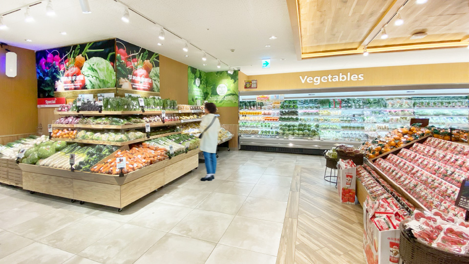
In 2021, SEIYU transitioned to a new management structure after exiting the ownership of Walmart. During the Walmart era, the focus on low prices and operational efficiency had led to a decline in customer loyalty. In response, SEIYU launched a rebranding and spatial design project aimed at redefining itself as a new-style Japanese supermarket.
Under Walmart’s ownership, SEIYU pursued a strict EDLP (Everyday Low Price) strategy, prioritising low prices and operational efficiency. However, this approach led to a loss of loyalty among Japanese consumers who valued quality. Additionally, SEIYU’s unique image as a customer-oriented brand—once known for offering what is now “MUJI” as a private-label line—had faded over time. The challenge was to re-examine SEIYU’s identity as a leader in Japanese supermarket retail, envision a renewed brand direction, and deliver that value through an enhanced customer experience in-store.
A cross-functional team led by next-generation leaders was formed, holding weekly workshops to reassess SEIYU’s core values and define the kind of value a new prototype store should deliver. The team explored what SEIYU could offer as a modern Japanese supermarket.
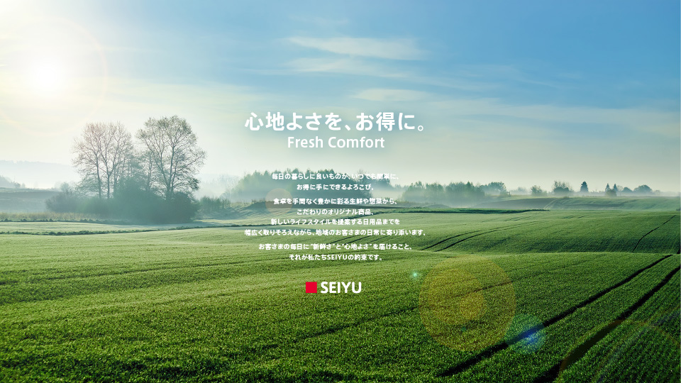
Through this process, SEIYU's distinctive qualities were refined into a clear brand concept:
“Fresh Comfort – Everyday essentials with quality and value, delivered simply and affordably.”
This concept expresses SEIYU’s commitment to enriching daily life by offering a wide range of fresh produce, ready-to-eat meals, exclusive private-label products, and lifestyle goods—balancing quality and price while remaining close to local communities and their everyday needs.
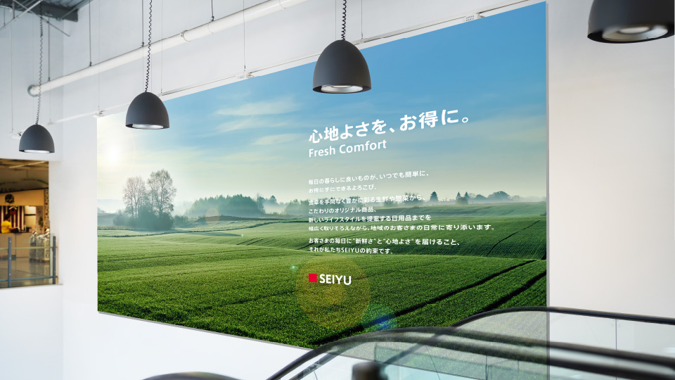
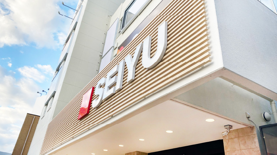
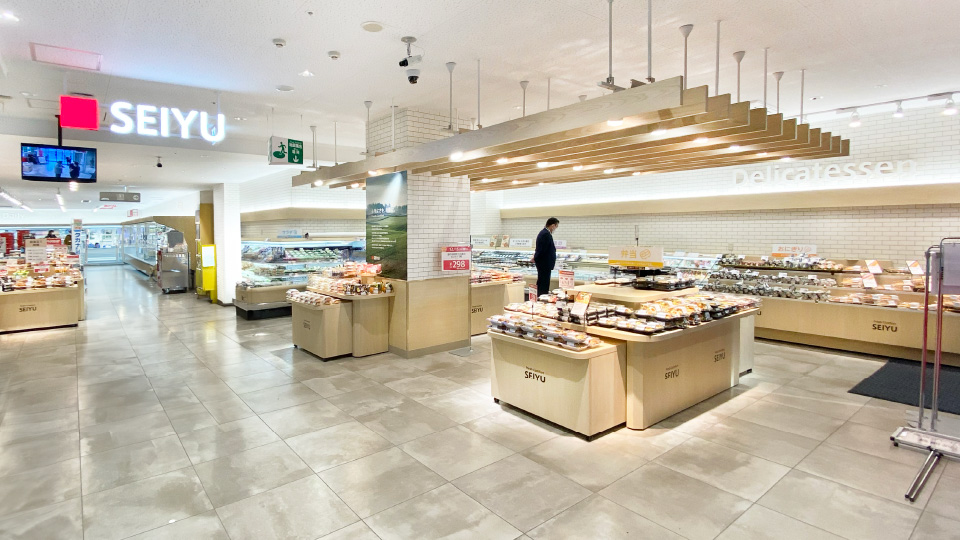
Following the concept definition, efforts turned to bringing this vision to life through store design. A prototype store was created to test the new direction. The spatial and graphic design were guided by the following principles:
SEIYU’s transformation is only just beginning. Learnings from the prototype will inform future development as the brand continues to evolve.
Shop Branding that Redefined the Concept of the 100-Yen Store
Request Information

現在、ブラウザの拡大・縮小機能を利用中です。
アクサムのサイトエクスペリエンスのために、拡大・縮小をオフにすることをおすすめします。
×