Caffé Veloce
Development and Implementation of a Brand Experience that Combines Casualness and Richness
Company Profile
Caffé Veloce
Originally launched in 1965 as the core business of Chat Noir Co., Ltd., Caffé Veloce is now operated by C-United Inc., which runs a nationwide café chain in Japan.
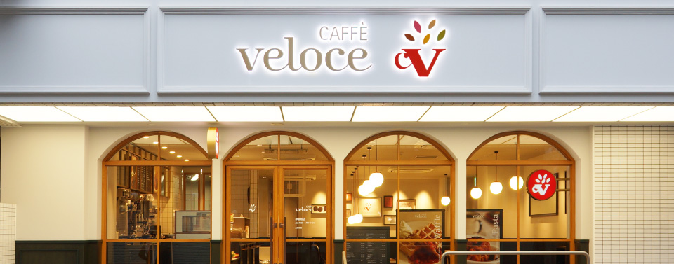
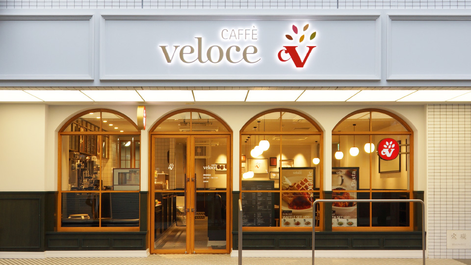
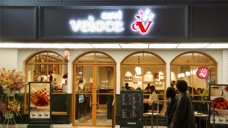
As a flagship initiative to embody the newly developed corporate philosophy, AXHUM led the creation of the new brand concept “Casual & Rich”, and was responsible for both the store logo development and spatial design planning for its pilot location in Kagurazaka.
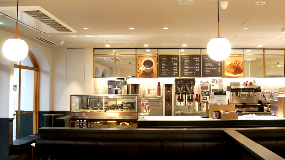
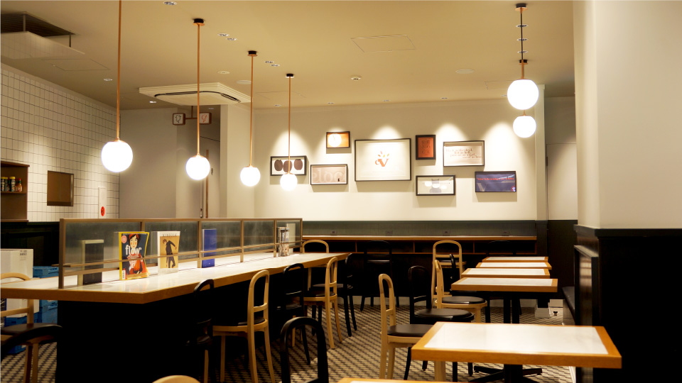
The interior and architectural design of the store was developed in collaboration with renowned architect Makoto Tanijiri and his firm Suppose Design Office. (Caffé Veloce is currently operated by C-United Inc. following a business transfer.)
The interior and architectural design of the store was developed in collaboration with renowned architect Makoto Tanijiri and his firm Suppose Design Office. (Caffé Veloce is currently operated by C-United Inc. following a business transfer.)
Delivering a New Brand Experience through a Logo and Store Design that Embody the Brand’s Evolving Concept
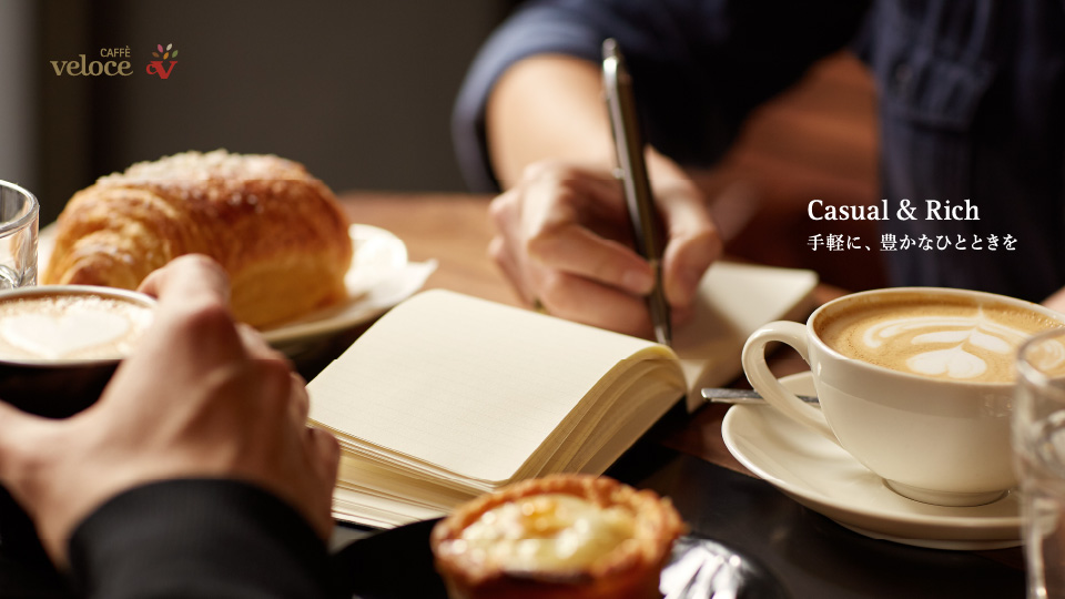
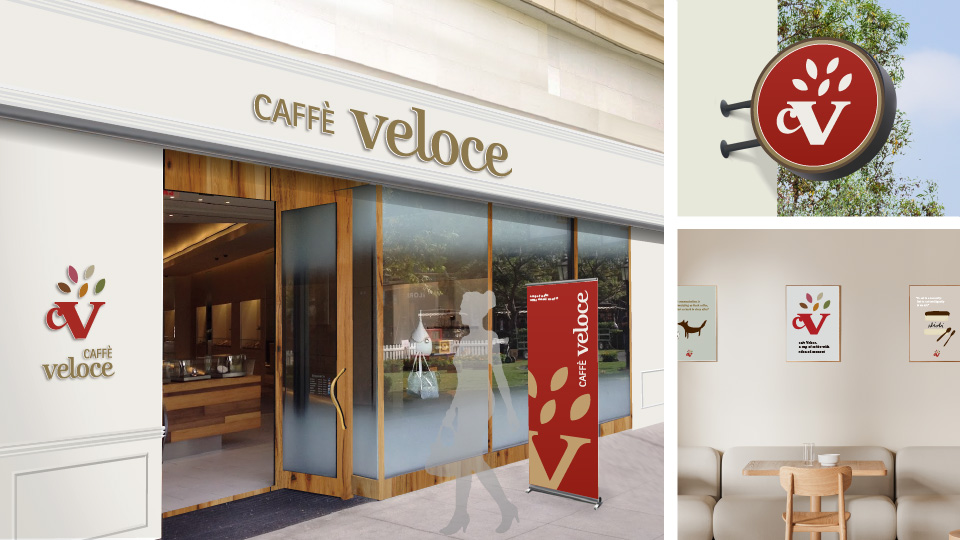
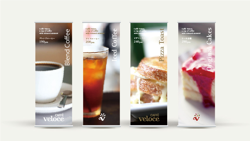
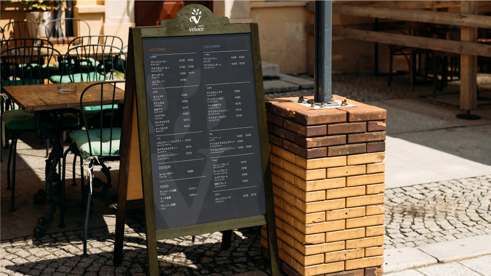
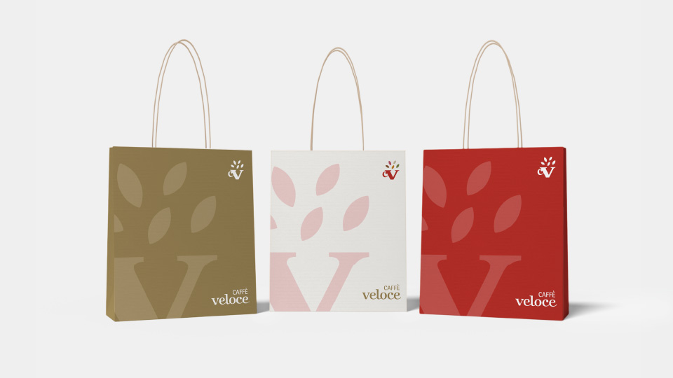
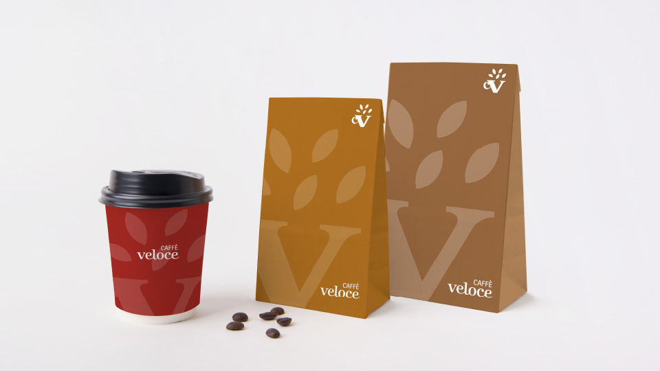
The brand concept of Caffé Veloce, previously associated with affordability, underwent a full transformation. Under the new concept, “Casual & Rich”, the brand experience was reimagined, beginning with a refreshed logo and extending to store and packaging design — all centred on the theme “Released Moments: a sense of richness inspired by a single cup of coffee.”
Brand Concept:
Casual & Rich – Effortless Comfort, Everyday Delight
Caffé Veloce offers an experience that is both accessible and refined. With delicious coffee and thoughtful hospitality in a warm, inviting setting, customers are welcomed into a space where they can enjoy moments of comfort and richness in their everyday lives.
Logo Design Concept:
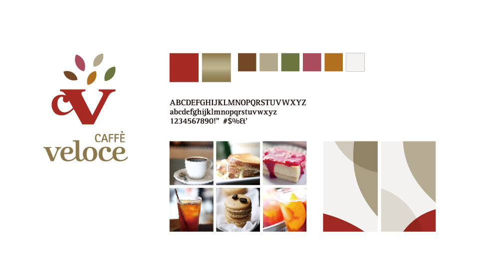
「Released Moments – A Sense of Richness Inspired by a Single Cup of Coffee
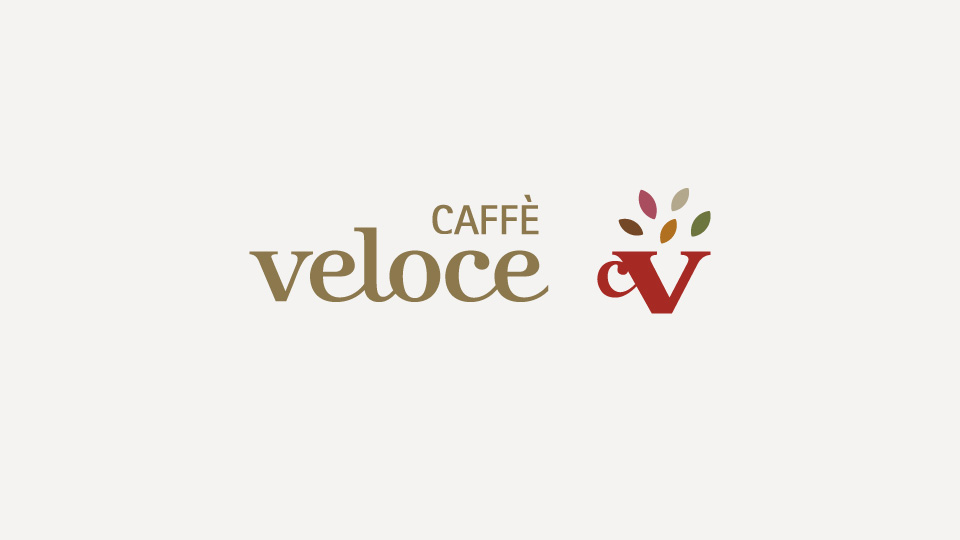
The new logo visualises the initials CV as a coffee cup, from which individual richness flows outward — symbolising the release of comfort and fulfilment. While retaining the signature red of the original brand identity, new elements of vitality, freedom, and wit have been added to reflect a refreshed and contemporary brand image.